FinancialViz Makeover: Table of metrics to 3 visuals based on the message for each metric
This makeover is based on a recent example from a session I delivered at a conference in Philadelphia. I commonly see tables of related metrics in the slides from the participants in my FinancialViz training courses. In this video I show you how to turn the table into 3 visuals, each one based on the… Continue reading FinancialViz Makeover: Table of metrics to 3 visuals based on the message for each metric
FinancialViz makeover: Make a Top 5 / Bottom 5 bar chart communicate clearly
This makeover is a recent visual I worked on and is similar to the “Top 5 / Bottom 5” visuals I see in my FinancialViz training courses. In this video I show you how to make the message clearer and it is done only using Excel, what you are already using. If you want to… Continue reading FinancialViz makeover: Make a Top 5 / Bottom 5 bar chart communicate clearly
FinancialViz: Non-zero-based column graphs mislead the viewer
I am no longer surprised when I see a column graph in a quarterly or annual financial report that is created to give the impression that the results shown are better than the actual numbers shown. The graph does not start the vertical axis at zero so the height of the columns is not accurately… Continue reading FinancialViz: Non-zero-based column graphs mislead the viewer
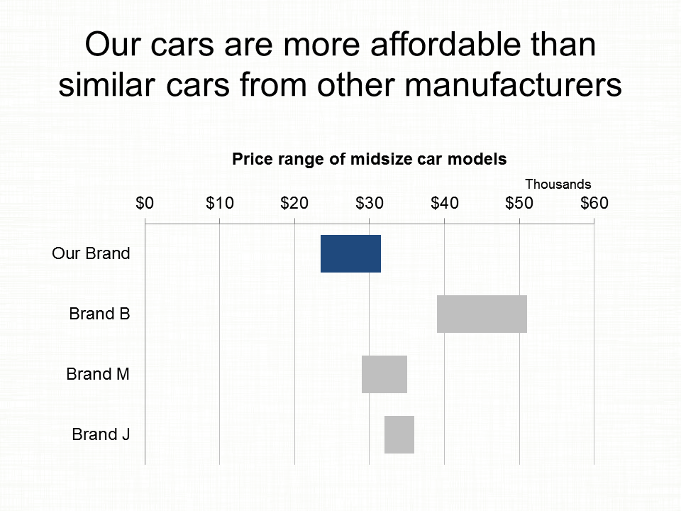
FinancialViz: “cool” visual doesn’t give accurate comparison
Too often I see financial professionals get seduced by the desire to create a “cool” visual. Maybe its one they’ve seen online or in a publication. It looks really neat and they think it would make them look goo if they used it in a presentation. Too often these “cool” visuals don’t communicate the message… Continue reading FinancialViz: “cool” visual doesn’t give accurate comparison
Dual-axis graph makeover: create a better visual for your data using Excel
I see dual-axis graphs frequently in the customized FinancialViz courses that I teach. In this video I show you an alternative to a dual-axis graph that better communicates the message to executives and stakeholders. It is possible to create the type of effective graph you see in this video just using Excel. If you want… Continue reading Dual-axis graph makeover: create a better visual for your data using Excel
AFP Article June 6 2022
The Association for Financial Professionals (AFP) published an article showing some of the makeovers of data heavy slides that were recently featured in a webinar I was a part of. You can see the before and after slides in the article here. The makeovers I submitted are #1, 2, 3, and 5.
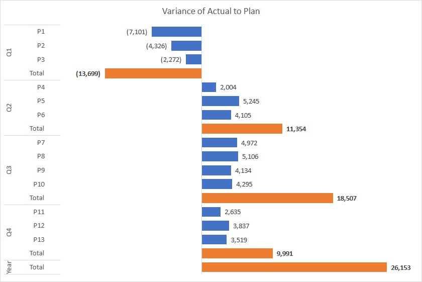
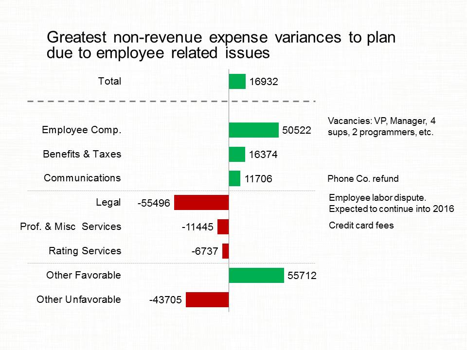
Showing variance to plan; Slide Makeover #103
CPG sales, marketing, and product managers regularly report on variance to plan for sales in dollars or units. Because the reporting is driven from a database, often the table of numbers is copied onto a slide. This makeover shows how to visually show the variance using a diverging bar chart. Discussion of original Easy to… Continue reading Showing variance to plan; Slide Makeover #103
Reporting related results; Slide Makeover #102
CPG sales, marketing, and product managers report on metrics that are related to performance but measured in different units, such as dollars, cases, or percentage. Because the reporting is driven from a database, often the table of numbers is copied onto a slide. This makeover shows how to visually show the comparison using a scaled… Continue reading Reporting related results; Slide Makeover #102
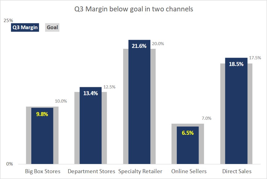
Comparing results to goals; Slide Makeover #100
CPG sales, marketing, and product managers report on sales or margin in each channel compared to the goal for that channel. Because the reporting is driven from a database, often the table of numbers is copied onto a slide. This makeover shows how to visually show the comparison using a multiple-width overlapping column graph. Discussion… Continue reading Comparing results to goals; Slide Makeover #100
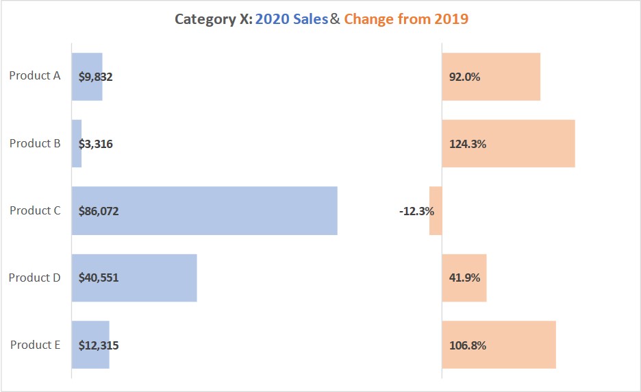
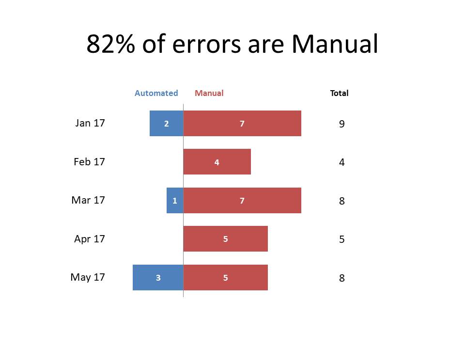
Showing Sales & YoY variance; Slide Makeover #98
CPG sales, marketing, and product managers report on product sales in a category and variance to previous year sales. Because the reporting is driven from a database, often the table of numbers is copied onto a slide. This makeover shows how to visually show the sales and variance using a small multiple bar graph. Discussion… Continue reading Showing Sales & YoY variance; Slide Makeover #98
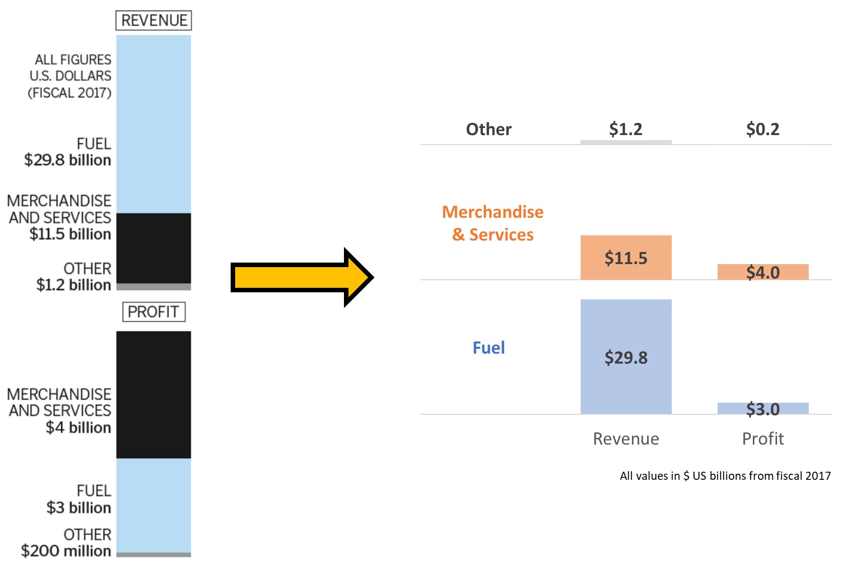
Lessons in creating effective Excel charts from the October 2019 SWD Challenge
Every month, Cole Nussbaumer Knaflic of storytelling with data posts a new challenge to help professionals think about how they can visually communicate a message from data. The October 2019 challenge is drawn from her new book and looks at how to communicate the message from a table of data related to revenue and number… Continue reading Lessons in creating effective Excel charts from the October 2019 SWD Challenge
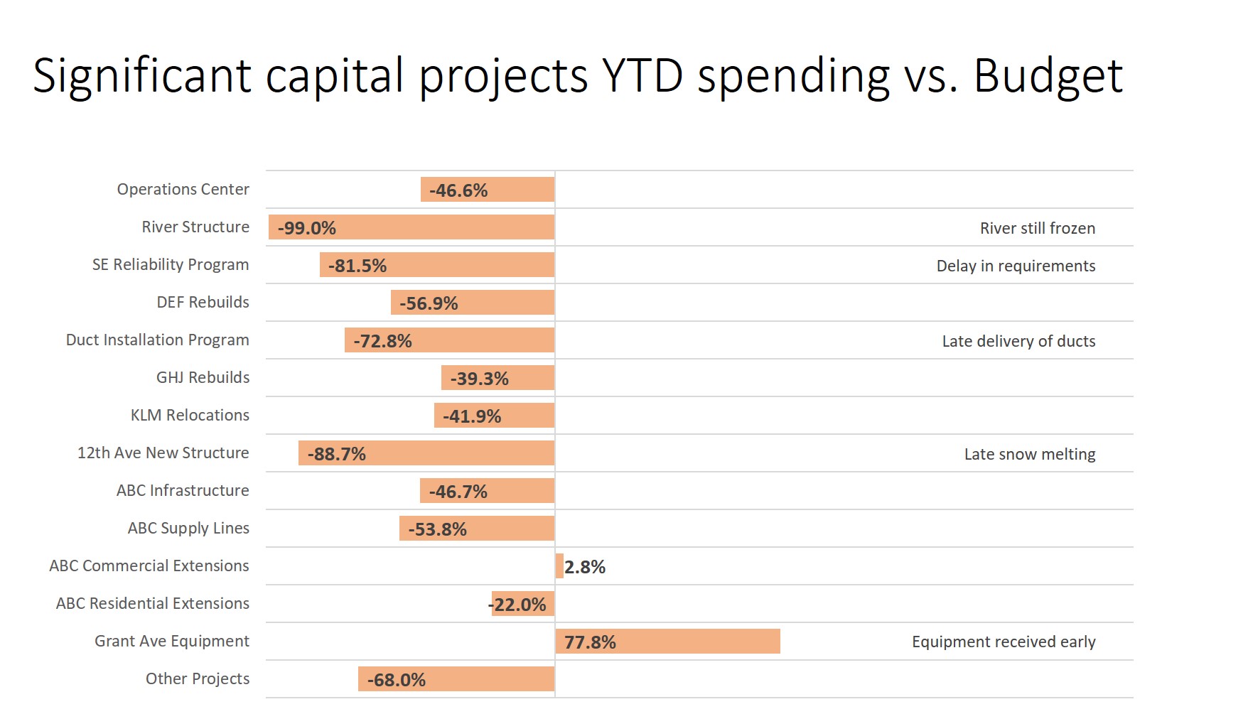
Comparing actual to budget with explanations; Slide Makeover #95
Comparing actual spending to budgeted spending is an important topic in many presentations. Too often the actual and budget amounts are shown in a table and the audience is expected to subtract large numbers in order to understand the difference. This makeover demonstrates how you can use a diverging bar chart with explanations to show… Continue reading Comparing actual to budget with explanations; Slide Makeover #95
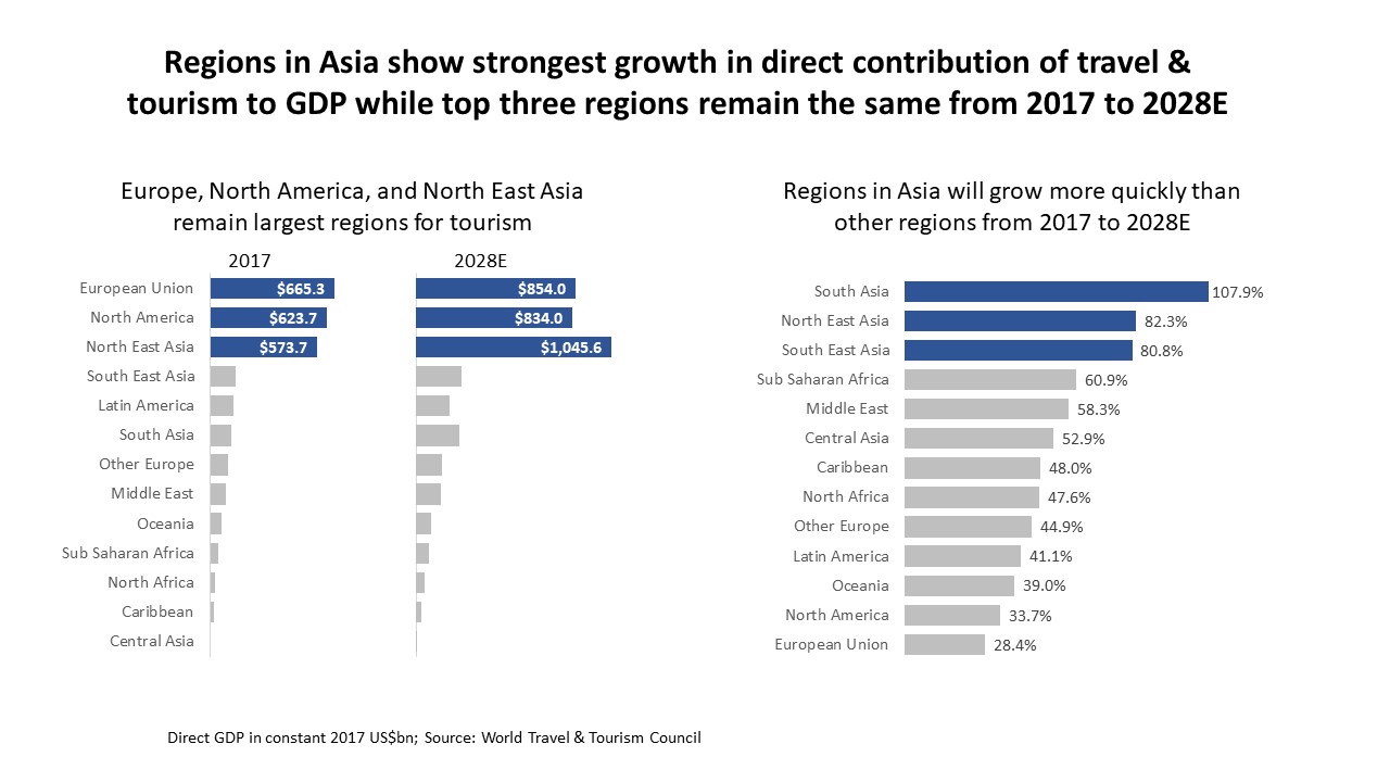
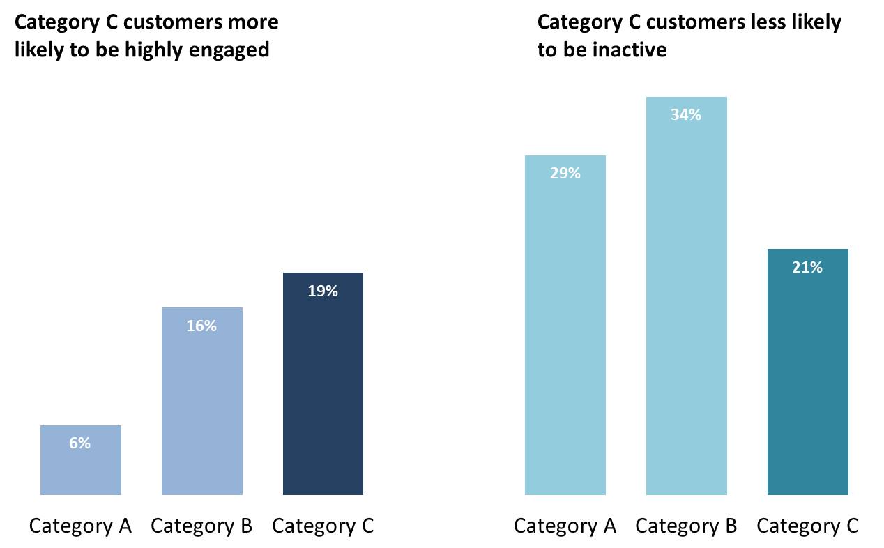
FinancialViz Makeover: Comparing multiple characteristics
This makeover shows how using bar charts beside each other makes it easier to compare multiple characteristics of the same items or areas. (this is a silent video and you can pause it to spend more time on any of the slides)
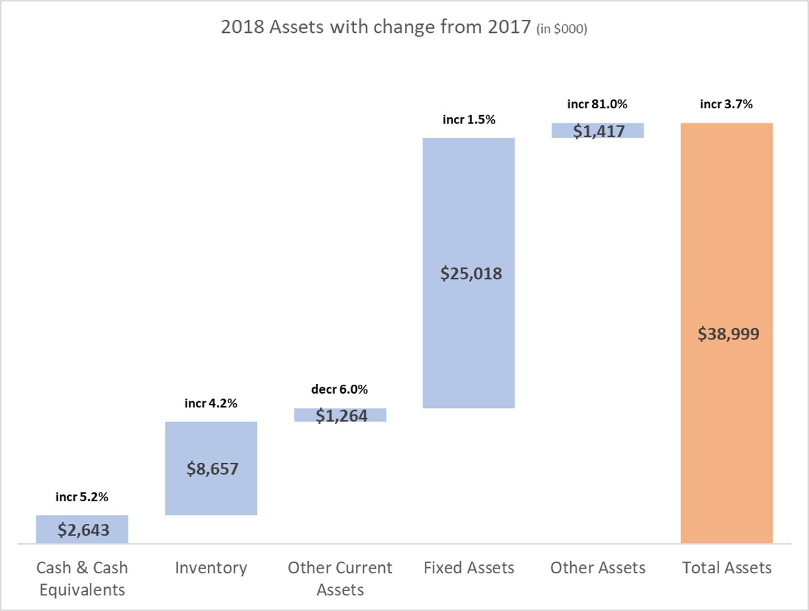
Presenting the Balance Sheet: Visually show Assets (or Liabilities) with YoY change
Today you will learn a great visual to use when presenting Assets or Liabilities from the Balance Sheet. Too often Balance Sheet presentations to executives or the Board are filled with spreadsheets. In my surveys of audiences they tell me that large tables of numbers are confusing and overwhelming. Our audiences want meaningful visuals instead… Continue reading Presenting the Balance Sheet: Visually show Assets (or Liabilities) with YoY change
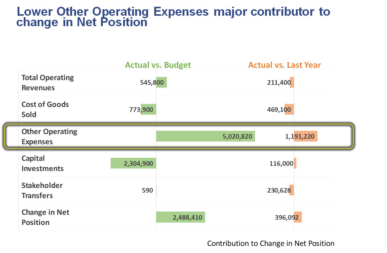
Showing difference between this year and last year/budget; Slide Makeover #93
Visually show variances: This Year compared to Last Year and Budget To see how well we are doing this year, we compare this year’s results to last year’s results and to the budget we set at the start of the year. Too often we show a spreadsheet of the numbers and expect the audience to… Continue reading Showing difference between this year and last year/budget; Slide Makeover #93
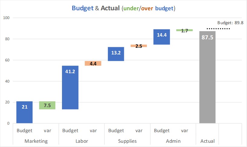
Presenting the income or P&L statement: Show Budget and variance walk of expense categories
You have looked at the difference between the actual and budget expenses in the different expense categories. You want to communicate the variances visually. This video shows how to use a steps to a total column graph to show the actual expenses and variance in each category and how they add to the total expense… Continue reading Presenting the income or P&L statement: Show Budget and variance walk of expense categories
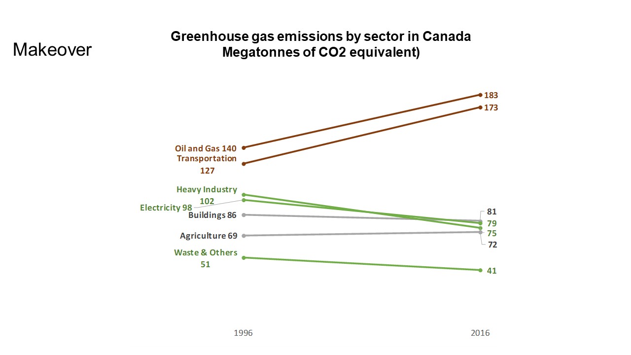
FinancialViz Makeover: Change in sectors over time
This makeover shows how using color and the right visual helps the audience compare the change in sectors between two time periods. (this is a silent video and you can pause it to spend more time on any of the slides)
SWD Challenge September 2018
I think makeovers of slides or visuals is a great way to see what is possible in our own presentations. If we have never seen a visual used in a certain way before, we would never think of applying it to what we present. The makeovers that I use in my custom workshops are always… Continue reading SWD Challenge September 2018
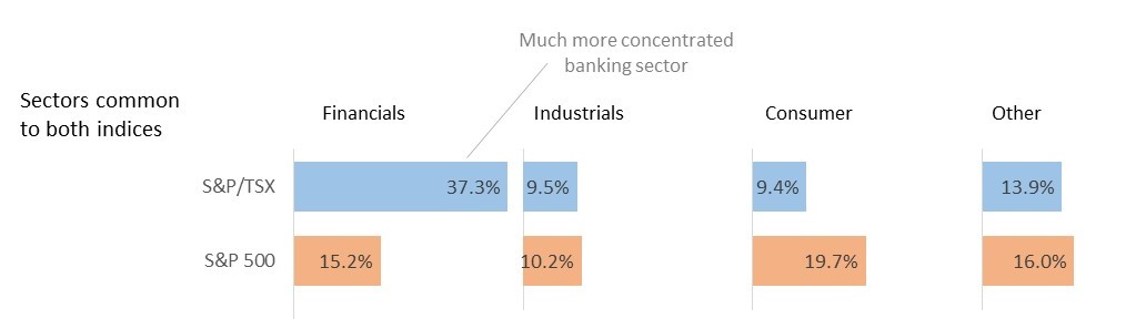
FinancialViz Makeover: Comparing common elements using color and position
This makeover shows how using color and position helps the audience compare common elements in two categories or data series.
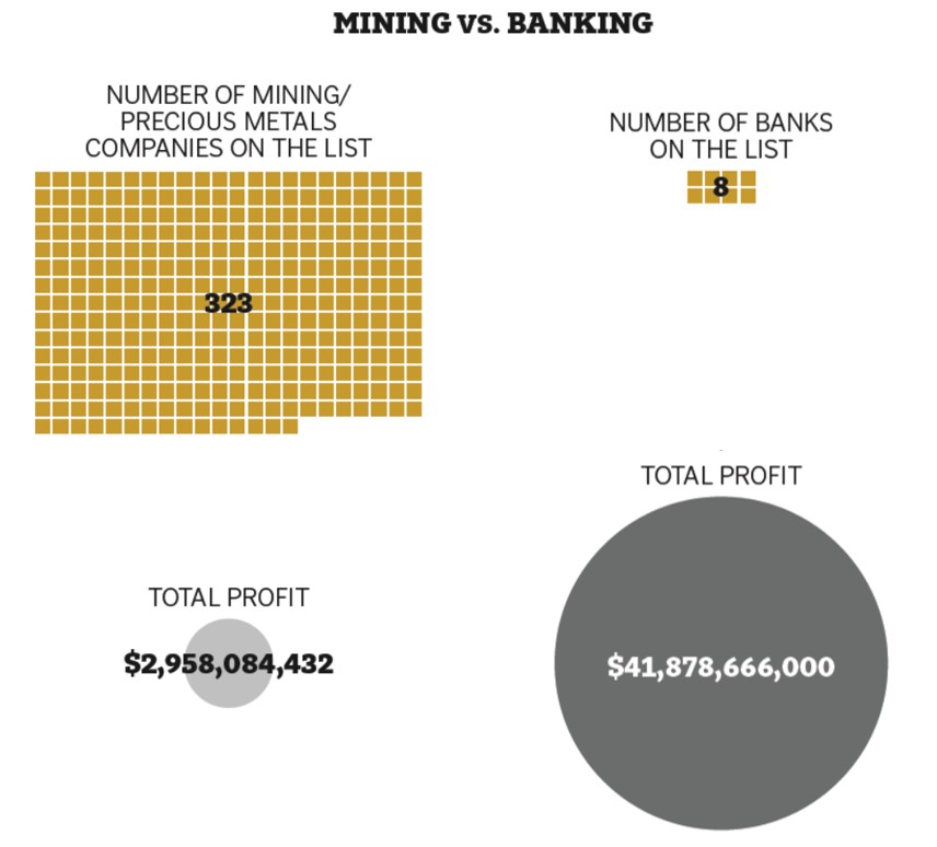
FinancialViz: Comparing Revenue & Profit in lines of business
This makeover shows a way to compare the revenue and profit from multiple lines of business
Another option for diverging bar charts; Issue #400 October 17, 2017
Use a diverging bar chart to compare two data series that are related
Replace stacked column graphs; Issue #393 July 11, 2017
Focus the audience on the comparison of the values in the important segments in a stacked column graph
Focusing the message for variance analysis; Slide Makeover #86
Focus your message with a visual that highlights important variances
Order data to support your message; Issue #378 December 6, 2016
When comparing values, make sure the order supports the message
Showing performance compared to past and budget; Slide Makeover #85
Use a multiple-width overlapping column graph to compare current performance to past and expected performance
Show the difference; Issue #366 June 21, 2016
When the difference in values is the message, just show the difference, not the values
Showing a range of values; Slide Makeover #81
Use a trick in a stacked bar chart in Excel or PowerPoint to create a graph that visually shows the range of values.