Every month, Cole Nussbaumer Knaflic of storytelling with data posts a new challenge to help professionals think about how they can visually communicate a message from data. The October 2019 challenge is drawn from her new book and looks at how to communicate the message from a table of data related to revenue and number of clients in five tiers.
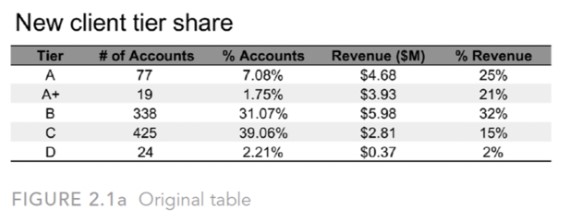
Here is the original table as shown in the challenge.
The message to be communicated is “the main comparison you want to make is between how accounts are distributed across the tiers compared to how revenue is distributed”.
Observations about the table of data
The first observation I made about the table of data is that it is sorted alphabetically instead of by tier. The A+ tier is the top tier but is shown as the second row. This is a common issue in data that is drawn from a database or other source. You get the data in whatever sort order the storage system holds it in, which is often alphabetical. To communicate the message, I had to re-order the data so it was sorted by tier.
The second observation is that the percentages in each column do not add up to 100%. And it is not due to rounding, it appears that there is an error in calculating the values. This is again another common situation you run into with data from another system. A good practice is to first double check the calculated values and then do your own calculations based on the raw data so you have values that you can support.
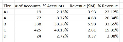
Table of data I used
Once I sorted the data and recalculated the percentages, I came up with this table of data used to create my visualizations.
Attempt #1: Small multiple columns
My first thought was to show columns for the tiers, ordered from lowest tier on the left to highest tier on the right. By placing a set of columns for the % of Revenue above the % of Accounts it would be clear that the revenue was weighted towards the top tiers and the number of accounts towards the bottom tiers. Here’s what I created in Excel.
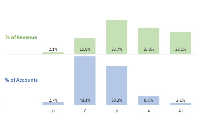
It worked, but I didn’t feel it gave the comparison I was looking for or communicated the message as clearly as it could.
Attempt #2: Diverging bars
With a bar chart I could rank the top tier at the top of the visual so that appealed to me. By having the bars diverge each direction from the center I felt it would be easier to see the shape of the distribution. Here’s what I created in Excel.
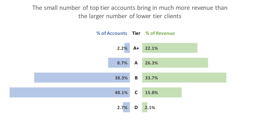
I was happy with this visual as it better shows the weighting of the revenue in the top tiers and the accounts in the bottom tiers.
Creation of the visuals in Excel
To create these two visuals in Excel I used a number of the techniques in my Excel Chart Skills 501 online course, including:
- Invisible spacers used to position visible segments such as the spacers used in the first visual to position all of the top columns at the same baseline and the spacers in the second visual used to align all of the blue bars at their right edges.
- Advanced labelling to drive all the text from the chart data table, including the headings and tier names in the second visual.
- Multiple data series to allow for easier formatting so that invisible segments used to hold text are separate series and do not rely on manually formatting one column or bar of a data series differently.
It is possible to create effective data visuals in Excel. You do not need any fancy tools or programming.
Additional analysis: Revenue per account
As I looked at the data it occurred to me that one way to emphasize how important the top tier accounts are was to look at the revenue per account. This is common in creating visuals for presentation, and we should pursue these additional directions to see if a clear, compelling visual may emerge. I did the calculations using the source data and created this column graph.
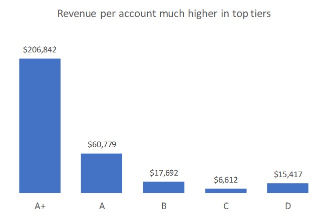
I like this visual because it shows the dramatic difference between the tiers. It was also interesting that this visual revealed the accounts in the lowest tier brought in more than double the revenue of those in the second lowest tier. This is an area that would be good to investigate further and see if there are opportunities being missed in some accounts.
Lessons
I am glad I completed this exercise and I wrote this article to illustrate my thinking and some lessons all professionals can remember:
- Always check the data you are given and arrange the data so it matches the message you want to communicate.
- There is usually more than one way to visually communicate a message. If your first attempt doesn’t work well enough, look for another visual that will communicate more effectively.
- Be open to following new paths of analysis that you discover when creating a visual. They may lead to even clearer visuals for your audience or new insights that can be uncovered by further investigation.
- You can create effective data visuals in the tools you already have, including Excel. Take some time to learn the expert-level techniques in your existing tools instead of thinking you have to climb the steep learning curve of new tools.

Dave Paradi has over twenty-two years of experience delivering customized training workshops to help business professionals improve their presentations. He has written ten books and over 600 articles on the topic of effective presentations and his ideas have appeared in publications around the world. His focus is on helping corporate professionals visually communicate the messages in their data so they don’t overwhelm and confuse executives. Dave is one of fewer than ten people in North America recognized by Microsoft with the Most Valuable Professional Award for his contributions to the Excel, PowerPoint, and Teams communities. His articles and videos on virtual presenting have been viewed over 4.8 million times and liked over 17,000 times on YouTube.