CPG sales, marketing, and product managers report on metrics that are related to performance but measured in different units, such as dollars, cases, or percentage. Because the reporting is driven from a database, often the table of numbers is copied onto a slide. This makeover shows how to visually show the comparison using a scaled column graph.
Discussion of Original
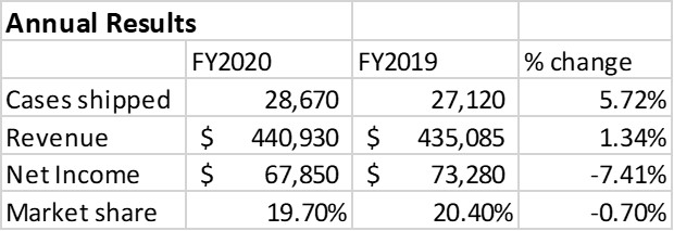
Easy to create: Since this visual is simply a copy and paste from Excel or a web-based reporting tool into PowerPoint, it is easy to create. Just because it is easy to create doesn’t mean it is effectively communicating the key message.
Makes the audience figure out the message: This visual makes the audience try to figure out how the different metrics are related and what are the important messages. This is risky as a presenter because each audience member may come to a different conclusion and not necessarily the one you were hoping them to see.
Discussion of Makeover
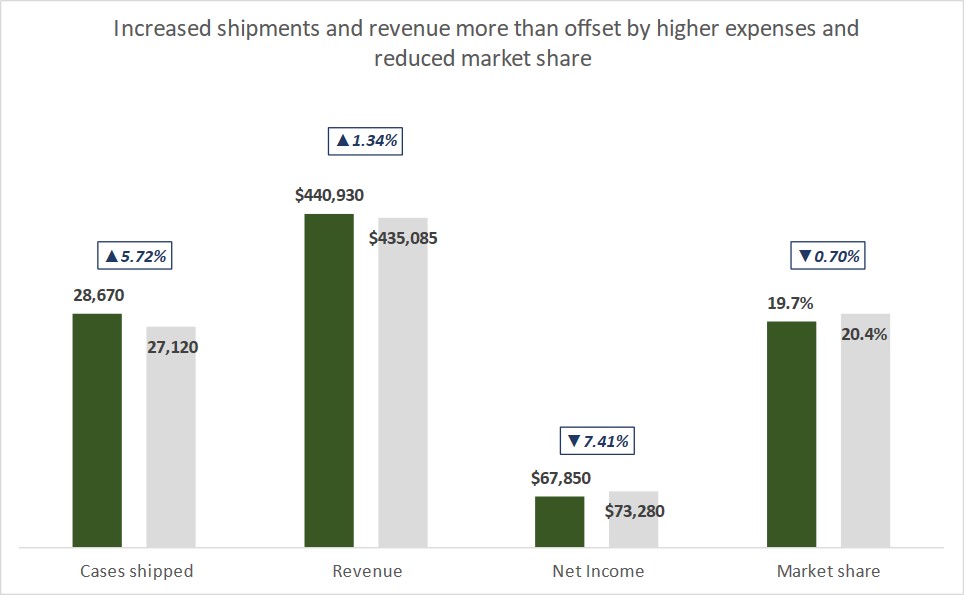
Scaled columns: This is a single standard column graph in Excel. The way values with different units are all on one graph is by using scaling to adjust the graphed values. This allows the graph to have a single baseline. The two sets of columns measured in dollars are not scaled so that they can be compared to each other.
Custom data labels: Because the column values in the graph for the scaled columns are not the same as the values they represent, custom data labels are used so that the viewer sees the correct values. Custom data labels in Excel give a presenter a lot of flexibility.
Change values added: The percentage change between the 2019 and 2020 values is shown using custom data labels on an invisible line. This allows the labels to be positioned above the columns and have the formatting that includes a directional arrow symbol.
All elements are data driven: Every element of the visual is driven from the data table in Excel, including the data labels and the customization of the change symbols. Even the chart title with the clear message of the graph comes from the data table. This allows the graph to automatically update when the data changes, saving you time every month or quarter.
Video
This is a silent video (no audio) with slide timing bars at the bottom of the slides. Pause the video to spend more time on a slide.

Dave Paradi has over twenty-two years of experience delivering customized training workshops to help business professionals improve their presentations. He has written ten books and over 600 articles on the topic of effective presentations and his ideas have appeared in publications around the world. His focus is on helping corporate professionals visually communicate the messages in their data so they don’t overwhelm and confuse executives. Dave is one of fewer than ten people in North America recognized by Microsoft with the Most Valuable Professional Award for his contributions to the Excel, PowerPoint, and Teams communities. His articles and videos on virtual presenting have been viewed over 4.8 million times and liked over 17,000 times on YouTube.