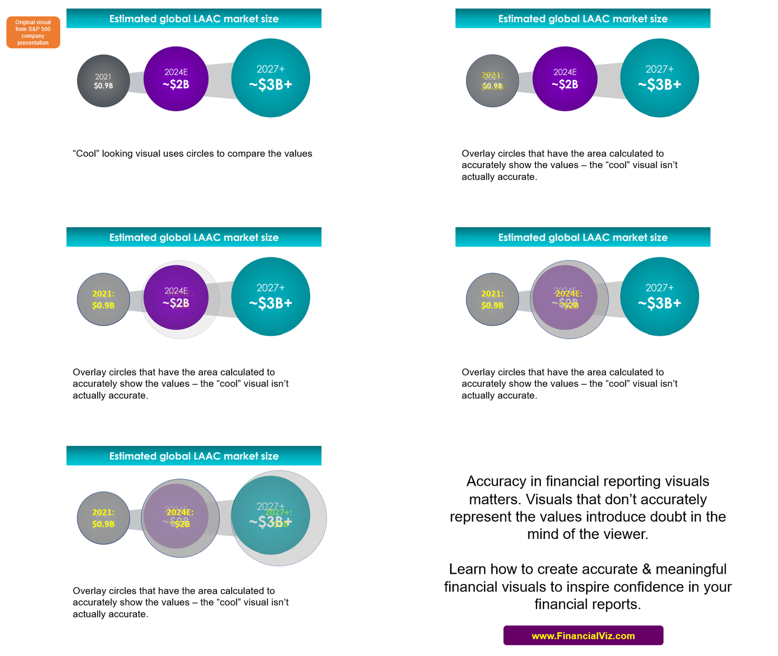
Too often I see financial professionals get seduced by the desire to create a “cool” visual. Maybe its one they’ve seen online or in a publication. It looks really neat and they think it would make them look goo if they used it in a presentation. Too often these “cool” visuals don’t communicate the message well and often the message isn’t even accurate.
Here’s an example from a presentation done by an S&P 500 company at a conference.

It is difficult for viewers to compare the area of circles and often they just guess that the numbers shown are being accurately represented by the size of the circles. Often the presenter has not done the calculation to make sure the comparison is accurate. The viewer ends up with an incorrect interpretation or ends up confused.
There is no shame in using a tried and true visual like a column or bar chart. It can accurately communicate the message and is easy to create. Go for accuracy and ease of understanding over the “cool” factor.
If your team wants to learn how to use Excel to create visuals that inspire confidence in your analysis and reports, check out my live customized FinancialViz training courses that are delivered virtually so staff can attend wherever they are located. Go to www.FinancialViz.com to learn more.

Dave Paradi has over twenty-two years of experience delivering customized training workshops to help business professionals improve their presentations. He has written ten books and over 600 articles on the topic of effective presentations and his ideas have appeared in publications around the world. His focus is on helping corporate professionals visually communicate the messages in their data so they don’t overwhelm and confuse executives. Dave is one of fewer than ten people in North America recognized by Microsoft with the Most Valuable Professional Award for his contributions to the Excel, PowerPoint, and Teams communities. His articles and videos on virtual presenting have been viewed over 4.8 million times and liked over 17,000 times on YouTube.
