CPG sales, marketing, and product managers report on product sales in a category and variance to previous year sales. Because the reporting is driven from a database, often the table of numbers is copied onto a slide. This makeover shows how to visually show the sales and variance using a small multiple bar graph.
Discussion of original
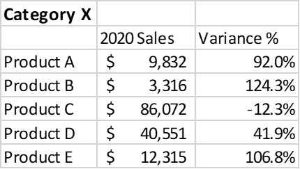
Easy to create: Since this visual is simply a copy and paste from Excel or a web-based reporting tool into PowerPoint, it is easy to create. Just because it is easy to create doesn’t mean it is effectively communicating the key message.
Makes the audience figure out the message: This visual makes the audience figure out what the important numbers or relationships are in the table. This is risky as a presenter because each audience member may come to a different conclusion and not necessarily the one you were hoping them to see.
Discussion of Makeover
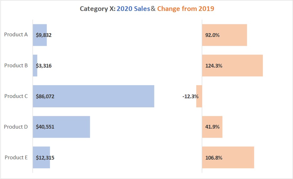
Small multiple bars: This visual is referred to as a small multiple bar graph. It is two bar graphs created in a single bar graph in Excel. Using a single graph allows each of the bars to be lined up with the product name without the hassle of manually moving and lining up two separate graphs. It also makes it easier to update in the future because both graphs update when the data changes.
Scaled bars: The way that percentages, which are a fraction of one, appear visible on a graph with tens of thousands of dollars is by using scaling. Since the two measurement units are different, the viewer is only comparing the length of the bars in each column, not the length of the bars in each row.
Comparing performance in each metric is easy: The bar graphs make it easy for the viewer to compare the performance of the products on each of the two metrics being reported. It is easy to see that our top selling product is Product C. It is also easy to see that three products had strong growth over the last year, one of the key messages we want the viewer to understand.
Sales & variance relationship easy to see: The relationship between the sales of a product and the comparison to the previous year is easy for the viewer to see in each row. For example, our biggest selling product, Product C, lost sales over the last year. This is likely an important message to communicate to the viewer.
Relative variance relationship with actual sales can be understood: While three of the products showed large percentage increases in sales over the last year, having the bars beside each other allows us to also see that those three products are our three lowest selling products. So large percentage increases in sales does not translate to a large bottom line impact. The percentage drop in sales of our largest selling product is likely a bigger factor on bottom line results.
Video
This is a silent video (no audio) with slide timing bars at the bottom of the slides. Pause the video to spend more time on a slide.

Dave Paradi has over twenty-two years of experience delivering customized training workshops to help business professionals improve their presentations. He has written ten books and over 600 articles on the topic of effective presentations and his ideas have appeared in publications around the world. His focus is on helping corporate professionals visually communicate the messages in their data so they don’t overwhelm and confuse executives. Dave is one of fewer than ten people in North America recognized by Microsoft with the Most Valuable Professional Award for his contributions to the Excel, PowerPoint, and Teams communities. His articles and videos on virtual presenting have been viewed over 4.8 million times and liked over 17,000 times on YouTube.