CPG sales, marketing, and product managers report on sales or margin in each channel compared to the goal for that channel. Because the reporting is driven from a database, often the table of numbers is copied onto a slide. This makeover shows how to visually show the comparison using a multiple-width overlapping column graph.
Discussion of original
Easy to create: Since this visual is simply a copy and paste from Excel or a web-based reporting tool into PowerPoint, it is easy to create. Just because it is easy to create doesn’t mean it is effectively communicating the key message.
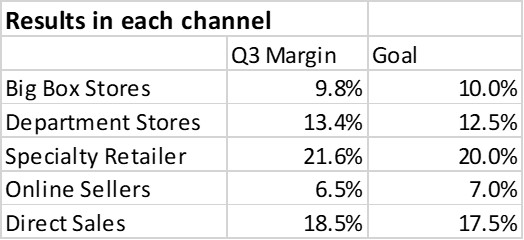
Makes the audience figure out the message: This visual makes the audience figure out whether the current performance is above or below the goal and which are the important numbers in the table. This is risky as a presenter because each audience member may come to a different conclusion and not necessarily the one you were hoping them to see.
Discussion of Makeover
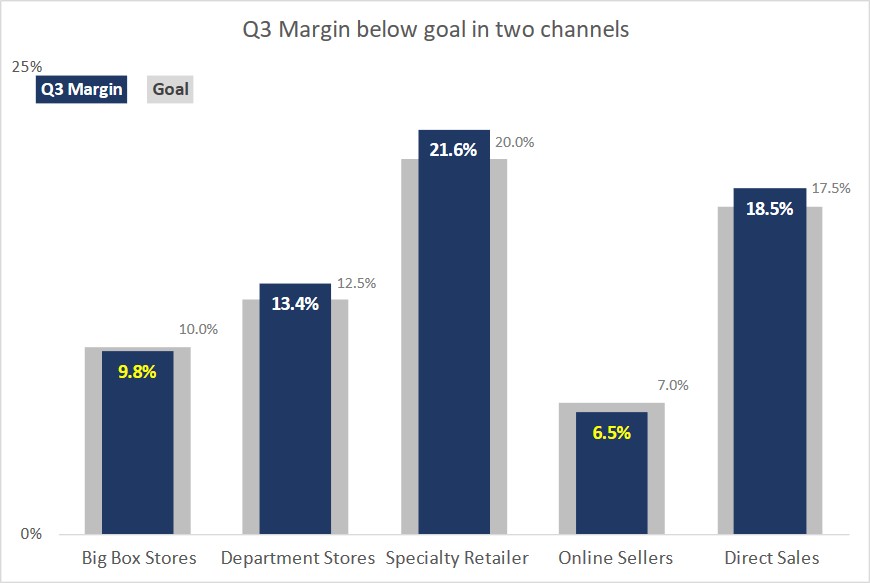
MWOCG: I refer to this visual as a multiple-width overlapping column graph (MWOCG). It shows the margin values in thinner columns in front of wider columns for the goal values. It is created in Excel using a standard clustered column graph.
Quickly compare value to goal: Because one column is in front of the other column it is easy for the viewer to see if the margin is above or below the goal. Having overlapping columns is easier to compare than columns that are beside each other.
Magnitudes are easy to see: The different channels are easy to compare in this graph, both the current margin as well as the goals. The magnitude of the difference between the current margin and goal is also easy to see with the overlapping columns.
Labels draw attention to key results: The data labels for the margin columns have conditional formatting built in so that if the value is below the goal for that channel, the value is in a bright yellow instead of the standard white. The viewer’s eyes will be drawn to this difference and will focus on the values that did not meet the goal, which is likely a key message in the slide.
All elements are data driven: Every element of the visual is driven from the data table in Excel, including the data labels, the data label color, and the position and text of the legend. This allows the graph to automatically update when the data changes, saving you time every month or quarter.
Video
This is a silent video (no audio) with slide timing bars at the bottom of the slides. Pause the video to spend more time on a slide.

Dave Paradi has over twenty-two years of experience delivering customized training workshops to help business professionals improve their presentations. He has written ten books and over 600 articles on the topic of effective presentations and his ideas have appeared in publications around the world. His focus is on helping corporate professionals visually communicate the messages in their data so they don’t overwhelm and confuse executives. Dave is one of fewer than ten people in North America recognized by Microsoft with the Most Valuable Professional Award for his contributions to the Excel, PowerPoint, and Teams communities. His articles and videos on virtual presenting have been viewed over 4.8 million times and liked over 17,000 times on YouTube.