I recently had a good discussion in the comments of a blog post by research data viz specialist Ann K Emery (the blog post and discussion are here). It led me to write this article explaining why I think stacked column graphs do not serve your audience very well and what you can do instead.
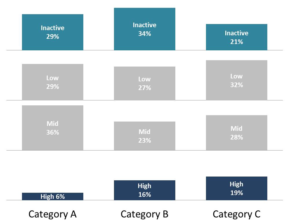
A stacked column graph is a common visual used to compare a breakdown of values into categories. Here is an example based on a recent slide makeover for a workshop client. The graph shows the breakdown in terms of level of engagement within three customer categories.

What key messages should the audience focus on? Is it the darker segments in the middle, which are hard to compare because they don’t line up with each other? Actually, the key messages are that Category C is significantly more likely to be highly engaged and less likely to be inactive. This illustrates the key problems with stacked column graphs. First, it is hard to compare segments that don’t have a common baseline, and second, there is often more data shown than needed to communicate the key message.
I think there are two options to consider that visually show this data better than a stacked column graph.
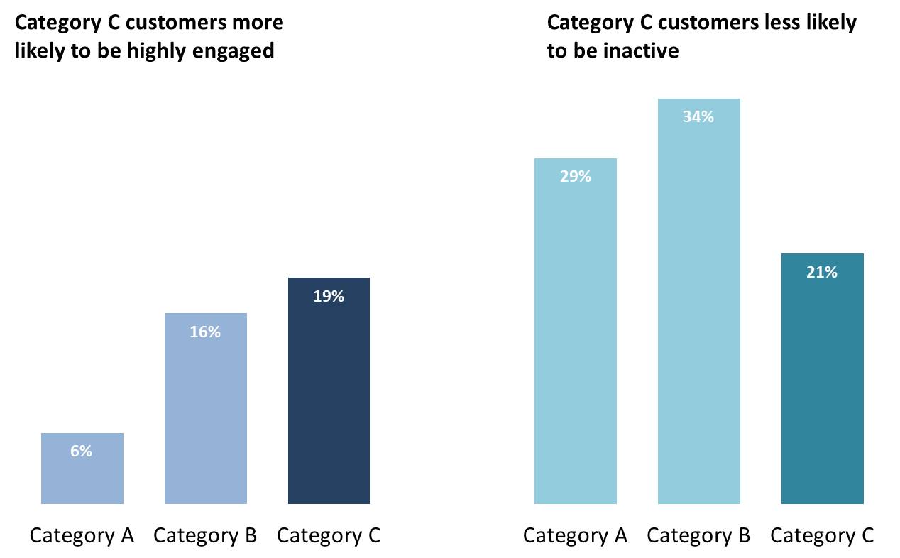
First, consider a small multiples graph where each segment has its own baseline, so the comparison of values in each segment is much easier. Here is what this would look like for the above graph.
Notice how I also used the choice of colors to focus the audience on the two levels of engagement that are important for the messages.
How can we improve this further? By getting rid of the values that don’t communicate the key messages. For too many presenters this is an outrageous idea because they believe that the audience surely wants to see every last data point and value they have analyzed. I can tell you from experience that the audience only cares about what impacts them, not the rest of what you have calculated. Make the rest of the data available in hidden slides or backup documents if you want the audience to have access to it.
When we get rid of the Mid and Low segments, we can focus the audience on the two key messages and not distract them with visuals that are extraneous and actually may give rise to questions that take us off track during the presentation. Here’s what that slide looks like.
The next time you want to create a stacked column graph, consider these ideas to make your message clearer for the audience.

Dave Paradi has over twenty-two years of experience delivering customized training workshops to help business professionals improve their presentations. He has written ten books and over 600 articles on the topic of effective presentations and his ideas have appeared in publications around the world. His focus is on helping corporate professionals visually communicate the messages in their data so they don’t overwhelm and confuse executives. Dave is one of fewer than ten people in North America recognized by Microsoft with the Most Valuable Professional Award for his contributions to the Excel, PowerPoint, and Teams communities. His articles and videos on virtual presenting have been viewed over 4.8 million times and liked over 17,000 times on YouTube.