Slide Makeovers
What could your slides look like when you apply the ideas that I share? Below are the latest makeovers I have done that share a before and after look at real-world slides. I discuss my thinking and provide some lessons for presenters when faced with communicating a similar message. Below the most recent makeovers is a link to see previous makeovers. For examples of visuals that can be used to communicate financial data or analysis, see FinancialViz.com.
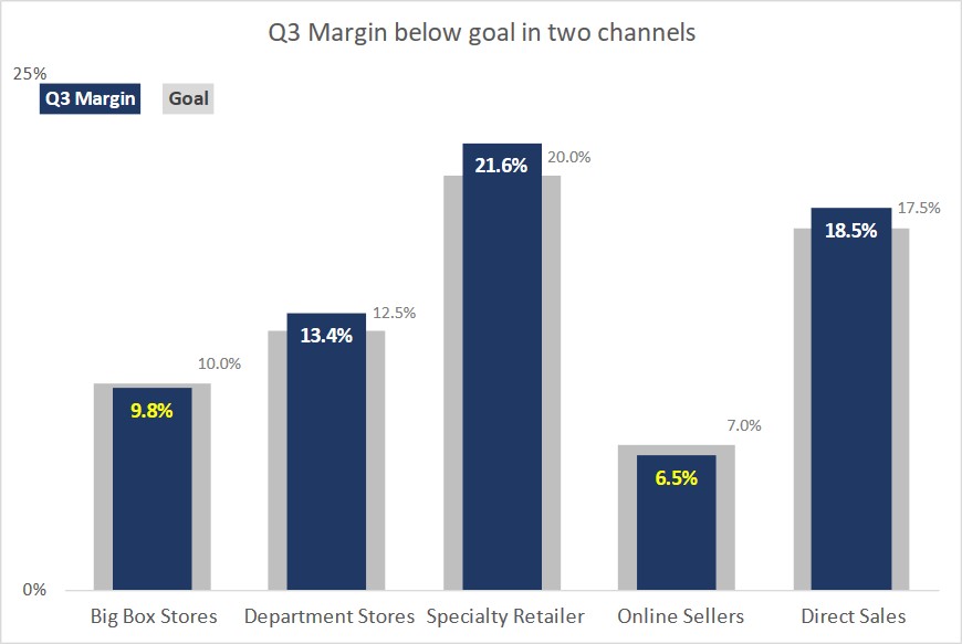
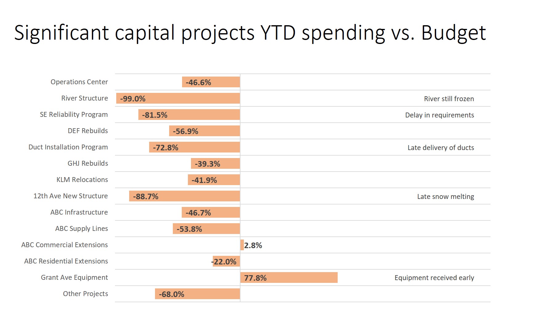
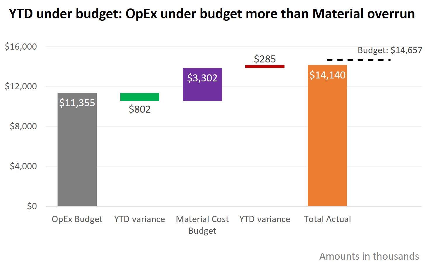
Comparing actual to budget with explanations; Slide Makeover #95
Comparing actual spending to budgeted spending is an important topic in many presentations. Too often the actual and budget amounts are shown in a table and the audience is expected to subtract large numbers in order to understand the difference. This makeover...
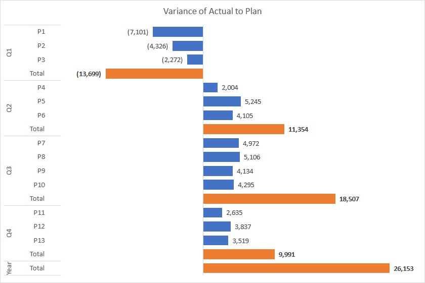
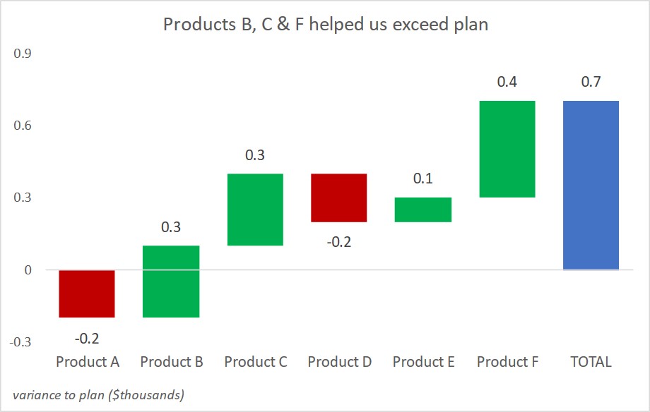
Showing component and total variance to budget; Slide Makeover #94
To explain the overall variance to the budget, we often look at the variances in each area. Too often the budget and variance amounts are shown in a table that the audience must interpret. This makeover demonstrates how you can use a steps to a total graph to show how...
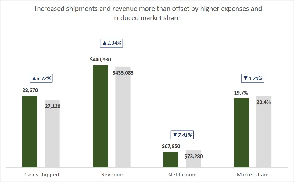
Showing difference between this year and last year/budget; Slide Makeover #93
Visually show variances: This Year compared to Last Year and Budget To see how well we are doing this year, we compare this year’s results to last year’s results and to the budget we set at the start of the year. Too often we show a spreadsheet of the numbers and...
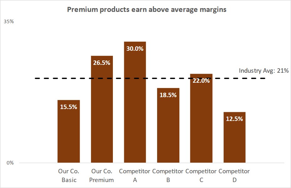
FinancialViz Makeover: Comparing to an average with long labels
This makeover shows how using a dashed line as part of a graph allows easy comparison of values to an average and a bar chart makes long category labels easier to read. (this is a silent video and you can pause it to spend more time on any of the slides)...
FinancialViz Makeover: Change in sectors over time
This makeover shows how using color and the right visual helps the audience compare the change in sectors between two time periods. (this is a silent video and you can pause it to spend more time on any of the slides) https://youtu.be/wOCBOUwZNPY
SWD Challenge September 2018
I think makeovers of slides or visuals is a great way to see what is possible in our own presentations. If we have never seen a visual used in a certain way before, we would never think of applying it to what we present. The makeovers that I use in my custom workshops...
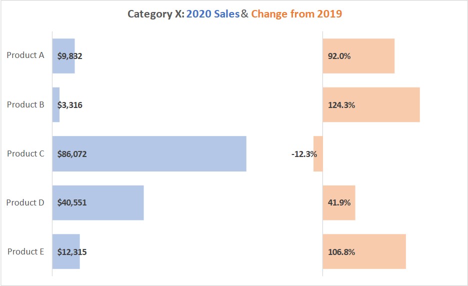
FinancialViz Makeover: Putting comparisons side-by-side
Comparing growth in Sales and Expense categories over time; Slide Makeover #92
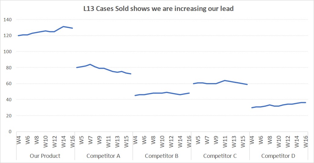
Use an index line graph to compare trends in different data series using a common starting point
FinancialViz: Comparing Revenue & Profit in lines of business
This makeover shows a way to compare the revenue and profit from multiple lines of business
Comparing Revenue components to previous year; Slide Makeover #91
Use a “steps to a total” graph instead of a spreadsheet to explain the components of total revenue
Showing the timing of steps in a project; Slide Makeover #90
Use a data-driven Gantt chart instead of a bulleted list of dates to show timing of steps.
Showing breakeven analysis; Slide Makeover #89
Show the breakeven analysis on an investment visually instead of a spreadsheet or table of numbers.