A situation I ran into recently is one that comes up often. The presenter wanted to communicate that a new product line was the premium priced product in the market. The real message was about the difference in price to the other competing products. This type of message, where we want the audience to understand the difference between values, is a common one in many presentations.
The initial slide looked similar to this:
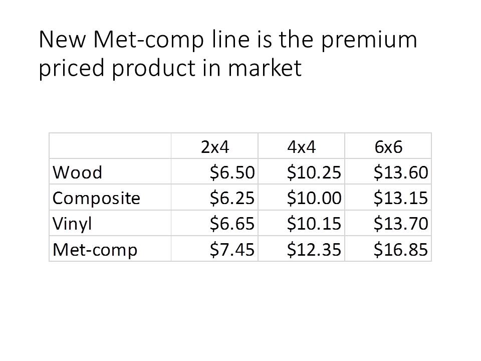
While all of the numbers are accurate, this type of slide makes the audience do math to figure out the price difference in each of the product variations. As I have said many times in my customized workshops, if you think the audience is going to do math, you are sadly mistaken. The audience rightfully expects you to have done the work of figuring out the message for them.
The first attempt at making this better is to create a column graph of the values so that the audience can see the difference visually. Here is the first graph:
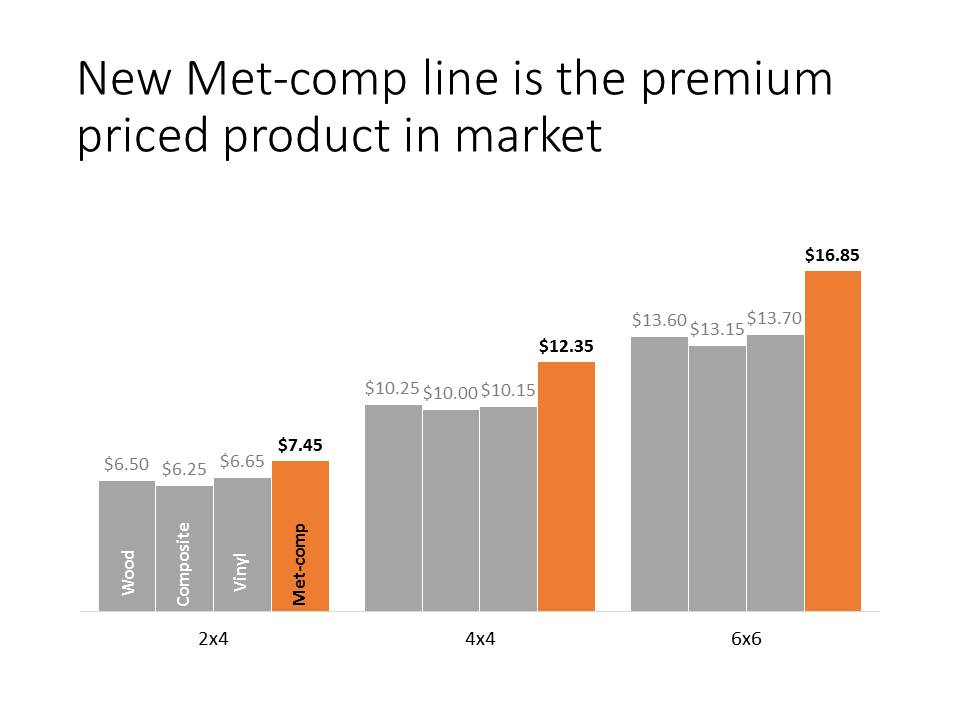
This is better than the table because now we can visually see the difference and the audience doesn’t have to do any calculations in their head to understand the message. It is clear that the new product line is priced higher than the other three competing products.
Let’s take this to the next level. If the message is the difference in price, why not just show the difference. This will depend on the context, but in this situation the wood product is considered the standard or base to compare to. So by doing the math for the audience of the price difference to the standard wood product, we can show how dramatic the price premium is for our new product line. Here is the graph of the price differences:
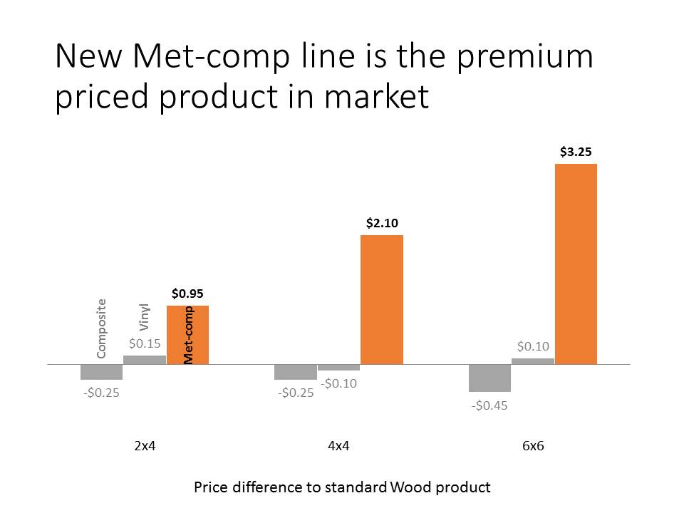
Now it is very apparent that our new product line is at a significant premium to not only the standard product, but also to the other competing products. The message now has more impact and the audience is clear on what we wanted to communicate.
The lesson for all presenters is that when your message is about the difference in values, take the visual to the next level and show just the difference. It may not work in all situations, but many times this will be a much more impactful message than just showing the values and making the audience do the math.

Dave Paradi has over twenty-two years of experience delivering customized training workshops to help business professionals improve their presentations. He has written ten books and over 600 articles on the topic of effective presentations and his ideas have appeared in publications around the world. His focus is on helping corporate professionals visually communicate the messages in their data so they don’t overwhelm and confuse executives. Dave is one of fewer than ten people in North America recognized by Microsoft with the Most Valuable Professional Award for his contributions to the Excel, PowerPoint, and Teams communities. His articles and videos on virtual presenting have been viewed over 4.8 million times and liked over 17,000 times on YouTube.