I think makeovers of slides or visuals is a great way to see what is possible in our own presentations. If we have never seen a visual used in a certain way before, we would never think of applying it to what we present. The makeovers that I use in my custom workshops are always the highlight of the day.
There are a couple of popular makeover challenges that the dataviz community uses each week or month to give people an opportunity to practice their skills and see what others came up with. Some are focused primarily on one tool and some are broader. One is a monthly challenge run by Cole Nussbaumer Knaflic of StorytellingWithData.com.
The September challenge asked readers to makeover a pair of pie charts that looks like it is a slide from a presentation (the challenge page is here). I rarely participate in these challenges but I thought this one offered some good reminders for business professionals when they are improving the visuals in their presentations.
When I initially looked at the challenge, I immediately thought of a clear slopegraph that showed the change in share for each region. Indeed, many of the submissions used this approach and I think it works well for the initial makeover.
But whenever we are improving how we show our data, whether it is operational data, financial data, marketing data, or any other data from our business, we need to look at what is behind the numbers. I went to the organization that the initial visual cites as the source for their data but could not find the data used for this original visual. It may be because it is for past years since I was able to easily find similar data for current time periods.
I always prefer to get the original data behind a visual so that I can see what insights the analysis can provide. One of the issues with the original visual is that it shows share of the total GDP contribution in each year but does not indicate the change in the total GDP value between the years. The share comes from raw values, and that is what I wanted to work with. The lesson for all presenters is to go back to the raw values to do your analysis, that is where you find the insights.
I used the values for direct GDP contribution here which could give a similar set of pie charts to the original visual but for the years 2017 to 2028E (estimated). Then I started to look at what messages would be important if I wanted to talk about the change between the two years. In analyzing the data, I decided on two messages.
First, there are clearly three regions that have much higher contribution to direct GDP than the other regions. They remain the top three in 2028E as well. I thought this was an important message. Second, I looked at the actual growth in direct GDP contribution in each of the regions. This calculation is only possible with the raw values. It would not be possible from the summarized pie chart data shown in the original visual. This analysis showed that three regions in Asia have much higher growth than the other regions. This became the second message.
Here is the slide I created.
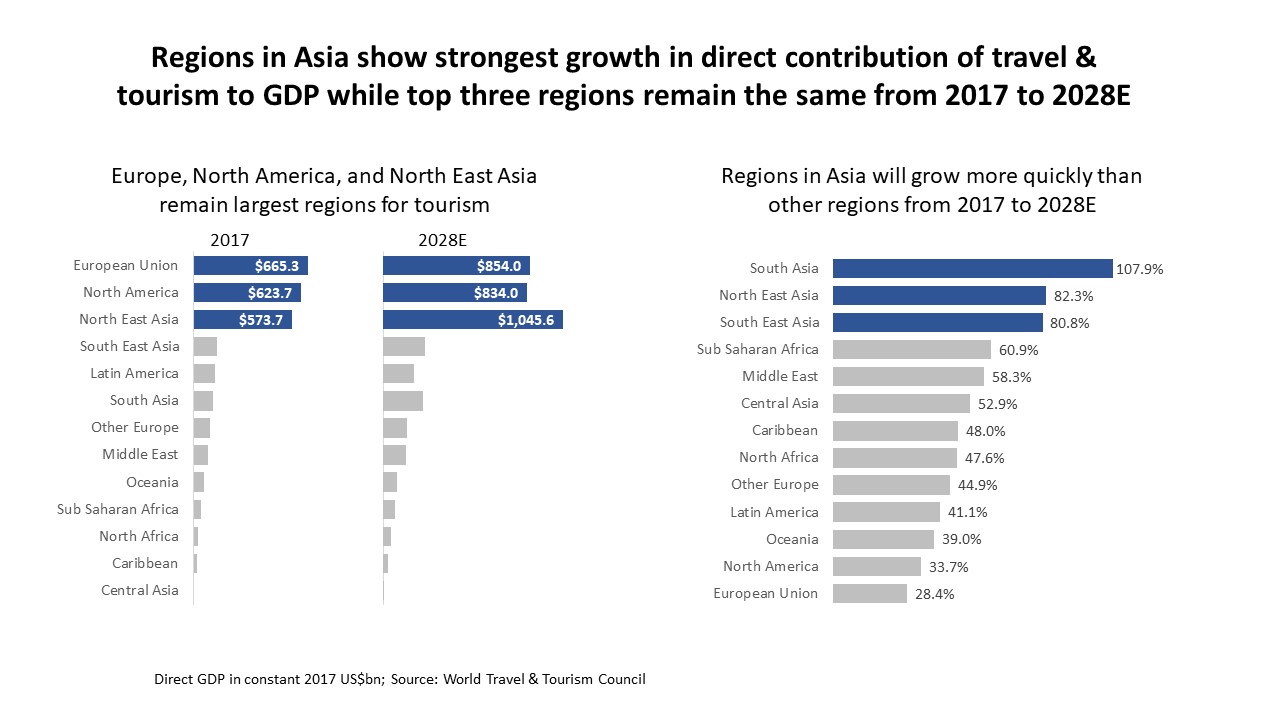
It starts with a headline that summarizes the key messages. Usually I would want only one message per slide, but sometimes the two messages are so tightly related that you need to keep them on one slide, which is what I decided here. This decision also required me to add headlines above each visual to make it clear to the audience what that graph was showing.
The graph on the left shows the actual direct GDP contribution of each of the regions in 2017 and 2028E. It is a small multiples bar chart created as a single graph to ensure all the bars lined up with each other. I used color to direct the attention to the top three regions and added data labels to only those three regions to reduce the clutter. The bars are ranked by 2017 direct contribution. The footnote gives the units as billions of US dollars.
The graph on the right shows the percentage change between 2017 and 2028E. It is ranked from highest to lowest percentage change. Again I used color to focus on the top three regions that have growth that is stronger than the other regions. All three of these regions are in Asia. I decided to add data labels to all of the bars so that the audience had the values as they related them to the two bars for each region in the left graph.
The reason I participated in this challenge was to reinforce two ideas. First, it is important to always go back to the raw data to do our analysis. Don’t just accept a summarized set of data because it may not show the insights that are valuable to the audience. This is especially important with data expressed in percentages since it does not give you a sense of the initial value. For example, the region with the highest growth is South Asia as shown in the right graph. If we then look to the left graph, we can see that South Asia starts with a small direct GDP contribution and even with this high growth rate is still not close to the top three regions when measured on actual GDP contribution. This is insight we can provide our audience only if we are working with the raw data.
Second, clear graphs make the point quickly. The bar charts I used here use headlines to summarize the message and color to focus the audience within the graph. The more you can make the message clear to your audience, the quicker they will understand the message you are communicating.
When you go back to improve a graph in your next presentation, keep these two ideas in mind.

Dave Paradi has over twenty-two years of experience delivering customized training workshops to help business professionals improve their presentations. He has written ten books and over 600 articles on the topic of effective presentations and his ideas have appeared in publications around the world. His focus is on helping corporate professionals visually communicate the messages in their data so they don’t overwhelm and confuse executives. Dave is one of fewer than ten people in North America recognized by Microsoft with the Most Valuable Professional Award for his contributions to the Excel, PowerPoint, and Teams communities. His articles and videos on virtual presenting have been viewed over 4.8 million times and liked over 17,000 times on YouTube.