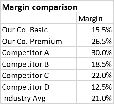
CPG sales, marketing, and product managers report on sales or margin for each product compared to the industry average. Because the reporting is driven from a database, often the table of numbers is copied onto a slide. This makeover shows how to visually show the comparison using a dashed line on a column graph.
Discussion of Original
Easy to create: Since this visual is simply a copy and paste from Excel or a web-based reporting tool into PowerPoint, it is easy to create. Just because it is easy to create doesn’t mean it is effectively communicating the key message.
Makes the audience figure out the message: This visual makes the audience find the industry average in the table and then go back and forth to compare each product margin to the average. This is risky as a presenter because each audience member may come to a different conclusion and not necessarily the one you were hoping them to see.
Discussion of Makeover
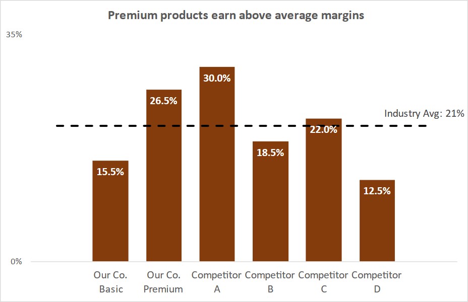
Dashed line on columns: The dashed line is part of the graph that is created in Excel. This is called a combo chart in Excel because it contains two types of graphs in one. One data series is a line graph and the other is a column graph. It is important that the line is part of the graph so it is always in the correct position when the graph is resized or moved.
Easy to see if value is above or below the standard: By having the dashed line on top of the columns it makes it easy for the viewer to quickly see which products have a margin higher than the average and which products have a margin lower than the average. The viewer does not have to go back and forth to figure it out which was required by the table.
Magnitude of difference easy to see: The graph makes it easy to see if the difference between the margin and the industry average is small or large without the viewer having to do any calculations in their head. This makes it more likely that they will see the key message you want them to act on.
All elements are data driven: Every element of the visual is driven from the data table in Excel, including the data labels and the position and text of the line for the average. This allows the graph to automatically update when the data changes, saving you time every month or quarter.
Video
This is a silent video (no audio) with slide timing bars at the bottom of the slides. Pause the video to spend more time on a slide.

Dave Paradi has over twenty-two years of experience delivering customized training workshops to help business professionals improve their presentations. He has written ten books and over 600 articles on the topic of effective presentations and his ideas have appeared in publications around the world. His focus is on helping corporate professionals visually communicate the messages in their data so they don’t overwhelm and confuse executives. Dave is one of fewer than ten people in North America recognized by Microsoft with the Most Valuable Professional Award for his contributions to the Excel, PowerPoint, and Teams communities. His articles and videos on virtual presenting have been viewed over 4.8 million times and liked over 17,000 times on YouTube.