CPG sales, marketing, and product managers regularly report on sales trends of a product compared to its competition. Because the reporting is driven from a database, often the table of numbers is copied onto a slide. This makeover shows how to visually show the sales trends using a panel line graph.
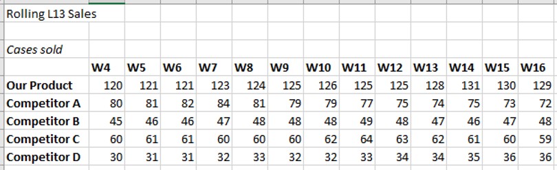
Discussion of original visual
Easy to create: Since this visual is simply a copy and paste from Excel or a web-based reporting tool into PowerPoint, it is easy to create. Just because it is easy to create doesn’t mean it is effectively communicating the key message.
Makes the audience figure out the message: This visual makes the audience figure out the trends and see patterns. This is risky as a presenter because each audience member may come to a different conclusion and not necessarily the one you were hoping them to see.
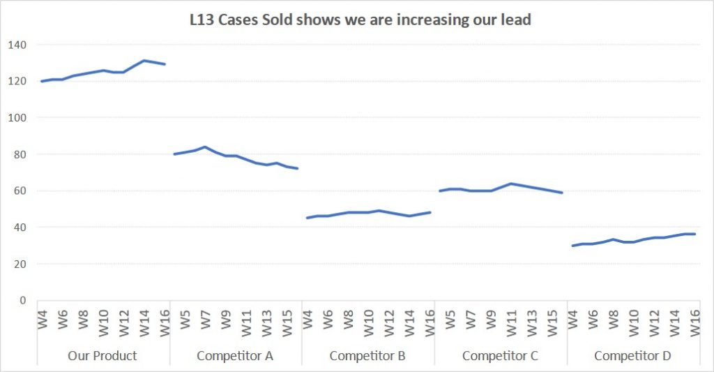
Discussion of Makeover
Panel of lines: This visual is referred to as a panel line graph because it has what appears to be multiple line graphs actually created as a single line graph in Excel. This keeps all of the graphs properly aligned so they can be compared.
Trends are easy to see: The best visual to use to show the trend in values is a line graph. This makeover demonstrates how easy it is for the viewer to see the trend. Light gridlines help the viewer to compare a trend against a known horizontal line.
Relative values are easy to see: Because all of the lines are on the same scale, it is easy to compare the relative values. If each line were a separate graph, Excel would determine the scale of the vertical axis for each graph and the graphs would not be comparable.
Video
This is a silent video (no audio) with slide timing bars at the bottom of the slides. Pause the video to spend more time on a slide.

Dave Paradi has over twenty-two years of experience delivering customized training workshops to help business professionals improve their presentations. He has written ten books and over 600 articles on the topic of effective presentations and his ideas have appeared in publications around the world. His focus is on helping corporate professionals visually communicate the messages in their data so they don’t overwhelm and confuse executives. Dave is one of fewer than ten people in North America recognized by Microsoft with the Most Valuable Professional Award for his contributions to the Excel, PowerPoint, and Teams communities. His articles and videos on virtual presenting have been viewed over 4.8 million times and liked over 17,000 times on YouTube.