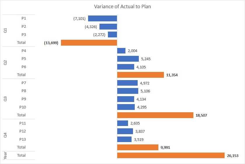
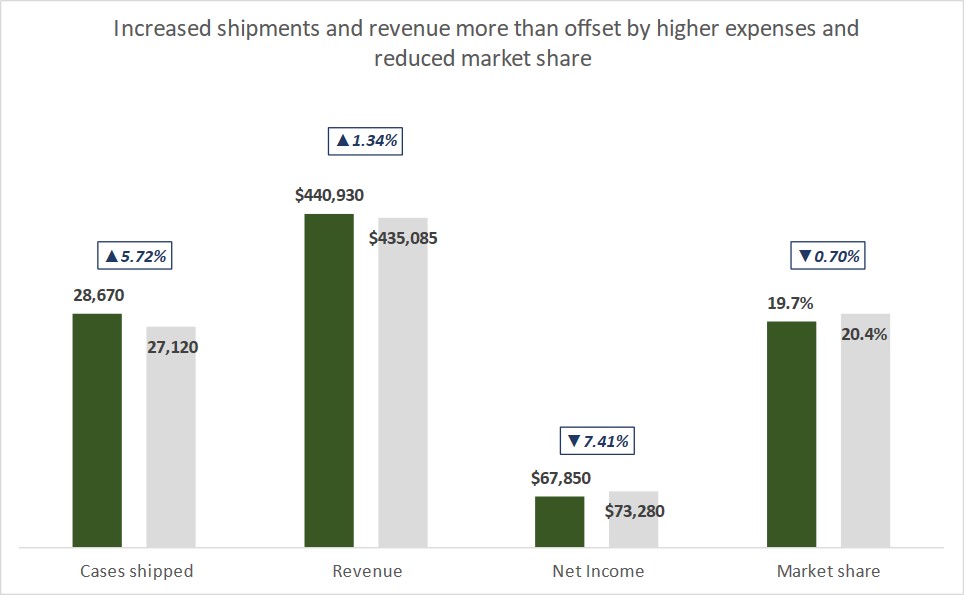
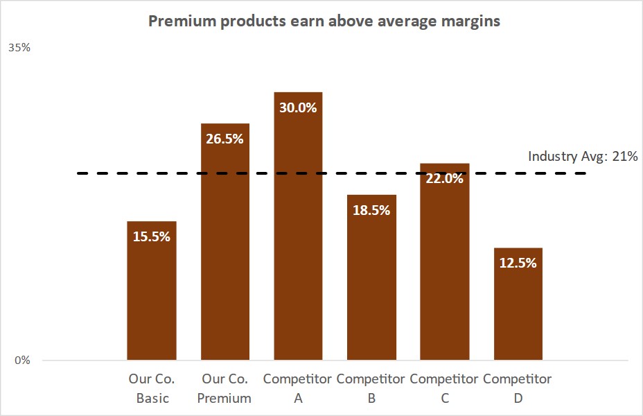
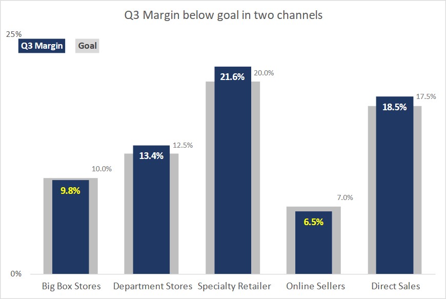
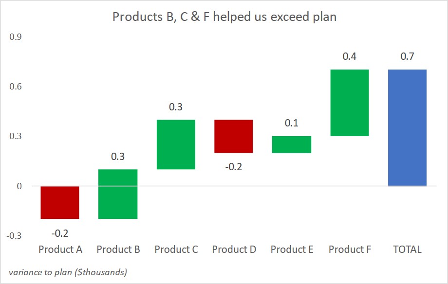
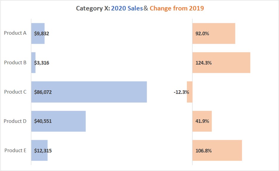
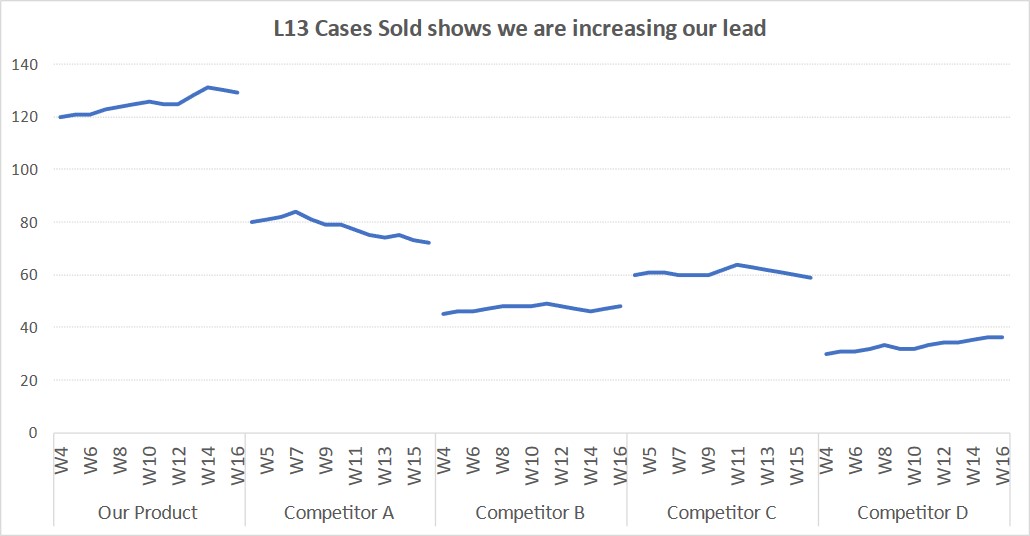
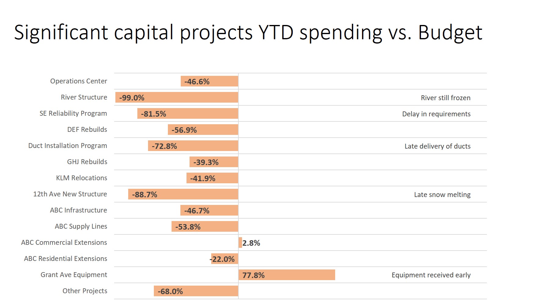
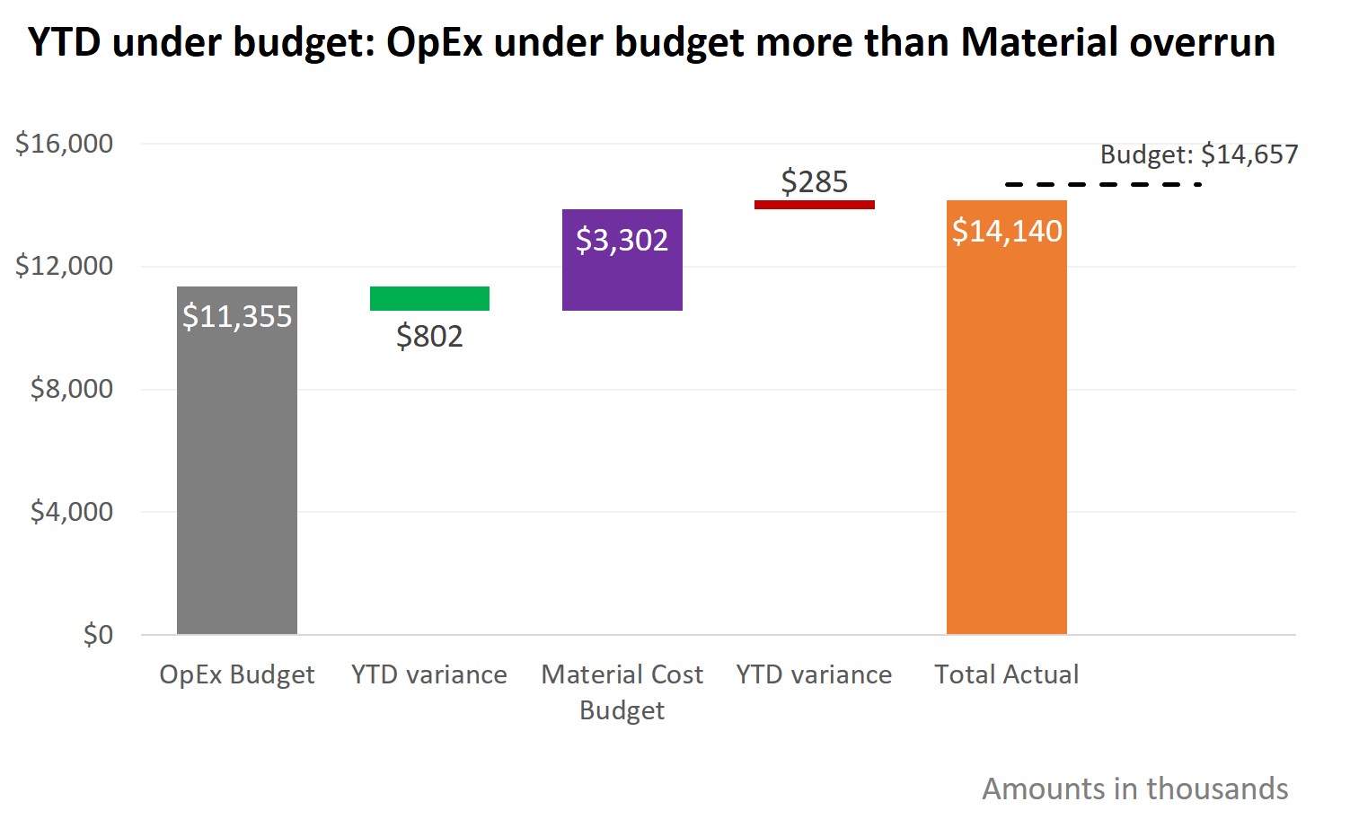
Slide Makeover Video
Podcasts These slide makeover videos show presenters who use PowerPoint or Keynote how to transform overloaded text slides into persuasive visuals that effectively sell ideas, products and services to decision-makers. The videos apply the five-step KWICK method from the book "The Visual Slide Revolution" to create slides that encourage the presenter to have a conversation instead of reading bullet paragraphs to the audience. A new video is posted every second Tuesday. Subscribe through iTunes by clicking here. Add to your podcatcher via this URL: http://www.thinkoutsidetheslide.com/podcasts/slidemakeovers.rss You can also watch and subscribe on YouTube at www.youtube.com/ThinkOutsideTheSlide March 2, 2010 - Issue #46 Description: When replacing text with a visual, don't make the mistake of thinking that you need a fancy or complex visual. This makeover shows that a simple visual combined with a good headline is much easier to create than trying to design a more complex visual; and it is more effective. Click here to watch the video (opens in a new browser window in Quicktime format) February 16, 2010 - Issue #45 Description: Far too many slides are, in reality, notes for the speaker to remember what they are supposed to say. The slides end up being read to the audience. This makeover takes a wordy slide and the accompanying speaking notes and shows how the clues hidden in the text can lead to a more effective visual. Click here to watch the video (opens in a new browser window in Quicktime format) February 2, 2010 - Issue #44 Description: In too many training and teaching presentations, the definitions of key terms are read verbatim from text on the slides. This makeover shows that defintions can be interesting if you connect with the audience and leave them with a definition they will remember. Click here to watch the video (opens in a new browser window in Quicktime format) January 19, 2010 - Issue #43 Description: If you present a long text list on a slide, it overwhelms the audience and they tune out. Use the ideas in this makeover to find a visual that connects and illustrates the point you want to make. Click here to watch the video (opens in a new browser window in Quicktime format) January 5, 2010 - Issue #42 Description: Too often presenters lose the audience when presenting a comparison at two points in time. This makeover shows how to visually present the comparison in a way that is easy for the audience to understand. Click here to watch the video (opens in a new browser window in Quicktime format) December 8, 2009 Description: When comparing financial figures between two periods, one of the common messages we need to communicate is what makes up the difference between the two figures. Instead of just pasting an Excel sheet on your slide, use the ideas in this makeover to break down the difference visually and make each component clear to your audience. Click here to watch the video (opens in a new browser window in Quicktime format) November 24, 2009 Description: Financial or operational analysis often includes reporting on what the outcome would be under different scenarios. Instead of listing each individual scenario in a table from Excel, use the ideas in this makeover to show the results visually. Click here to watch the video (opens in a new browser window in Quicktime format) November 10, 2009 Description: Presenting tests or measurements usually includes talking about how often the testing is done and what tests were performed. Don't use bullet filled slides, use the ideas in this makeover to organize the information visually so it is clear for your audience. Click here to watch the video (opens in a new browser window in Quicktime format) October 27, 2009 Description: When we get graphs as graphics from other sources, we think there is nothing we can do with them. This makeover shows how to take a graph image and make it more effective using tools in PowerPoint. Click here to watch the video (opens in a new browser window in Quicktime format) October 13, 2009 Description: As presenters, we regularly need to show our audiences how to fill out forms. In this makeover, a text slide is transformed by showing visuals that explain where to find the form and how to correctly complete it. Click here to watch the video (opens in a new browser window in Quicktime format) September 29, 2009 Description: Presenters struggle with graphs that are cluttered with too much information that takes away from the data being shown. This makeover shows how to clean up a graph to make it clear for the audience. Click here to watch the video (opens in a new browser window in Quicktime format) September 15, 2009 Description: When different factors add up to an overall financial change, many presenters use a stacked column graph with a legend. This makeover shows how to create a better visual that makes each change clear and easy to understand. Click here to watch the video (opens in a new browser window in Quicktime format) September 1, 2009 Description: Instead of writing paragraphs to explain each role in a situation or organization, use the ideas in this makeover to create a visual that the audience can easily follow. Click here to watch the video (opens in a new browser window in Quicktime format) August 18, 2009 Description: If you have to explain the calculations you did or methodology used to create your results, don't use paragraphs on the slide. Instead, like this makeover shows, illustrate the methods using a simple approach and examples. Click here to watch the video (opens in a new browser window in Quicktime format) August 4, 2009 Description: When you want to show numeric values that have moved between two tests or time periods, don't use a copied Excel table on your slide. This makeover shows how to use a visual with appropriate movement animation to illustrate the results. Click here to watch the video (opens in a new browser window in Quicktime format) July 22, 2009 Description: When you compare measured values to an average or standard, make sure that the chart delivers the correct message. This makeover transforms a column chart that is easily misinterpreted and makes it clear for the audience. Click here to watch the video (opens in a new browser window in Quicktime format) July 7, 2009 Description: Analogies are a great way to help your audience put your point in context because it relates your point to something they are familiar with. This makeover transforms a text bullet point into a visual analogy that makes the point much clearer. Click here to watch the video (opens in a new browser window in Quicktime format) June 23, 2009 Description: Sometimes you are restricted in the number of slides you can use and may need to put more than one idea on a slide. This makeover shows how to put two related ideas on a slide using persuasive visuals. Click here to watch the video (opens in a new browser window in Quicktime format) June 9, 2009 Description: Often presentations need to include statistics. When those statistics are about people, consider showing pictures of people instead of just quoting the text and numbers. It helps the audience connect with what the statistic means to them. Click here to watch the video (opens in a new browser window in Quicktime format) May 26, 2009 Description: When showing financial and operational performance against targets, it is common to use a table of figures. This makeover shows how to transform one of the measurements into a graph that effectively communicates to the audience that planned performance is within an acceptable range. Click here to watch the video (opens in a new browser window in Quicktime format) May 12, 2009 Description: A common bullet point list is transformed by focusing on how to give the audience context and help them understand the information. It is not necessary to eliminate all text, but restructuring it often increases the effectiveness. Click here to watch the video (opens in a new browser window in Quicktime format) April 28, 2009 Description: When someone showed a way to make survey statistics more visual, they made a few key errors. This makeover shows the correct visual for survey results so the audience understands them and trusts them. Click here to watch the video (opens in a new browser window in Quicktime format) April 14, 2009 Description: When we present a proportion or share statistic, I would usually suggest using a pie chart. This makeover shows how a diagram with universal symbols can sometimes be more powerful than a pie chart in helping the audience understand the message. Click here to watch the video (opens in a new browser window in Quicktime format) March 31, 2009 Description: Seth Godin and PC World describe this slide as one of the worst PowerPoint slides ever. The complex diagram makes it impossible to understand what the message is. This makeover shows a better way to present complex diagrams so the audience understands the ideas. Click here to watch the video (opens in a new browser window in Quicktime format) March 17, 2009 Description: Any time you need to use a second slide as a (continued) slide for a list of information, it is time to rethink the way you are presenting the list. This makeover shows a list spanning four slides transformed so that the audience has context and can better understand the information. Click here to watch the video (opens in a new browser window in Quicktime format) March 3, 2009 Description: Analogies are a good way to help the audience understand your point. But if the analogy is unclear, it hinders instead of helps. This makeover shows a more visual way to use an analogy to make the point more effectively. Click here to watch the video (opens in a new browser window in Quicktime format) February 17, 2009 Description: When explaining a technique, it is better to show than to tell. This makeover, supplied by a reader of "The Visual Slide Revolution", shows how he transformed a simple, mostly text explanation, into a visual that makes the technique crystal clear to the audience. Click here to watch the video (opens in a new browser window in Quicktime format) February 3, 2009 Description: If you are showing a process that repeats on a regular basis, make sure that it is clear for the audience. This makeover shows a slide that tries to explain a cyclical process but doesn't succeed as well as it could. The new slide tells the story clearly and is easier to understand. Click here to watch the video (opens in a new browser window in Quicktime format) January 20, 2009 Description: On a monthly, quarterly or annual basis many people report their activity to the boss, a committee or stakeholders. This makeover shows a different way to look at an activity list slide. It shows how to transform it into a slide that tells a story and is more meaningful to the audience. Click here to watch the video (opens in a new browser window in Quicktime format) January 6, 2009 Description: Often the design of our slides actually promotes too much text and leads to reading the slides. This makeover shows a slide design that led to a slide full of text. It is transformed into a visual that is more effective and leads to action after the presentation. Click here to watch the video (opens in a new browser window in Quicktime format) December 16, 2008 Description: When you are talking about date based events or information, don't use a simple list of the dates with no visual. This makeover shows a slide with a list of dates transformed into a clear visual that people will be able to understand and act on after the presentation. Click here to watch the video (opens in a new browser window in Quicktime format) December 2, 2008 Description: When you are showing changes over a time period, avoid confusing the audience with an overloaded visual. This makeover shows a slide with a confusing diagram transformed into a series of clear visuals that people will be able to understand and act on after the presentation. Click here to watch the video (opens in a new browser window in Quicktime format) November 18, 2008 Description: When you are presenting a calculation and how changes will affect it, make sure you do it so that the information is clearly understood. This makeover shows a slide with a confusing calculation transformed into a clear visual that people will be able to understand and act on after the presentation. Click here to watch the video (opens in a new browser window in Quicktime format) November 4, 2008 Description: Legal topics can be dry and boring if presented using slides that simply contain the words from a document. This makeover shows a slide full of legal text transformed into a clear visual that people will be able to understand and act on after the presentation. Click here to watch the video (opens in a new browser window in Quicktime format) October 21, 2008 Description: When you are describing a real-life situation or issue, too often the slides are simply words describing the idea and the slides become a transcript of what we would say. This makeover shows a slide full of descriptive text transformed into a clear visual that people will be able to understand and act on after the presentation. Click here to watch the video (opens in a new browser window in Quicktime format) October 7, 2008 Description: When you are presenting data, too often the slides become heavy with text and numbers and become hard to understand for the audience. This makeover shows a slide that confuses the audience transformed into a clear visual that people will be able to understand and act on after the presentation. Click here to watch the video (opens in a new browser window in Quicktime format) September 23, 2008 Description: Whether you are comparing two positions, results at two points in time or two concepts, your audience needs to be able to keep context to understand the differences. This makeover shows two slides that lose the audience transformed into a clear visual that people will be able to remember and act on after the presentation. Click here to watch the video (opens in a new browser window in Quicktime format) September 9, 2008 Description: If you have to use a screen capture to show a feature of a program or highlight a section of a web site, make sure your audience can understand what you are showing. This makeover shows a hard-to-read screen capture transformed into a clear visual that people will be able to remember and act on after the presentation. Click here to watch the video (opens in a new browser window in Quicktime format) August 26, 2008 Description: When presenting numbers that were calculated in Excel, don't just copy and paste part of your spreadsheet. This makeover shows a table of numbers transformed into a concise summary of the key issues that decision makers need to know. Click here to watch the video (opens in a new browser window in Quicktime format) August 12, 2008 Description: Just adding a visual to your slides is not enough - it must have context so the audience can understand it. This makeover shows a visual and how it can be recreated to have a much better impact on the audience. Click here to watch the video (opens in a new browser window in Quicktime format) July 29, 2008 Description: In many training situations, too much text is put on the slide. The reason is that the audience will need to refer to it later. This makeover transforms an overloaded slide into a visual slide and gives a technique for including detail in a PowerPoint file & handout without showing it on the screen. Click here to watch the video (opens in a new browser window in Quicktime format) July 15, 2008 Description: A commonly used slide, the "About Us" slide, is transformed into a series of slides that show the the audience why they should care about all these facts and makes the impact you want. Click here to watch the video (opens in a new browser window in Quicktime format) July 1, 2008 Description: A slide with a paragraph of a policy out of a manual is transformed into a series of slides that focuses the audience and makes the information easier to understand. Click here to watch the video (opens in a new browser window in Quicktime format) June 17, 2008 Description: A slide with few simple text phrases used in Toastmasters leadership training is transformed into a visual slide that connects with the audience. Click here to watch the video (opens in a new browser window in Quicktime format) June 3, 2008 Description: A slide with tons of data from a survey is transformed into a series of visuals that communicate clearly to decision-makers. Click here to watch the video (opens in a new browser window in Quicktime format) May 20, 2008 Description: A text loaded slide with multiple messages is transformed into multiple visuals that lead to a clear conclusion for decision-makers. Click here to watch the video (opens in a new browser window in Quicktime format) |