FinancialViz: waterfall chart using rectangles instead of Excel introduces doubt
When things don’t add up in a data visual used in a financial presentation it introduces doubt in the mind of the viewer. If this visual is not correct, what else may not be correct? When presenting financials we want to inspire confidence. It is important to ensure that the visuals we create are accurate.… Continue reading FinancialViz: waterfall chart using rectangles instead of Excel introduces doubt
AFP Article June 6 2022
The Association for Financial Professionals (AFP) published an article showing some of the makeovers of data heavy slides that were recently featured in a webinar I was a part of. You can see the before and after slides in the article here. The makeovers I submitted are #1, 2, 3, and 5.
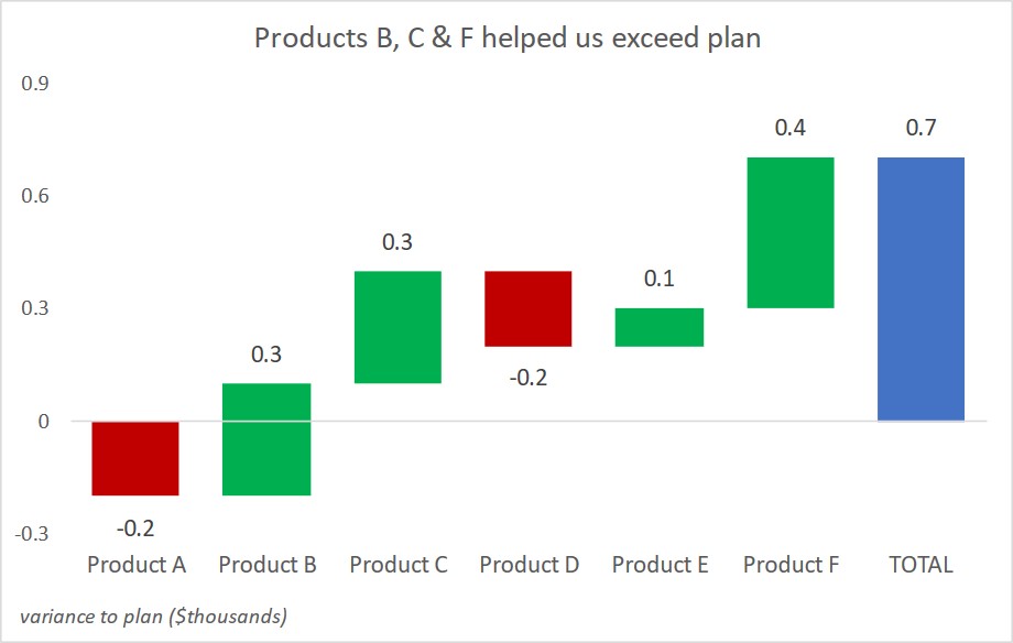
Showing variance to plan; Slide Makeover #99
CPG sales, marketing, and product managers report on variance to a previous plan for product sales in a category. Because the reporting is driven from a database, often the table of numbers is copied onto a slide. This makeover shows how to visually show the variance using a steps to a total graph. Discussion of… Continue reading Showing variance to plan; Slide Makeover #99
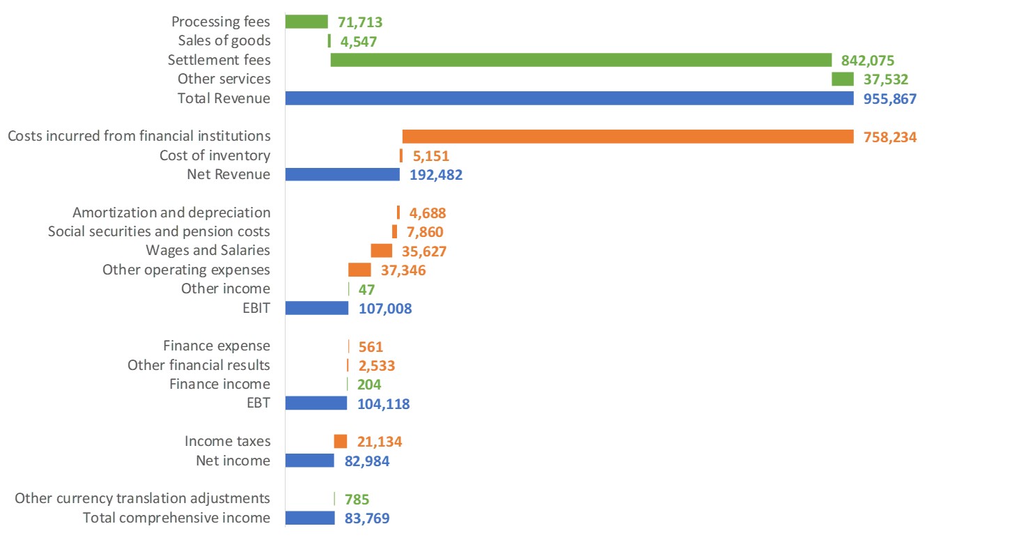
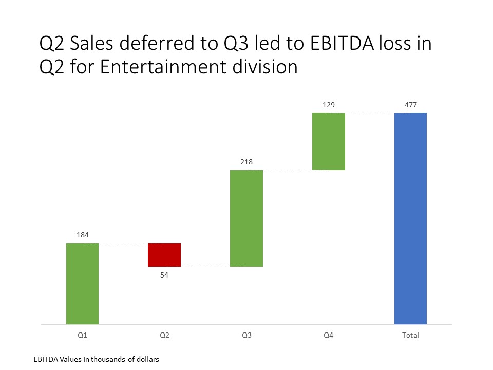
Visualizing Net Income from Inflows and Outflows; Issue #443 July 9 2019
Via Twitter I came across an interesting visual created by Nadieh Bremer to show the inflows and outflows that resulted in the Net income for an organization in their annual report. Here is the visual, used with Nadieh’s permission from her article. Here are some of the things I really like about it. It visually… Continue reading Visualizing Net Income from Inflows and Outflows; Issue #443 July 9 2019
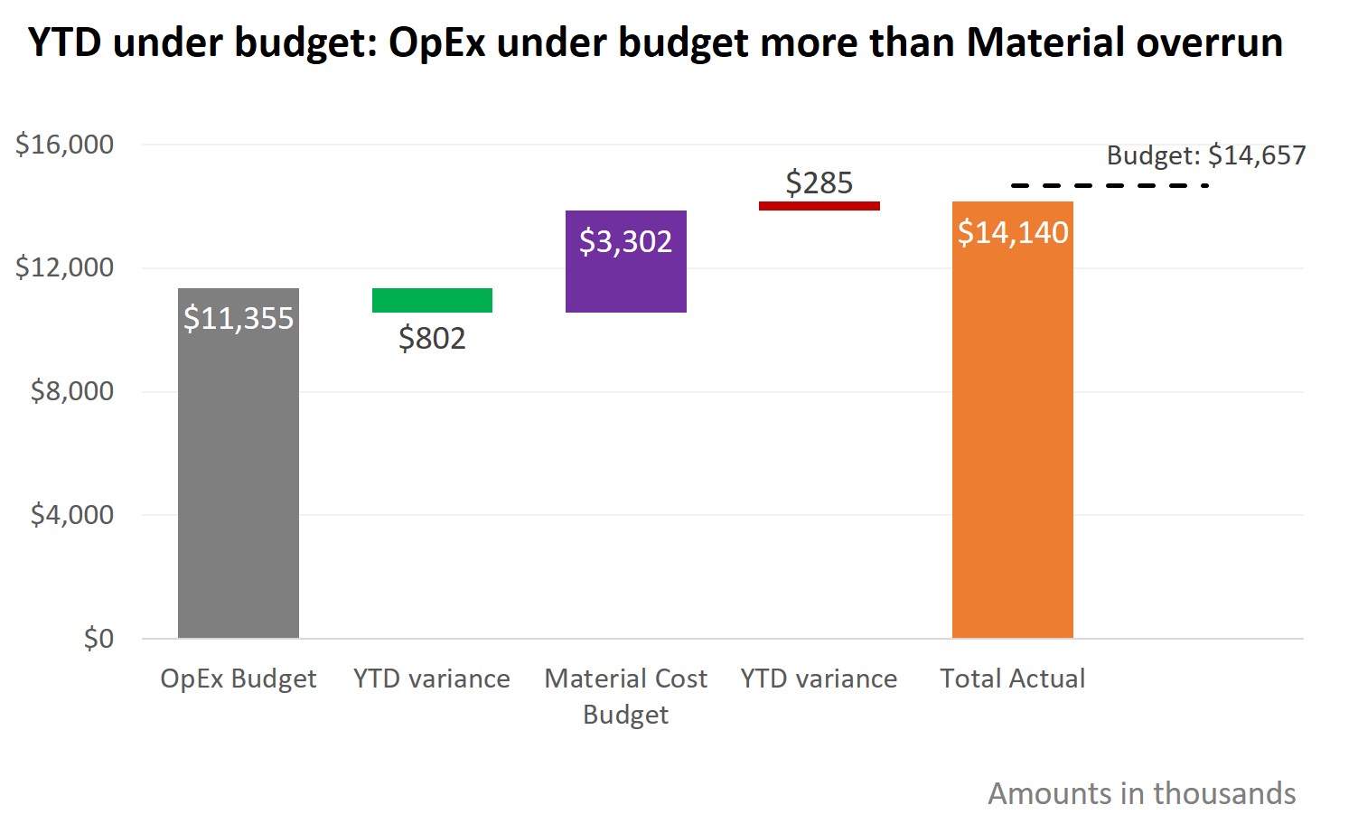
Showing component and total variance to budget; Slide Makeover #94
To explain the overall variance to the budget, we often look at the variances in each area. Too often the budget and variance amounts are shown in a table that the audience must interpret. This makeover demonstrates how you can use a steps to a total graph to show how each budgeted amount and variance… Continue reading Showing component and total variance to budget; Slide Makeover #94
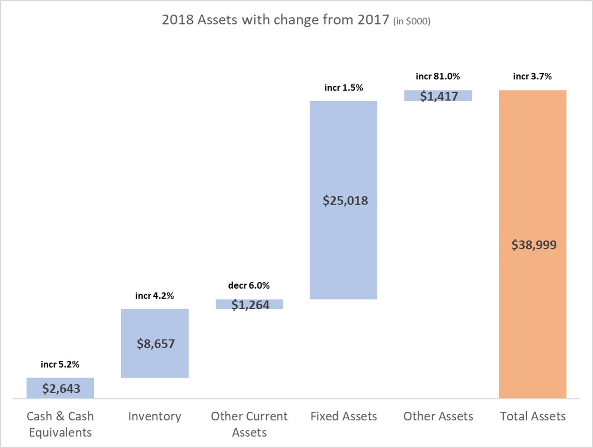
Presenting the Balance Sheet: Visually show Assets (or Liabilities) with YoY change
Today you will learn a great visual to use when presenting Assets or Liabilities from the Balance Sheet. Too often Balance Sheet presentations to executives or the Board are filled with spreadsheets. In my surveys of audiences they tell me that large tables of numbers are confusing and overwhelming. Our audiences want meaningful visuals instead… Continue reading Presenting the Balance Sheet: Visually show Assets (or Liabilities) with YoY change
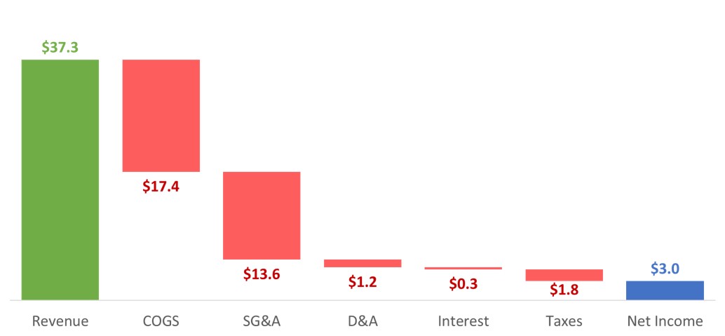
Presenting the income or P&L statement: Show how revenue less expenses results in net income
You’ve analyzed the income and expenses and need to communicate important findings to the executives or Board. If you want to show how the revenue and expenses lead to the net income for the time period, this video shows how to use a waterfall graph to allow the viewers to quickly walk through the components… Continue reading Presenting the income or P&L statement: Show how revenue less expenses results in net income
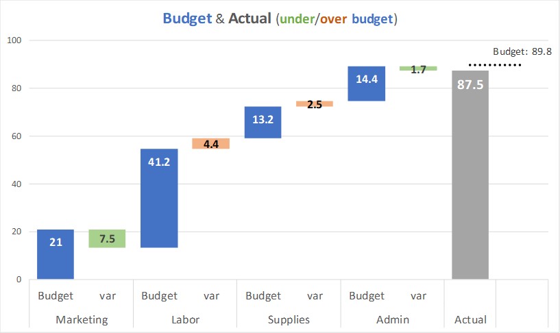
Presenting the income or P&L statement: Show Budget and variance walk of expense categories
You have looked at the difference between the actual and budget expenses in the different expense categories. You want to communicate the variances visually. This video shows how to use a steps to a total column graph to show the actual expenses and variance in each category and how they add to the total expense… Continue reading Presenting the income or P&L statement: Show Budget and variance walk of expense categories
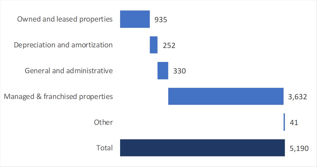
Presenting the income or P&L statement: Show components that make up the total expenses
You’ve analyzed the income and expenses and need to communicate important findings to the executives or Board. If you want to show the components that make up the total expenses for the time period, this video shows how to use a steps to a total bar chart to allow the viewers to quickly see which… Continue reading Presenting the income or P&L statement: Show components that make up the total expenses
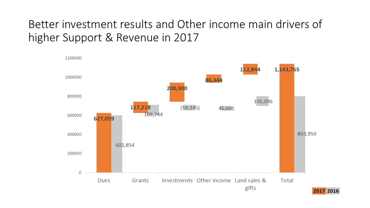
Comparing Revenue components to previous year; Slide Makeover #91
Use a “steps to a total” graph instead of a spreadsheet to explain the components of total revenue
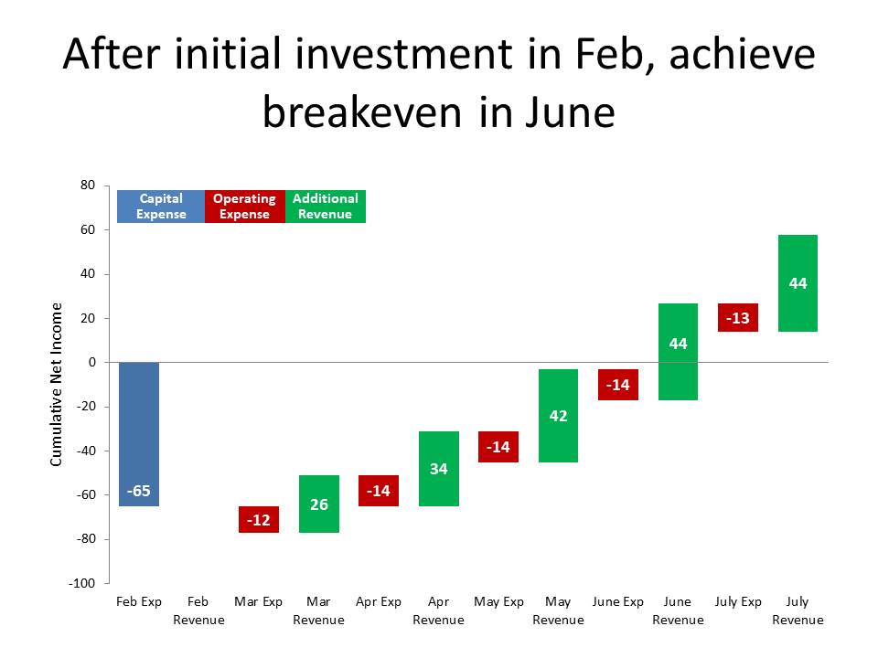
Showing breakeven analysis; Slide Makeover #89
Show the breakeven analysis on an investment visually instead of a spreadsheet or table of numbers.
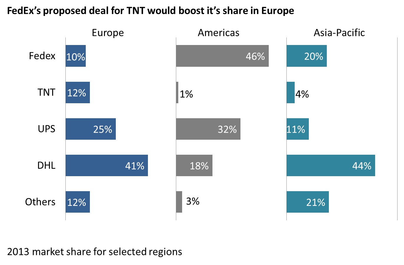
Replace stacked column graphs; Issue #393 July 11, 2017
Focus the audience on the comparison of the values in the important segments in a stacked column graph
Showing the components that add up to a total; Slide Makeover #87
Use a Steps to a Total graph to visually show components instead of a spreadsheet.
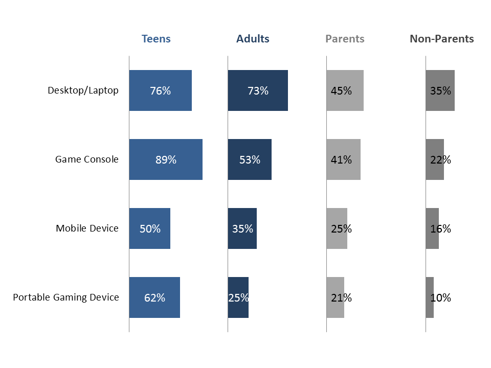
Makeover Monday Challenge February 15 2016
Compare the same measurement categories across different groups visually
Small multiples makeover April 8, 2015
Compare multiple data series across multiple categories using small multiple bar graphs
Shifting breakdown of segments totalling 100%; Slide Makeover #80
Use a diverging stacked bar chart to make the changes in two groups of segments easier for the audience to understand