When things don’t add up in a data visual used in a financial presentation it introduces doubt in the mind of the viewer. If this visual is not correct, what else may not be correct? When presenting financials we want to inspire confidence. It is important to ensure that the visuals we create are accurate.
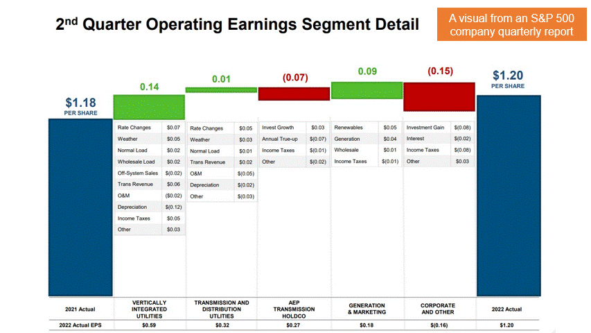
Here’s an example from the quarterly report from an S&P 500 company.
Visuals can be inaccurate for a number of reasons. Some of the common ones I see often are:
- A typo in entering values when creating the visual
- Visuals created using PowerPoint or other design software where the dimensions of a shape are not tied to the data (this is what I think happened in the example above)
- Not knowing how to create the visual properly so things are fudged with shapes and text boxes
How do you make sure the visuals you create tell an accurate story? Here are some suggestions to address the above issues:
- Use cell references or copy cells instead of re-typing values to reduce the risk of typos creating inaccurate visuals
- Use the right tool, Excel, to create data-based visuals
- Learn how to use Excel to create meaningful and accurate visuals that are data driven
If your team wants to learn how to use Excel to create visuals that inspire confidence in your analysis and reports, check out my live customized FinancialViz training courses that are delivered virtually so staff can attend wherever they are located. Go to www.FinancialViz.com to learn more.

Dave Paradi has over twenty-two years of experience delivering customized training workshops to help business professionals improve their presentations. He has written ten books and over 600 articles on the topic of effective presentations and his ideas have appeared in publications around the world. His focus is on helping corporate professionals visually communicate the messages in their data so they don’t overwhelm and confuse executives. Dave is one of fewer than ten people in North America recognized by Microsoft with the Most Valuable Professional Award for his contributions to the Excel, PowerPoint, and Teams communities. His articles and videos on virtual presenting have been viewed over 4.8 million times and liked over 17,000 times on YouTube.