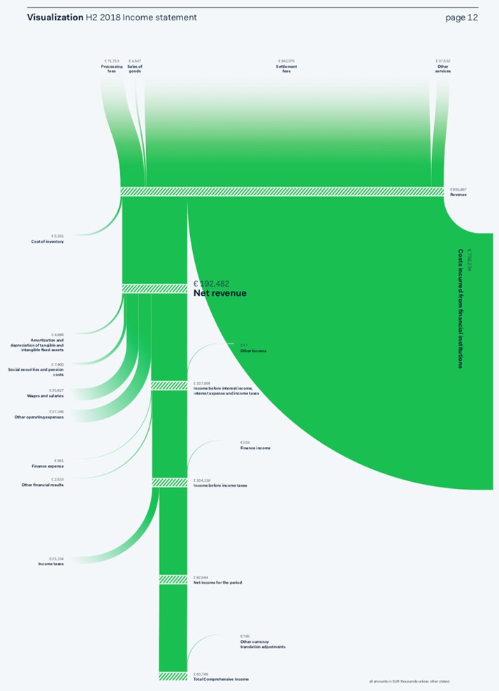
Via Twitter I came across an interesting visual created by Nadieh Bremer to show the inflows and outflows that resulted in the Net income for an organization in their annual report. Here is the visual, used with Nadieh’s permission from her article.
Here are some of the things I really like about it.
- It visually shows the inflows and outflows. The inflows are revenue items at the top and other income items that are counted in subsequent stages shown as flows in from the right side of the remaining flow line.
- The width of the flow line that continues down the page shows the remaining value relative to the total width of the flow line at the start.
- The intermediary totals, such as EBIT, are visible because they have a diagonal pattern added on top of the flow line.
- Each inflow or outflow is labelled and the value shown, which allows the viewer to get the details if they need to.
- In the article you read that Nadieh prepared these visuals in advance with the values from the previous year and designed it so that when the current values were available, she could update the numbers and the visual would automatically update. This is so important for visuals that need to be regularly updated.
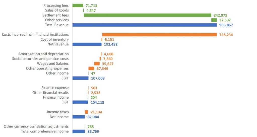
Nadieh used JavaScript and d3.js programming to create the visual. I was inspired by her visual and looked to create a visual in Excel that would capture what I liked about it. I knew I could not create a flow visual, but I decided on a bar chart that could show the progression from the different revenue streams at the top to the final income figure at the bottom. Here is the visual I created.
Here’s how I incorporated the different aspects I liked in Nadieh’s original visual:
- I used colors to show inflows (green), outflows (orange), and intermediary totals (blue). The inflows move from left to right and the outflows right to left. As in the original, some of the inflows happen in later stages of the income calculation.
- I used a single graph for all the bars so that the scale was accurate and bars further down could still be compared to the bars at the top because every bar has the same scale.
- Each of the inflows, outflows, and intermediary totals are identified and the value shown so that viewers can see the details if needed.
- The chart is developed using formulas that organize the data into the three categories (inflows, outflows, and intermediary totals) so that when the data is updated, the bars and labels in the graph automatically update.
I am thankful that Nadieh allowed me to use her visual in this article. When I find visuals from the world of finance and business that are clear and communicate effectively, I like to see how we can use Excel, a tool we all have, to create a visual that can be clear and effective.
Here are some key lessons to take away from this exercise:
- Use direction and color to indicate meaning
- Make sure values are scaled correctly so they can be visually compared
- Add explanatory text when needed
- Build charts so that they can be easily updated later
I also created a short video explaining the ideas in this article if you prefer to watch my analysis and explanation.
If you want to learn more about building presentation-ready charts that are easy to update and re-use, register for my free online mini-course here. If you want to learn the expert-level skills to build these visuals, check out my Excel Chart Skills 501 online course.

Dave Paradi has over twenty-two years of experience delivering customized training workshops to help business professionals improve their presentations. He has written ten books and over 600 articles on the topic of effective presentations and his ideas have appeared in publications around the world. His focus is on helping corporate professionals visually communicate the messages in their data so they don’t overwhelm and confuse executives. Dave is one of fewer than ten people in North America recognized by Microsoft with the Most Valuable Professional Award for his contributions to the Excel, PowerPoint, and Teams communities. His articles and videos on virtual presenting have been viewed over 4.8 million times and liked over 17,000 times on YouTube.