FinancialViz Makeover: Table of metrics to 3 visuals based on the message for each metric
This makeover is based on a recent example from a session I delivered at a conference in Philadelphia. I commonly see tables of related metrics in the slides from the participants in my FinancialViz training courses. In this video I show you how to turn the table into 3 visuals, each one based on the… Continue reading FinancialViz Makeover: Table of metrics to 3 visuals based on the message for each metric
AFP Article June 6 2022
The Association for Financial Professionals (AFP) published an article showing some of the makeovers of data heavy slides that were recently featured in a webinar I was a part of. You can see the before and after slides in the article here. The makeovers I submitted are #1, 2, 3, and 5.
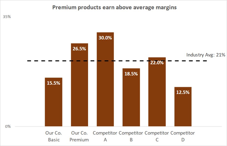
Comparing values to a standard; Slide Makeover #101
CPG sales, marketing, and product managers report on sales or margin for each product compared to the industry average. Because the reporting is driven from a database, often the table of numbers is copied onto a slide. This makeover shows how to visually show the comparison using a dashed line on a column graph. Discussion… Continue reading Comparing values to a standard; Slide Makeover #101
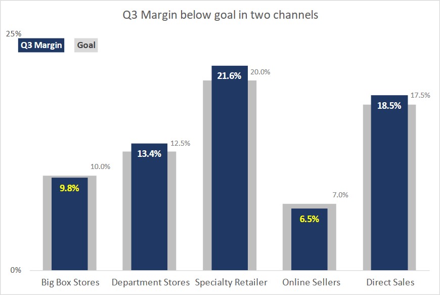
Comparing results to goals; Slide Makeover #100
CPG sales, marketing, and product managers report on sales or margin in each channel compared to the goal for that channel. Because the reporting is driven from a database, often the table of numbers is copied onto a slide. This makeover shows how to visually show the comparison using a multiple-width overlapping column graph. Discussion… Continue reading Comparing results to goals; Slide Makeover #100
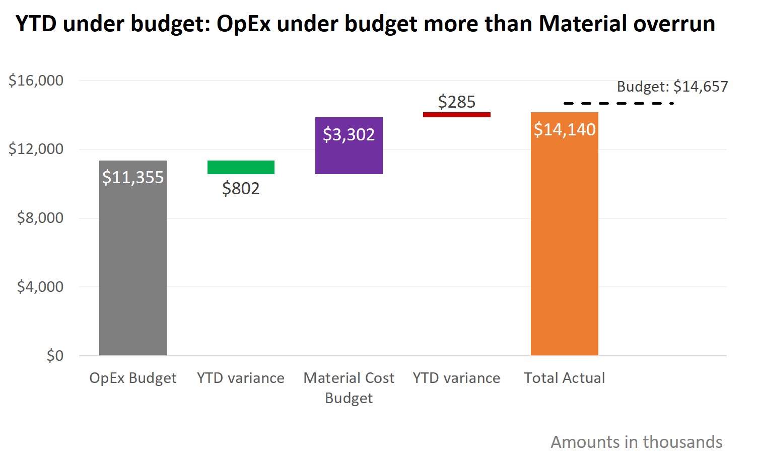
Showing component and total variance to budget; Slide Makeover #94
To explain the overall variance to the budget, we often look at the variances in each area. Too often the budget and variance amounts are shown in a table that the audience must interpret. This makeover demonstrates how you can use a steps to a total graph to show how each budgeted amount and variance… Continue reading Showing component and total variance to budget; Slide Makeover #94

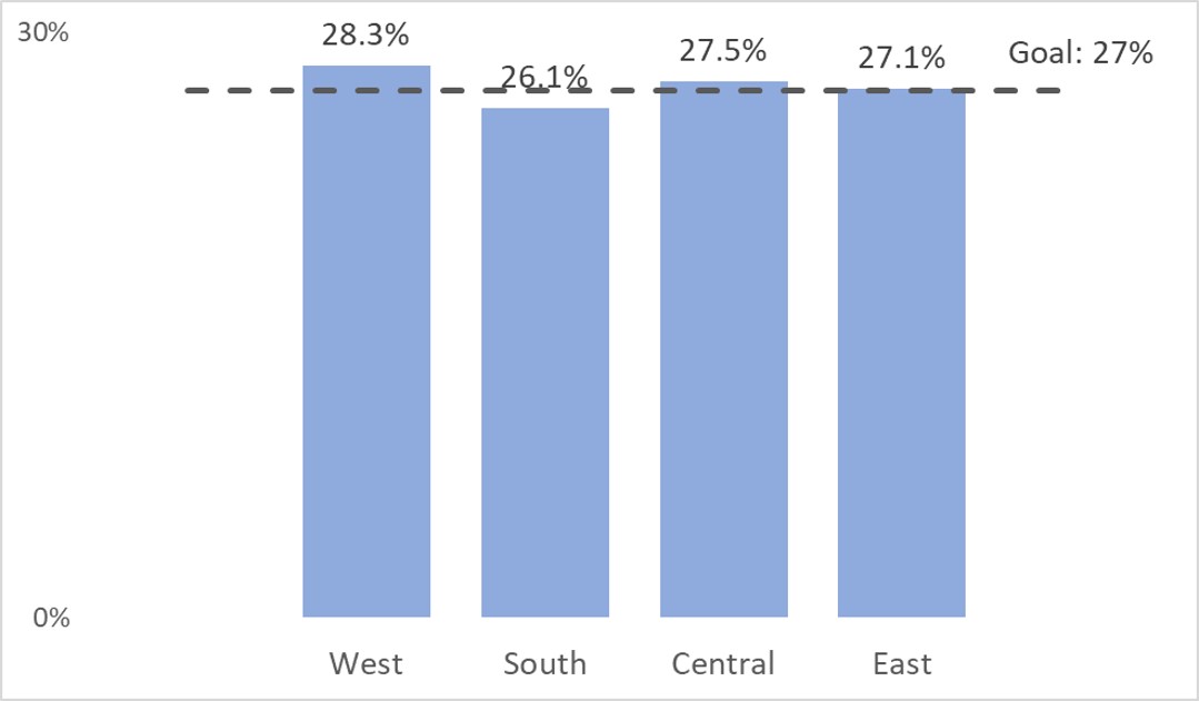
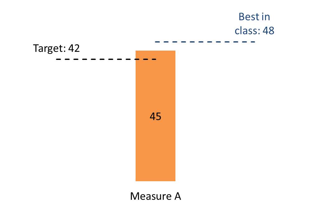
Comparing only one value to a standard; Issue #432 February 5 2019
When you want to compare values to a standard, such as comparing output in various production plants to the goal, a dashed line on a column graph is a good visual to use. The dashed line runs across the graph and it is easy to see if each column is above or below the goal.… Continue reading Comparing only one value to a standard; Issue #432 February 5 2019
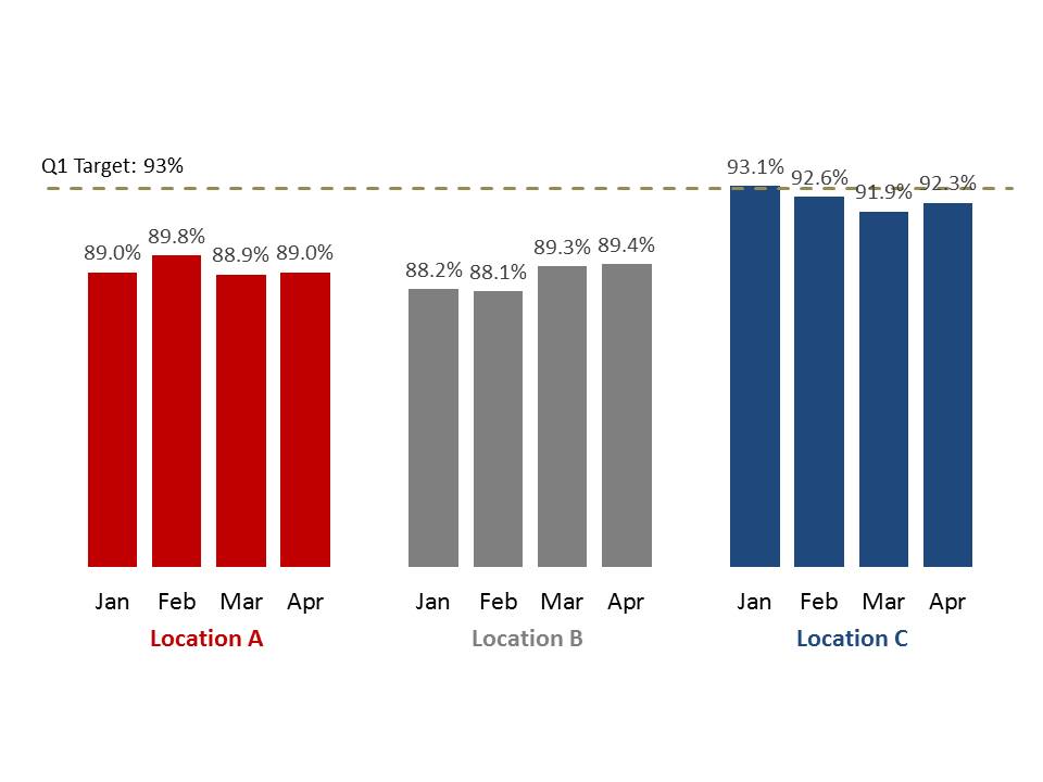
Presenting the income or P&L statement: Compare values to a common goal
You’ve analyzed the income and expenses and need to communicate important findings to the executives or Board. If you want to show how different regions, offices, etc. compare to the single goal set for all of them, this video shows you how to use a dashed line on a column chart to allow the viewers… Continue reading Presenting the income or P&L statement: Compare values to a common goal
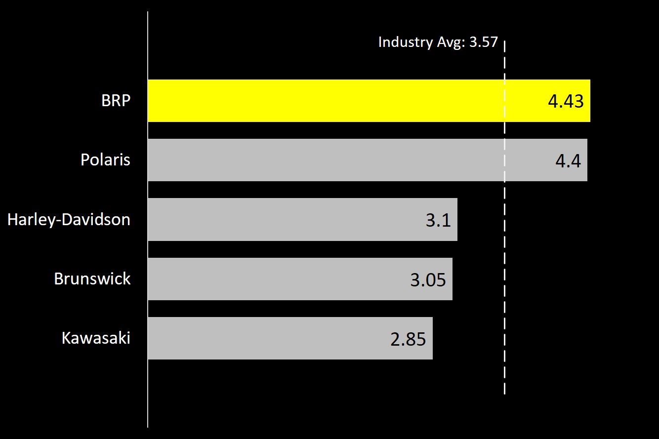
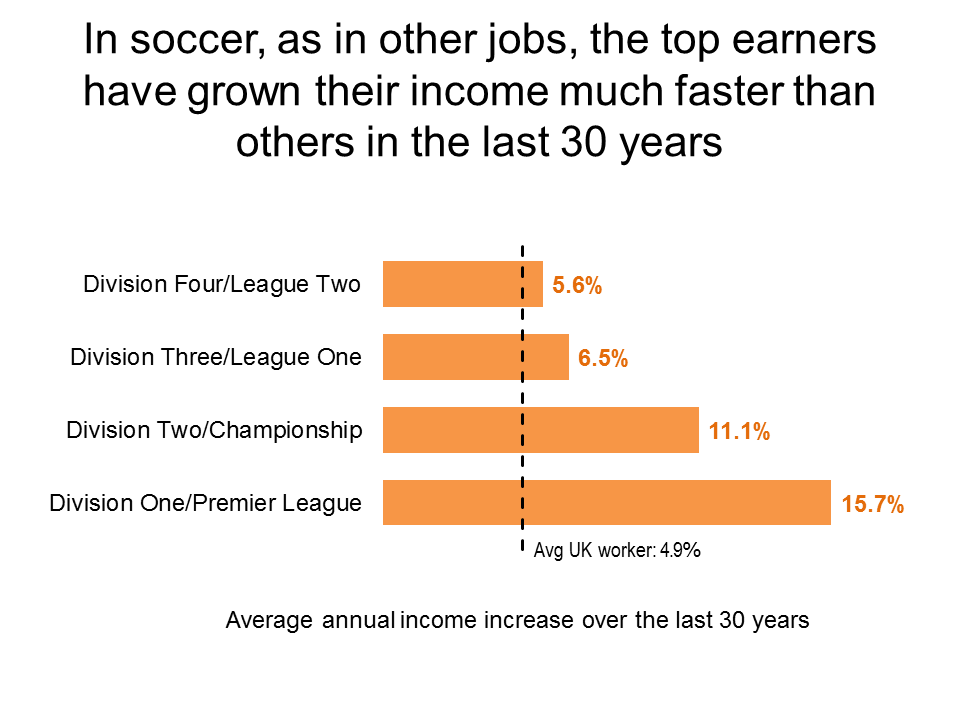
FinancialViz Makeover: Comparing to an average with long labels
This makeover shows how using a dashed line as part of a graph allows easy comparison of values to an average and a bar chart makes long category labels easier to read. (this is a silent video and you can pause it to spend more time on any of the slides)
Comparing to two standards; Issue #388 May 2, 2017
Use a column with two dashed lines to compare a value to two standards
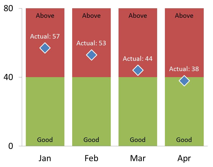
Showing performance where we want to be below a goal; Issue #379 December 20, 2016
Showing performance where the desire is to remain below a standard (vs. the usual above the goal)
Order data to support your message; Issue #378 December 6, 2016
When comparing values, make sure the order supports the message
Makeover Monday Challenge February 29 2016
Comparing values to an average using a dashed line on a bar chart