When you want to compare values to a standard, such as comparing output in various production plants to the goal, a dashed line on a column graph is a good visual to use. The dashed line runs across the graph and it is easy to see if each column is above or below the goal.
In this article I want to show some examples of using this idea in a situation where the goal only applies to one of the columns. In this case, the dashed line would only be drawn within the space of that one column, usually the last column. Here are three examples of when this visual works well.
Example 1: The standard only applies to the latest value
If the standard is a regularly updated forecast, it only applies to the latest time period. Here is an example of a monthly sales forecast compared to just the last month in the graph. The forecast does not apply to the previous months since it is updated each month.

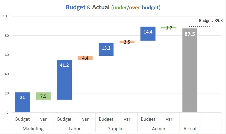
Example 2: The standard only applies to the total amount
If you are using a steps to a total graph to show the components that make up the total, then the standard is only compared to the total amount. Here is an example from a recent FinancialViz video where the different expense items and their variances add up to the total Actual expense amount (87.5) but the budget (89.8) is only compared to the total.
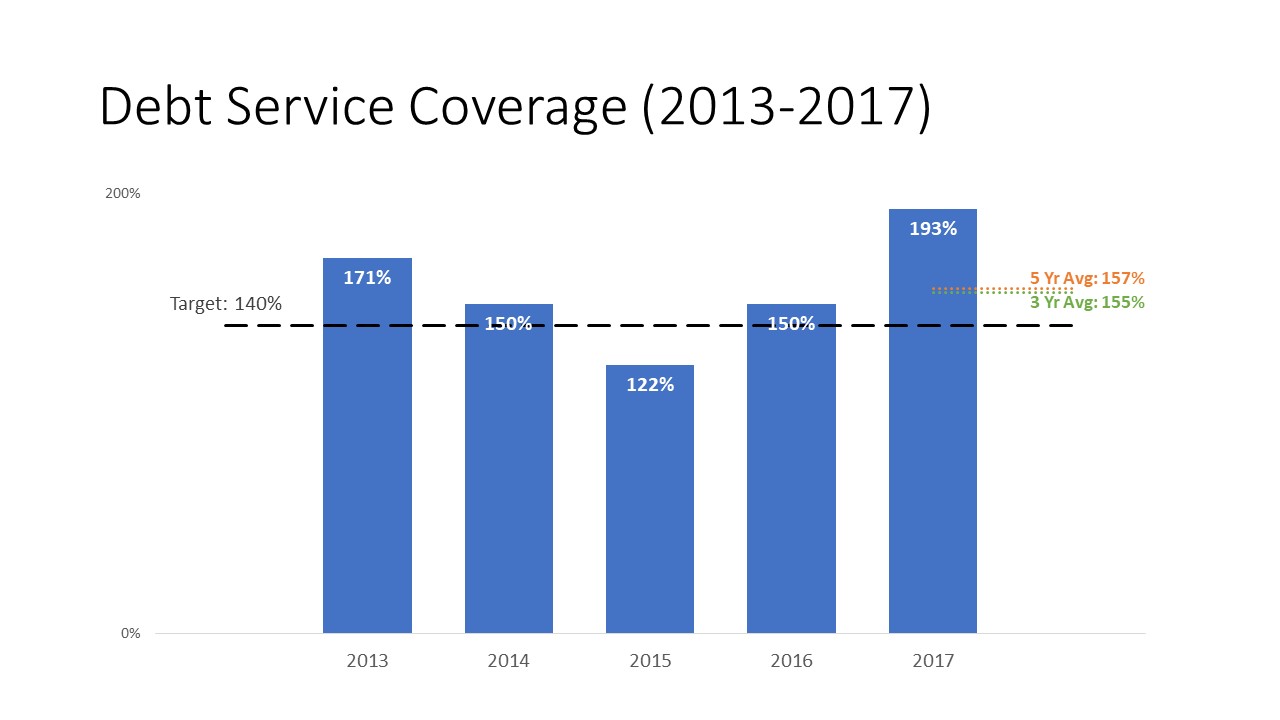
Example 3: The standard is a rolling average
Often we compare current values to a rolling average to see how the current performance compares to an average of recent values, such as a 12 month rolling average that takes into account seasonality across the months. A rolling average only applies to the latest value since it is updated each time period. This example shows both a target that applies to all years and three and five year averages that apply only to the latest year.
It is important that the dashed or dotted line be built as part of the graph so that if the graph is moved or resized the line stays in the correct spot and the comparison is accurate. This is one of the key visuals I teach in my hands-on workshops and here is a video recorded last year of how you create these graphs in Excel. If you want to learn more advanced techniques for effective graphs in Excel, check out my Excel Chart Skills 501 course.
When you are comparing one value in the data series to a standard, consider a dashed line on that one column in the column chart.

Dave Paradi has over twenty-two years of experience delivering customized training workshops to help business professionals improve their presentations. He has written ten books and over 600 articles on the topic of effective presentations and his ideas have appeared in publications around the world. His focus is on helping corporate professionals visually communicate the messages in their data so they don’t overwhelm and confuse executives. Dave is one of fewer than ten people in North America recognized by Microsoft with the Most Valuable Professional Award for his contributions to the Excel, PowerPoint, and Teams communities. His articles and videos on virtual presenting have been viewed over 4.8 million times and liked over 17,000 times on YouTube.