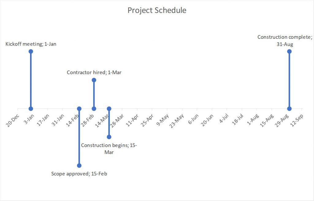
A timeline visual is a generic term used to describe any time-based visual. It consists of the time scale for the desired period of time and shapes or text that indicate the events during the time period shown. A Gantt chart is a specific type of timeline visual often used in project management. Here is an example of a timeline visual.
The hardest part of creating most timeline visuals is creating the time scale so it accurately portrays the time period and segments within that time period. Adding shapes or text along the time scale is relatively simple once the time scale has been created.
Here are six options for creating the time scale so it is accurate and leads the audience to correctly understand the message from the timeline visual. None of these options require add-ins, plug-ins, or programming. They are all done using the features of PowerPoint or Excel.
Option 1: Equally spaced vertical lines on a horizontal line
The first option is to create the time scale using horizontal and vertical lines drawn in PowerPoint. When using this method, it is important to equally space the vertical tick mark lines along the long horizontal line. PowerPoint’s Distribute Horizontally feature in the Align set of features makes this easier than manually positioning the lines. I have a video that shows this approach. It was done a while ago in a previous version of PowerPoint but the techniques shown have not changed.
Option 2: Use a table
An easier approach to creating the time scale is to use a table in PowerPoint. Tables make it easy to equally space the dividing lines between the cells by making each cell the same width. Tables can be formatted to just have a horizontal line and vertical lines that represent the time periods. This is the approach I use most often. I wrote more about creating time scales with tables in PowerPoint in this article.
Option 3: Use a pre-made time scale from TimeSlides.com
I often end up creating a timeline visual as part of the slide makeovers I prepare for my customized training courses. To make it easier I created files that contain the variety of time scales that I used most often. The participants in my workshops frequently asked if they could have these files and I ended up making the three files available for download on my website at TimeSlides.com. You can save a lot of time creating timeline visuals when you can start with the time scale already created.
Option 4: Use a formatted line chart to create a timeline visual
A line chart in Excel can use dates as the horizontal axis, automatically spacing them accurately. I used this approach to create a timeline visual in this article. You can download the Excel file using the link in the article. When you have created the timescale as part of the timeline visual in Excel you need to copy it to your PowerPoint slide. This article contains a video that explains two methods when you want the chart linked and a video on two methods if you don’t need the chart linked.
Option 5: Use a bar chart in Excel to create a Gantt chart
An Excel stacked bar chart is a way to create a Gantt chart when you need exact dates and durations shown. Because the units used in the bar chart are days or months, Excel accurately creates the time scale as part of the timeline visual. I have an article on creating a Gantt chart with a time scale in days and an article on creating a Gantt chart with a time scale in months.
Option 6: Use a pre-made timeline visual template from Microsoft
In their collection of Office templates, Microsoft offers a number of templates that create the time scale as part of a timeline visual. Be careful in selecting one of these templates to make sure that the time scale created is accurate. Some of the templates just use evenly spaced time scales regardless of the dates they represent. Some of the Excel templates like this one for a horizontal timeline visual or this one for a vertical timeline visual create a line chart similar to Option 4 above and the time scale is automatically accurate.
Whichever method you choose to create the time scale for your timeline diagram, make sure it is accurate so the correct message is delivered to the audience.

Dave Paradi has over twenty-two years of experience delivering customized training workshops to help business professionals improve their presentations. He has written ten books and over 600 articles on the topic of effective presentations and his ideas have appeared in publications around the world. His focus is on helping corporate professionals visually communicate the messages in their data so they don’t overwhelm and confuse executives. Dave is one of fewer than ten people in North America recognized by Microsoft with the Most Valuable Professional Award for his contributions to the Excel, PowerPoint, and Teams communities. His articles and videos on virtual presenting have been viewed over 4.8 million times and liked over 17,000 times on YouTube.