In a previous newsletter I showed an example of how PowerPoint’s Design Ideas feature (last week Microsoft changed the name from Designer to Design Ideas) can create a visual from a bullet list of dates for events. Here is the example it created.
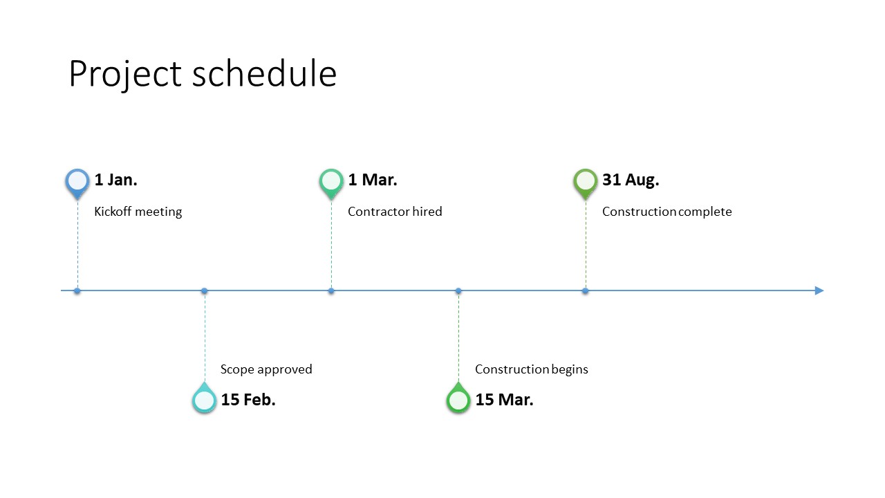
I like the idea of the events being placed on a timeline and being shown above and below the line. There are two significant issues I have with the visual. The first is that it is created as SmartArt, which limits your ability to control the formatting and customize it. The second issue is much more significant. A timeline visual must represent the time aspect accurately. This visual does not. It shows the same distance on the timeline between March 1 and March 15 as between March 15 and August 31. This results in a visual that is misleading to the audience.
When I first saw this visual in a demonstration at the Microsoft MVP Summit in March, I started thinking about how I could create a similar visual using a graph so that it was an accurate representation of the events and the timing. It would not look as nice, but it would be a true representation of the time relationship between the events. Here is the visual I created.
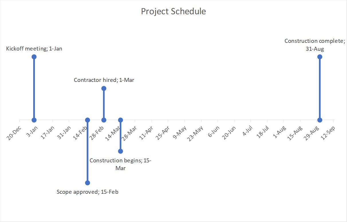
I created an Excel workbook that you can download here to create this type of accurate timeline visual. The worksheet allows you to enter up to eight dates and associated event names in chronological order. It graphs only those events that have been entered. It automatically adds a small amount of space (5% of the total time between the first and last event) to the start and end of the timeline so it looks balanced. The lines are data series and I used the round circle arrow end instead of markers because it makes the formatting easier. You have an option to offset adjacent events to help prevent the date and event names running into each other.
Some of the common customizations that you will want to consider when using the visual created from this worksheet include:
a) Changing or removing the chart title
b) The date and event names are added to the graph using data labels. If you want custom labels for each event, you can remove the data labels and add your own text boxes either in Excel or in PowerPoint.
c) Changing the color or format of the lines indicating each event
d) You can control the number and frequency of the x-axis labels for the timeline by changing the Units options in the Axis Options section for the x-axis
The graph is created in Excel and there are two common ways that I see presenters copying the graph into a PowerPoint slide.
Option 1: As a graph
If you want to be able to format the graph in PowerPoint, you will copy the graph from Excel and paste it into a slide. If you use the default Ctrl+V paste method, the data will not be in the PowerPoint file and any edits to the dates will require you to open the Excel file. If you use a method of pasting with embedding the data, you get a copy of the data in the PowerPoint file and can edit the dates without needing the Excel file. Because the visual would be a graph in PowerPoint, you have all the formatting tools available, including colors, labels, etc.
Option 2: As an image
If you paste the visual as an image (the Enhanced Metafile format allows for scaling without distortion), you will have to do all the formatting in Excel before copying to PowerPoint as the visual will be an image and cannot be formatted as a graph in PowerPoint. I would typically see this option being used when you just want the basic timeline and event lines only. You plan to add all the other formatting in PowerPoint. Be aware that the line color should be set properly in Excel as an image of the graph will not adopt any custom colors in your organization’s template.
The file to create this visual is free to download and use. I supply it to allow you to create more effective visuals and can’t be responsible for any errors or misuse of the results (my lawyer makes me say that).
When you are creating time relationship visuals, make sure the timeline is accurately reflecting the timing of the events. Use the downloadable worksheet to create a visual inspired by PowerPoint’s Design Ideas to create a timeline visual with the events indicated above and below the timeline.

Dave Paradi has over twenty-two years of experience delivering customized training workshops to help business professionals improve their presentations. He has written ten books and over 600 articles on the topic of effective presentations and his ideas have appeared in publications around the world. His focus is on helping corporate professionals visually communicate the messages in their data so they don’t overwhelm and confuse executives. Dave is one of fewer than ten people in North America recognized by Microsoft with the Most Valuable Professional Award for his contributions to the Excel, PowerPoint, and Teams communities. His articles and videos on virtual presenting have been viewed over 4.8 million times and liked over 17,000 times on YouTube.