How do you create a Gantt chart in Excel?
You can create a Gantt chart to show project tasks and timelines in Excel using a stacked bar chart. You can include milestones if needed. By using a chart in Excel, when the dates of the tasks change, the Gantt chart is automatically updated.
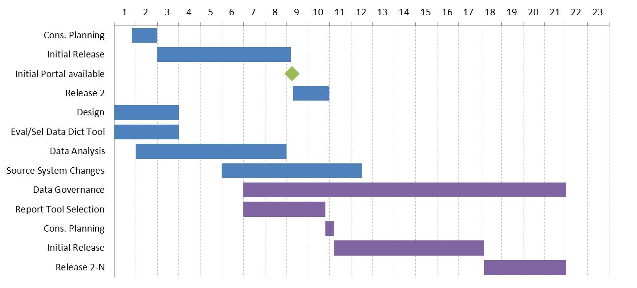
In this article I want to build on a previous article about creating Gantt charts using a stacked bar chart in Excel. The previous article used a timeline of dates and this article uses a monthly timeline. A similar method can be used to create the Gantt in PowerPoint. If you want an advanced solution with full video tutorials and sample Excel files for both monthly and daily Gantt charts, click here to jump to the bottom of the page to learn more. Here’s what our completed graph will look like.
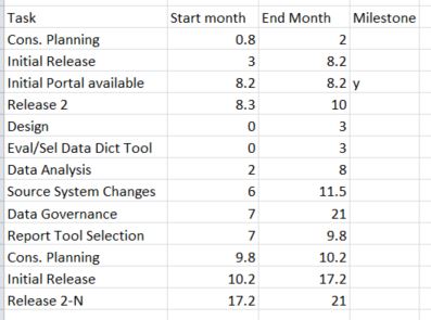
Step 1 – Simple list of tasks with milestones identified
We start with a simple list of tasks with the start and end months, as well as an indicator as to which tasks are milestones. I prefer start and end months to start months and durations because in most cases durations do not account for weekends and holidays, making the calculations much harder. Here is the list we start with.
Step 2 – Create the table for the Gantt chart
To convert the list of tasks and dates into a table for the Gantt chart, we need to calculate durations for each task and designate which tasks are milestones. We set up a table like the following.
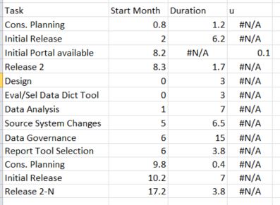
In the Task column, we simply enter a formula to copy the task name from the original table.
In the Start Month column, create a formula that calculates the start month. The formula is needed because when the start month is a whole number, the task starts at the beginning of the month but when the start date includes a decimal, it starts partway through the month. The formula would be similar to “=IF(AND(B5>1,TRUNC(B5)=B5),B5-1,B5)”.
In the Duration column, create a formula that calculates the duration if the task is not designated as a milestone. Similar to the Start Month formula, this formula takes into account the difference between the start month being a whole number or a decimal. The formula is similar to “=IF(D5<>”y”,IF(AND(B5>1,TRUNC(B5)=B5),C5-B5+1,C5-B5),NA())”. The NA() formula enters the #N/A value in this column for milestone tasks. This allows the milestone tasks to be a separate data series with its own formatting.
The column for milestone tasks has a series name as a lower case u. This will allow us to show a diamond character for the milestones in the graph (a diamond is the standard in project management for milestone tasks). The formula in this column puts 0.1 in the cell if the task is a milestone and the #N/A value if the task is not a milestone. In project management standards, a milestone has no duration, but we need a small space for the diamond shape in the graph. The formula for the first row of the table is “=IF(D5=”y”,0.1,NA())”.
Step 3 – Create the graph
Select the entire table for the graph. Insert a Stacked Bar chart.
Step 4 – Format the Chart
Chart Title – can be removed or edited to indicate the project name
Legend – delete
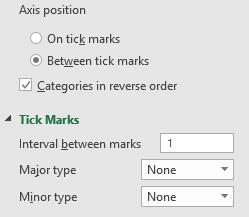
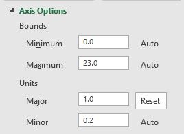
Vertical axis – in Axis Options, check the Categories in reverse order checkbox to order the tasks in the correct order; in Tick Marks, set Major and Minor to None
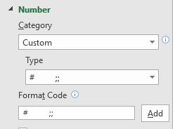
Horizontal axis – in Axis Options, set the Major Units value to 2 only if you want to show two month time periods; in Tick Marks, set Major type to Outside; if the month numbers are too large or running into each other, make the font smaller. To position the months numbers inbetween the dividing lines, you will need to use a custom number format (“# ;;”) that adds spaces after the number and does not display the zero value. (For more information on custom number formats, see this article).
Vertical Gridlines – set to a light color so they are visible but not as prominent as the bars; make them dashed if you want to
Start Date series – set the Shape Fill to No Fill so this segment is invisible
Duration series – set the Shape Fill to a desired color; set the Gap Width to 30% or less to make the bars wider
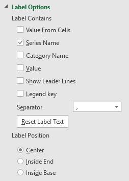
Milestone (u) series – set the Shape Fill to No Fill so the segment is invisible; add a Data Label of the Series Name only; change the font to Wingdings to change the lower case u to a diamond shape; set the font size as large as desired
As the table of dates is updated, the Gantt chart will change because the table for the chart calculates its values based on the original table. If you add tasks to the original table, remember to add rows to the table for the graph and include these new rows in the data that is used for the graph.
[Note: if you want to create the Gantt chart in Excel but use the colors from your organizations’ PowerPoint template so the chart will be consistent with the rest of the colors in your presentation, follow the steps in this article and video.]
Advanced solution videos & sample files
I’ve taken the idea in this article and created video tutorials and sample files for monthly and daily Gantt charts available below. It allows you to use either a list of dates or a list of task linkages and durations to create a Gantt chart. It teaches you the specific functions, formulas, and techniques to build your own flexible Gantt chart that is easy to update. It also gives you the flexibility to change the start date of the chart and the timeline automatically adjusts. Check it out below.

Dave Paradi has over twenty-two years of experience delivering customized training workshops to help business professionals improve their presentations. He has written ten books and over 600 articles on the topic of effective presentations and his ideas have appeared in publications around the world. His focus is on helping corporate professionals visually communicate the messages in their data so they don’t overwhelm and confuse executives. Dave is one of fewer than ten people in North America recognized by Microsoft with the Most Valuable Professional Award for his contributions to the Excel, PowerPoint, and Teams communities. His articles and videos on virtual presenting have been viewed over 4.8 million times and liked over 17,000 times on YouTube.