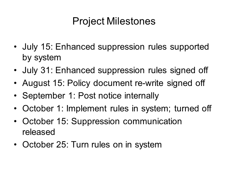
One of the categories of messages I cover in my book Select Effective Visuals is messages that communicate a relationship over time. Too often presenters use a list of dates like this:
Instead, use a visual that includes a timeline, like this:
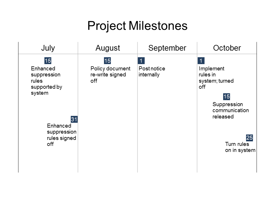
When I show this sort of makeover in my customized workshops, I often get the question of how to create the timeline easily and quickly. If you have ever tried to create a timeline using lines and tried to position them manually, you know how painful this can be. I used to show people the technique for creating a timeline using straight lines and the align & distribute tools in PowerPoint.
Then I found an easier way to create a perfectly spaced timeline. I now use a table created in PowerPoint. The reason a table works so well is that:
- The columns are the same width when you create the table, eliminating the need to evenly distribute the lines
- If the column widths accidentally change, you can reset them to equal width with a button on the table layout ribbon
- You can set the border lines of the table so that there are only lines separating the time periods
- It is easy to format the text in the first row of the table for the time period labels
- It is easy to resize the entire table to fit the area on the slide and all the lines are automatically resized
- It is easy to place shapes and text boxes on top of the table to complete the timeline visual
In my new Creating Diagrams Implementation Guide, I give step-by-step directions on creating timelines using a table if you need some more detailed instructions. This guide is part of my newly launched set of Implementation Guides which give detailed instructions, including screen shots, on how to create the effective visuals I show in my workshops and in my book Select Effective Visuals. You can see all five guides here and the guide on using Images on slides is a free download.

Dave Paradi has over twenty-two years of experience delivering customized training workshops to help business professionals improve their presentations. He has written ten books and over 600 articles on the topic of effective presentations and his ideas have appeared in publications around the world. His focus is on helping corporate professionals visually communicate the messages in their data so they don’t overwhelm and confuse executives. Dave is one of fewer than ten people in North America recognized by Microsoft with the Most Valuable Professional Award for his contributions to the Excel, PowerPoint, and Teams communities. His articles and videos on virtual presenting have been viewed over 4.8 million times and liked over 17,000 times on YouTube.