AFP Online: 5 Ways to Visualize Data: Thanksgiving Edition
Dave was one of the experts AFP asked to provide an example of a data visualization related to American Thanksgiving. See Dave’s example on the change in consumption of different meats on the AFP website.
FinancialViz Makeover: Table of metrics to 3 visuals based on the message for each metric
This makeover is based on a recent example from a session I delivered at a conference in Philadelphia. I commonly see tables of related metrics in the slides from the participants in my FinancialViz training courses. In this video I show you how to turn the table into 3 visuals, each one based on the… Continue reading FinancialViz Makeover: Table of metrics to 3 visuals based on the message for each metric
AFP Article June 6 2022
The Association for Financial Professionals (AFP) published an article showing some of the makeovers of data heavy slides that were recently featured in a webinar I was a part of. You can see the before and after slides in the article here. The makeovers I submitted are #1, 2, 3, and 5.
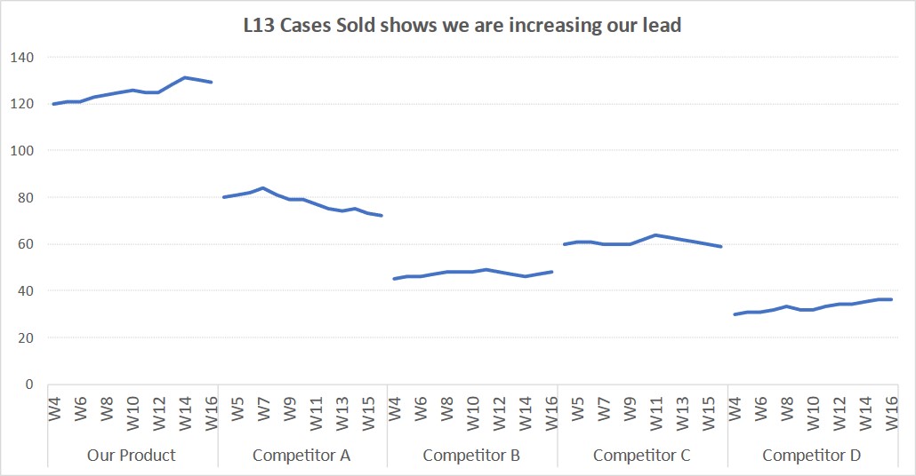
Comparing product sales trends; Slide Makeover #97
CPG sales, marketing, and product managers regularly report on sales trends of a product compared to its competition. Because the reporting is driven from a database, often the table of numbers is copied onto a slide. This makeover shows how to visually show the sales trends using a panel line graph. Discussion of original visual… Continue reading Comparing product sales trends; Slide Makeover #97
7 steps to make one line stand out in a spaghetti line graph
If you have a line graph with many lines and you want to focus the viewer on one of those lines, how can you do that? Here are 7 steps you can follow to make one line the focus in what is often called a spaghetti line graph (because the many lines can look like… Continue reading 7 steps to make one line stand out in a spaghetti line graph
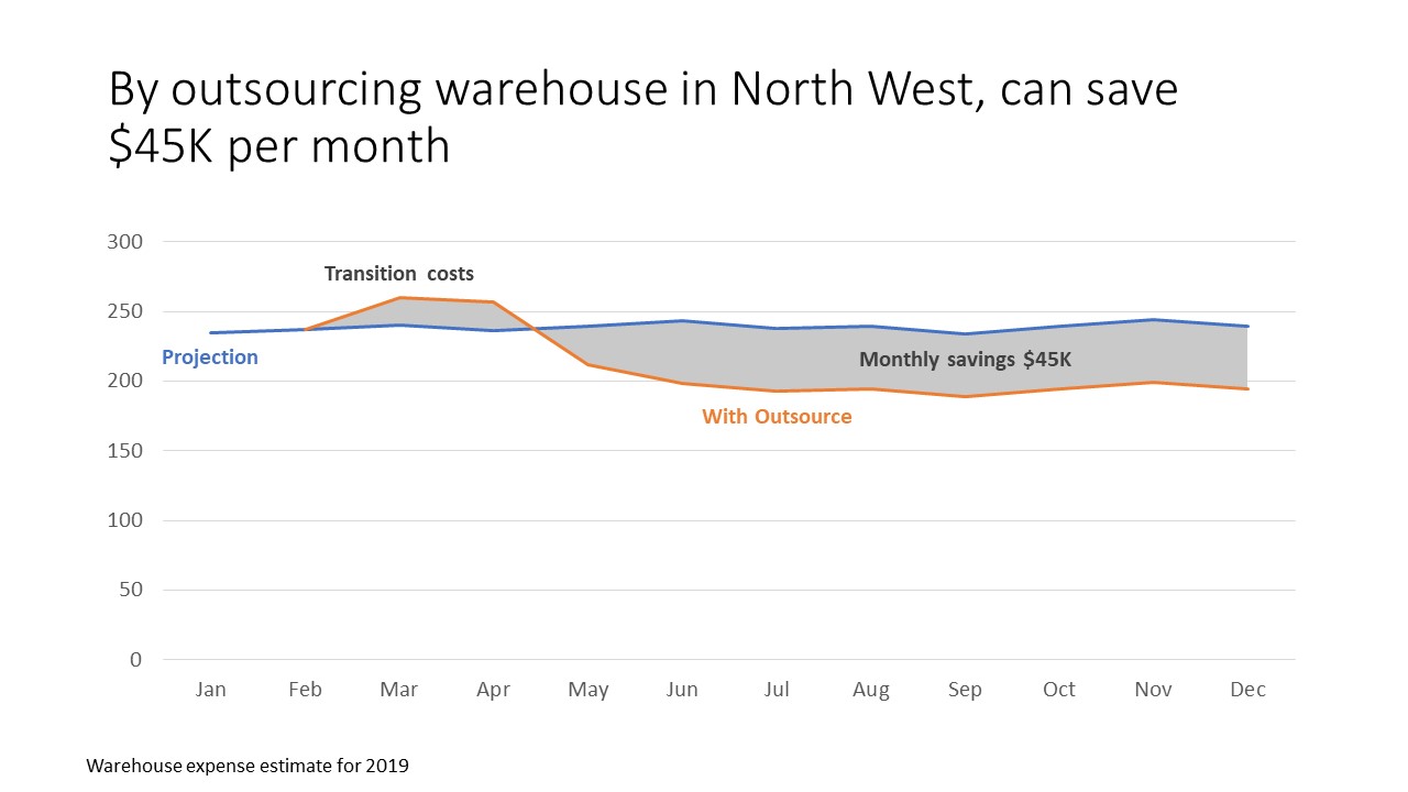
Showing future differences; Issue #433 February 19 2019
When we want to show the impact of a proposed change, one of the ways we can do it is to show a line graph of the current state and the proposed state with a shaded area between the two to emphasize the difference. This is much better than the default table of values that… Continue reading Showing future differences; Issue #433 February 19 2019
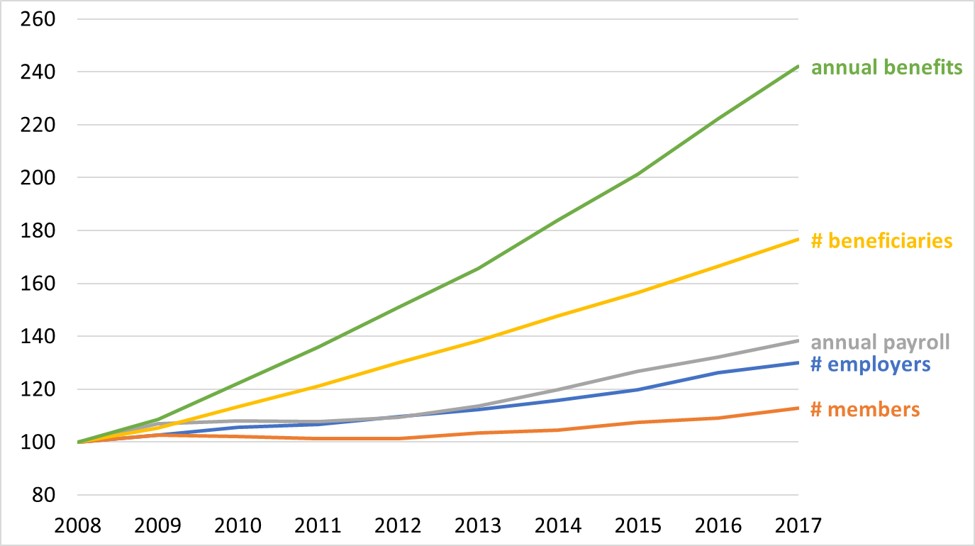
Presenting financial analysis: Show trends in data series measured in different units
You’ve analyzed the past data and need to communicate important findings to the executives or Board. If you want to show how the trends in different measurements compare to each other even though they are measured in different units, this video shows how to use an index line graph to allow the viewers to quickly… Continue reading Presenting financial analysis: Show trends in data series measured in different units
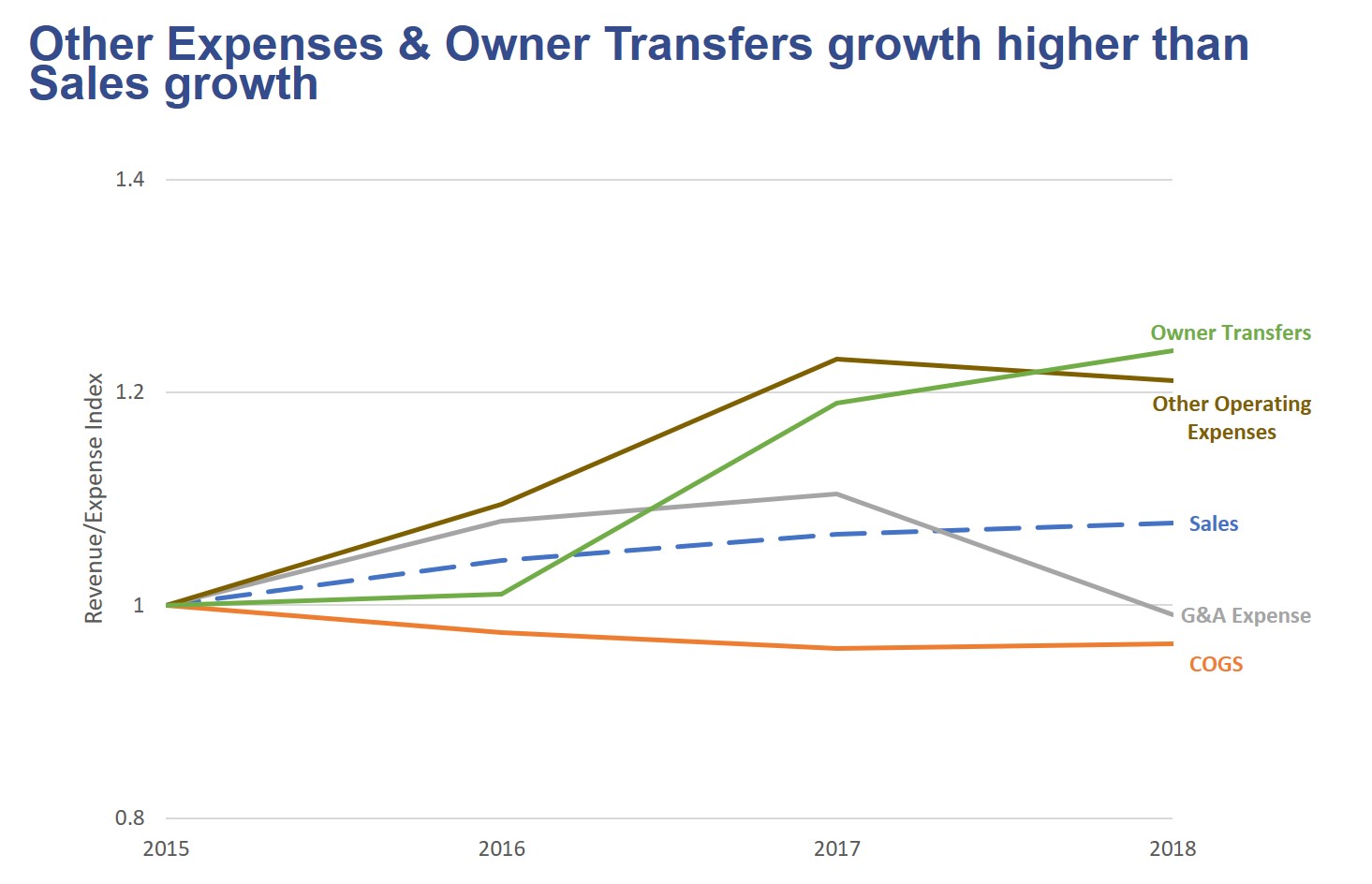
Comparing growth in Sales and Expense categories over time; Slide Makeover #92
Use an index line graph to compare trends in different data series using a common starting point
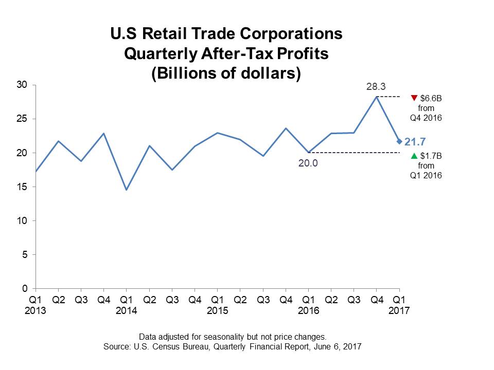
Showing a trend and comparing current value to last Q and last Y; Slide Makeover #88
Use a line graph instead of a column graph to show both the trend and comparisons to previous values.
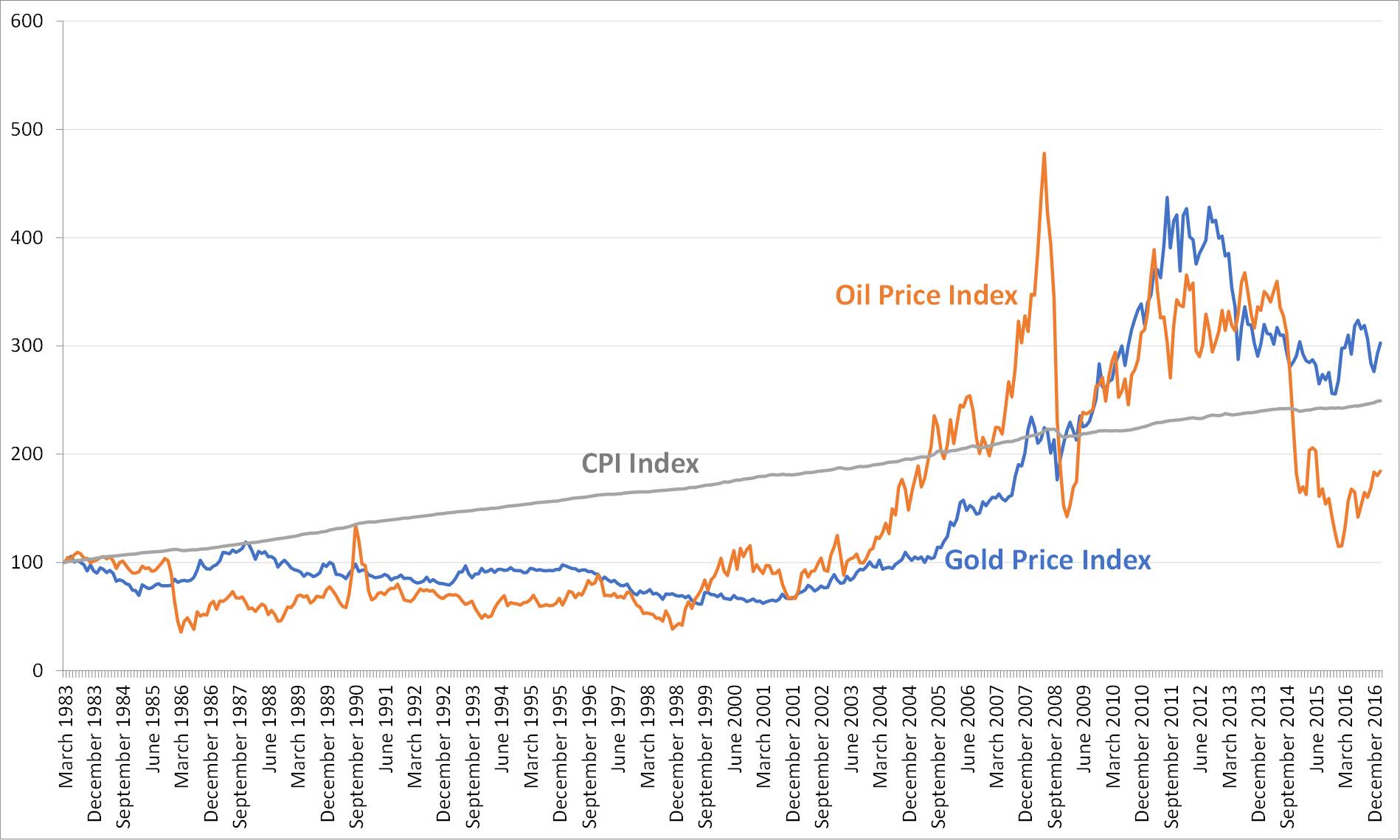
Makeover Monday Challenge April 10 2017
Use an index line graph instead of a dual axis chart to compare trends in different data series.
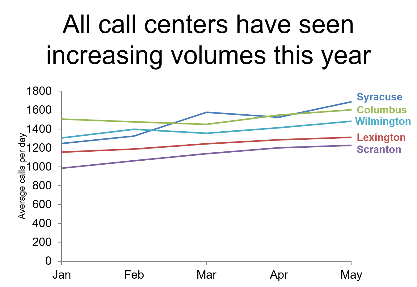
Showing trends as lines, not clustered columns; Slide Makeover #82
Use a line graph instead of a clustered column graph to show trends
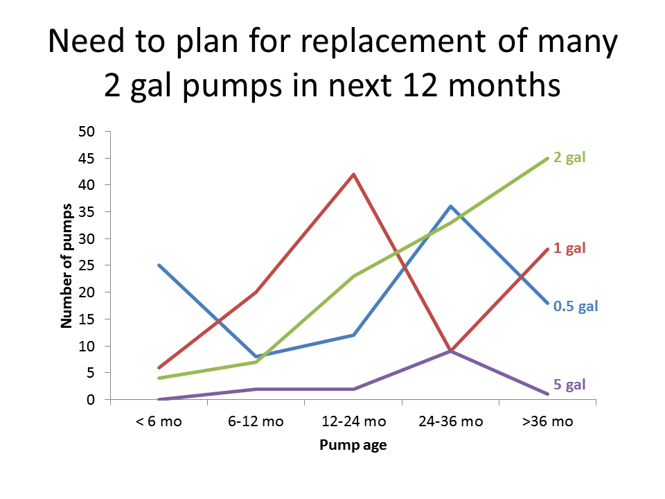
Showing trends in related series of data; Slide Makeover #78
A line graph is easier to see trends in multiple data series than a stacked column graph
