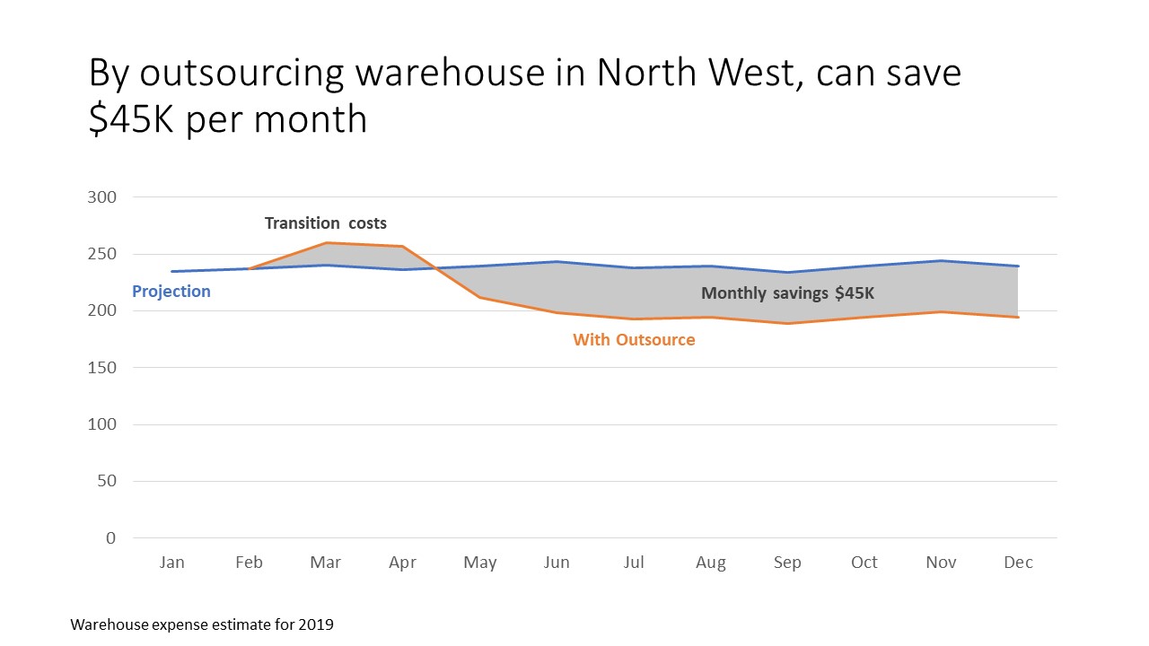
When we want to show the impact of a proposed change, one of the ways we can do it is to show a line graph of the current state and the proposed state with a shaded area between the two to emphasize the difference. This is much better than the default table of values that we see in too many presentations.
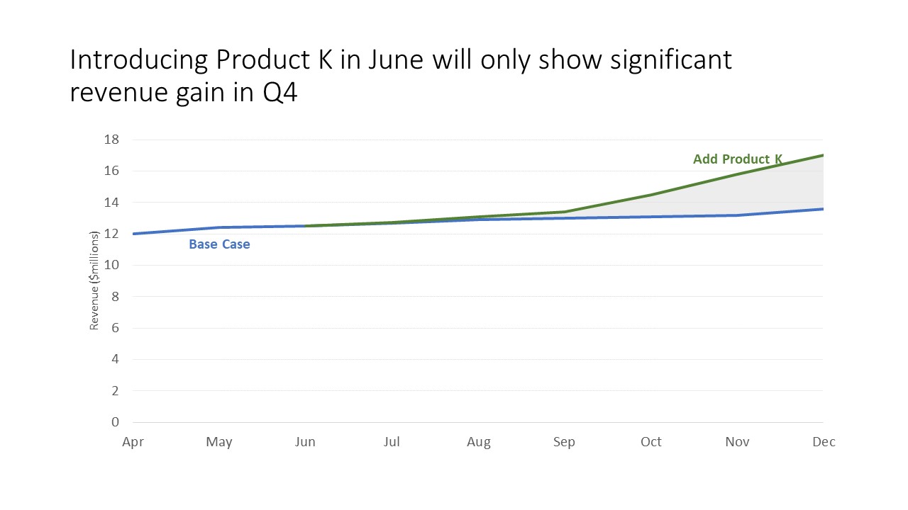
Here’s an example of showing the difference between the base case for revenue and the revenue if we introduce a new product.
You don’t need any fancy software to create this type of meaningful visual. There are a number of different ways to create this graph in Excel or PowerPoint. The method I discovered is simple to use and works in many different scenarios.
The current state and projected lines are straightforward. The shaded area between the lines is created using a stacked area graph with two series. The first series in invisible and is the same as the current state line. The second series is the difference between the two lines and is the shaded area. If you want the gridlines to still be visible, you can make the shading color semi-transparent (I find 50% works well).
I’ve created a video tutorial to show how this method works in Excel and how it applies when the difference is positive in some time periods and negative in other time periods, such as this example.
You can view the video below.
If you want to learn more advanced techniques for effective graphs in Excel, check out my Excel Chart Skills 501 course.
There are other methods for creating the shaded area that may work better for more complicated situations. Two Microsoft MVPs have written tutorials that you should refer to if you have a more complex situation. Excel chart expert Jon Peltier’s solution is here and Excel expert Chandoo’s solution is here.
When you want to show the difference a change will make to future results, consider adding a shaded area between the two lines representing the current state and projected state to emphasize the difference.

Dave Paradi has over twenty-two years of experience delivering customized training workshops to help business professionals improve their presentations. He has written ten books and over 600 articles on the topic of effective presentations and his ideas have appeared in publications around the world. His focus is on helping corporate professionals visually communicate the messages in their data so they don’t overwhelm and confuse executives. Dave is one of fewer than ten people in North America recognized by Microsoft with the Most Valuable Professional Award for his contributions to the Excel, PowerPoint, and Teams communities. His articles and videos on virtual presenting have been viewed over 4.8 million times and liked over 17,000 times on YouTube.