In this Makeover Monday, the request was to see how you can improve a dual-axis chart comparing oil prices and gold prices. This is the original chart from a Forbes article.
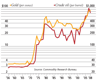
I see dual-axis charts regularly in my work training corporate professionals how to more effectively present data. The problem with dual-axis charts is that they open up manipulation of the message because the trend can be altered dramatically simply by altering the scale of each data series (I explain in more detail in this article).
For this makeover, the data set included Consumer Price Index data for the months after the start of 1983, so I chose to use the time period that included data for all three data series. As the article I linked to above explains, I think a better approach to comparing trends that are measured on different scales is to convert the data to index values with the starting value in each data series being 100. Then the true comparison of the trends can be done because there is only one measurement scale for all data series.
For the data series that were supplied, I created this graph that shows how the oil price, gold price, and consumer price have changed over the selected time period (click on the image to enlarge it).
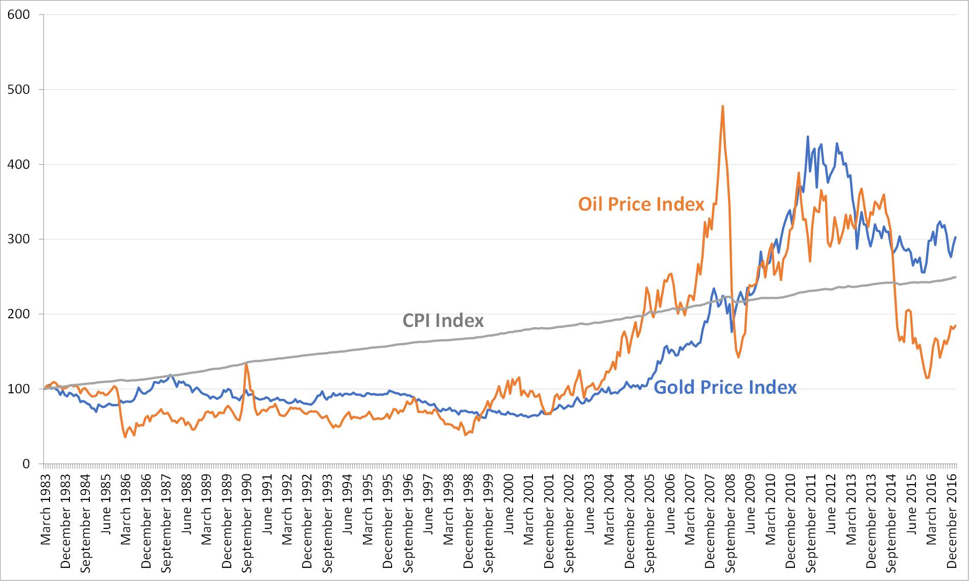
Now we can see that there was a fair amount of correlation between oil and gold prices between 1983 and 1999. After the start of 2000, there seems to be little correlation. With a simple visual like the multiple lines, most people can come to this conclusion for themselves. I find more complex statistical visuals end up confusing most people.
Almost all of the Makeover Monday submissions are done in Tableau, and it seems that many people use it to practice or demonstrate their skills with this tool. I did this makeover to show the hundreds of millions of Microsoft Office users that effective visuals can be created using the tools you already have. This graph was created in Excel (and could have been created in PowerPoint instead). You don’t need fancy tools to clearly communicate a message to an audience. The tool doesn’t matter. Clarity of the message communicated by the visual is what counts.

Dave Paradi has over twenty-two years of experience delivering customized training workshops to help business professionals improve their presentations. He has written ten books and over 600 articles on the topic of effective presentations and his ideas have appeared in publications around the world. His focus is on helping corporate professionals visually communicate the messages in their data so they don’t overwhelm and confuse executives. Dave is one of fewer than ten people in North America recognized by Microsoft with the Most Valuable Professional Award for his contributions to the Excel, PowerPoint, and Teams communities. His articles and videos on virtual presenting have been viewed over 4.8 million times and liked over 17,000 times on YouTube.