If you have a line graph with many lines and you want to focus the viewer on one of those lines, how can you do that? Here are 7 steps you can follow to make one line the focus in what is often called a spaghetti line graph (because the many lines can look like spaghetti on a plate).
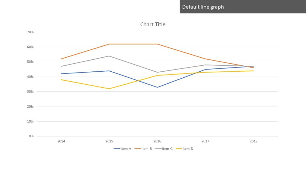
The default line graph
By default, Excel or PowerPoint assigns the line colors based on the color theme you are using and uses gridlines, a legend, and the other default formatting (you can see 7 steps to make a professional looking line graph here).
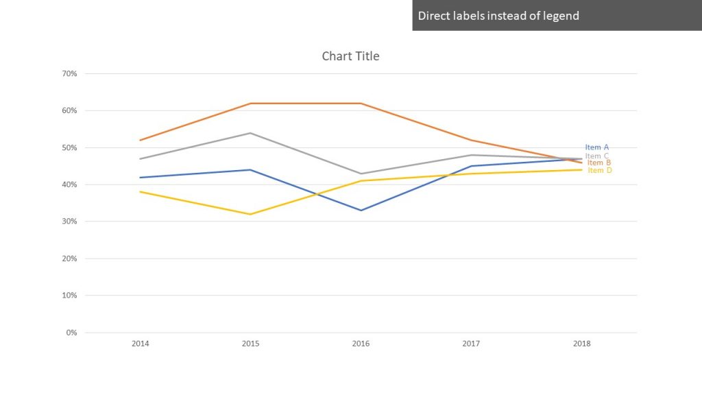
Direct labels instead of the legend
Making the viewer look back and forth between the legend and the lines to try to match the colors and text is not ideal. Instead, add data labels of the series name to the last point of each line. Make the text color match the line color so the viewer connects the label to the line easier.
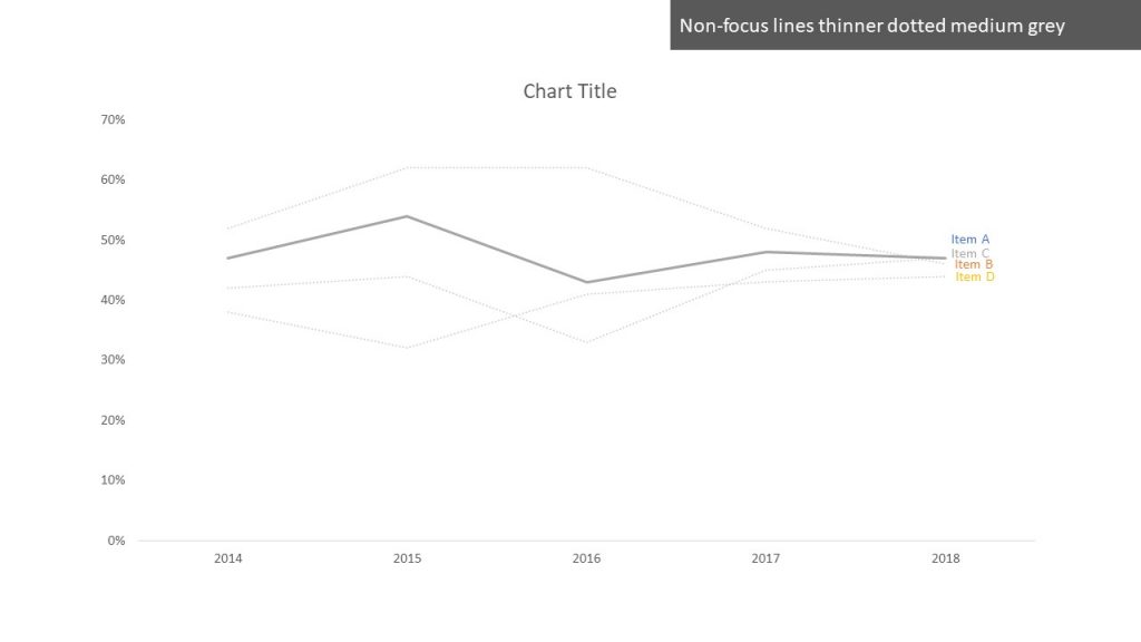
Remove the gridlines
By default, Excel and PowerPoint add gridlines to all line graphs. When we want the viewer to focus on just one line, we want to reduce the distractions on the graph so removing the gridlines help to focus the viewer.

Make the non-focus lines stand out less
The lines that are not the focus of the graph need to be there for context, but they should not be as prominent as the focus line. Make them slightly thinner, change the color to a medium grey, and make them dotted. This allows the viewer to see the other lines but makes the focus line easier to see.
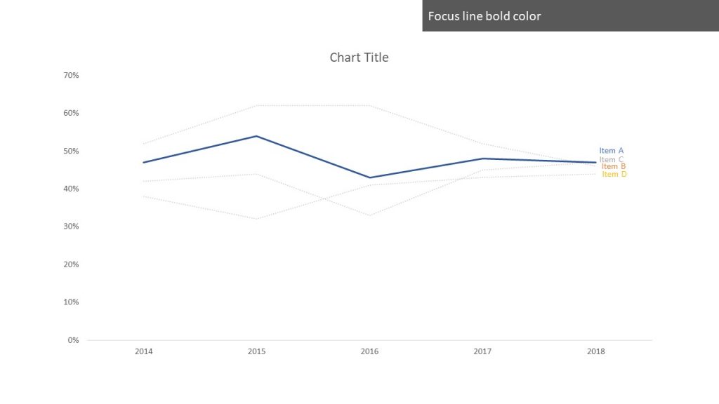
Make the focus line bolder in color
Change the default color of the focus line to one of the bold or dark colors in the color theme. This makes the line stand out against the graph background. You do not need to make it thicker because the non-focus lines have already been made thinner.
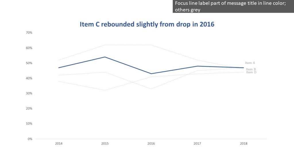
Move the focus line label to the message title and make the other labels muted
The label for the focus line should be moved to be part of a message title for the graph that makes the point clear for the viewer. Make the title font color the same as the line color and make the title font bigger if the default font size is small. The labels for the non-focus lines can be changed to a grey color similar to the color chosen for these lines.
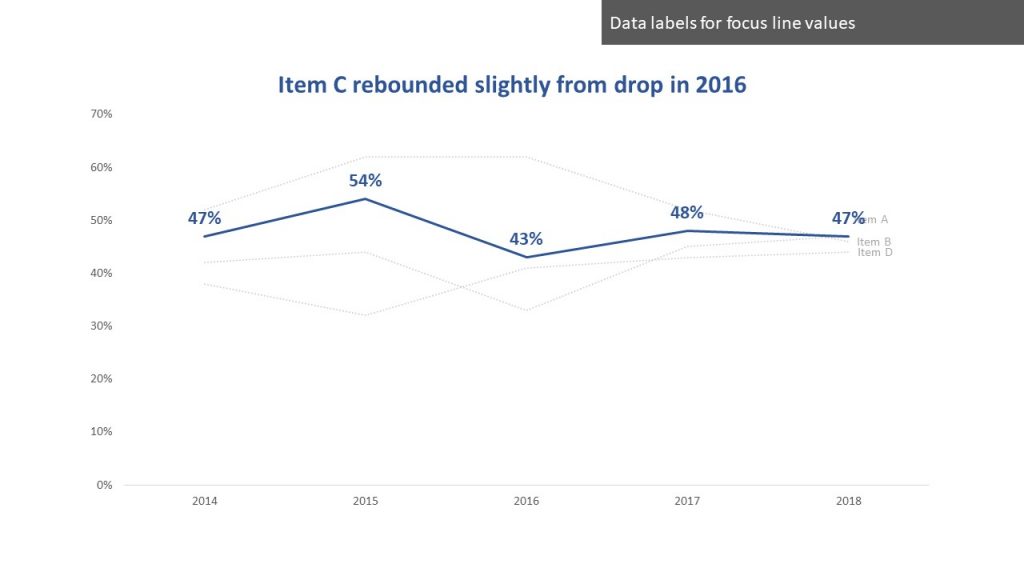
Add data labels for the focus line
Normally data labels are not needed in line graphs because the slope of the line is the key message. When you are focusing on just one line, it is often a good idea to add data labels so the audience sees how the values support the conclusion in the message title. Make the data label font color the same as the line color and make the labels a larger font and bold to make them stand out.
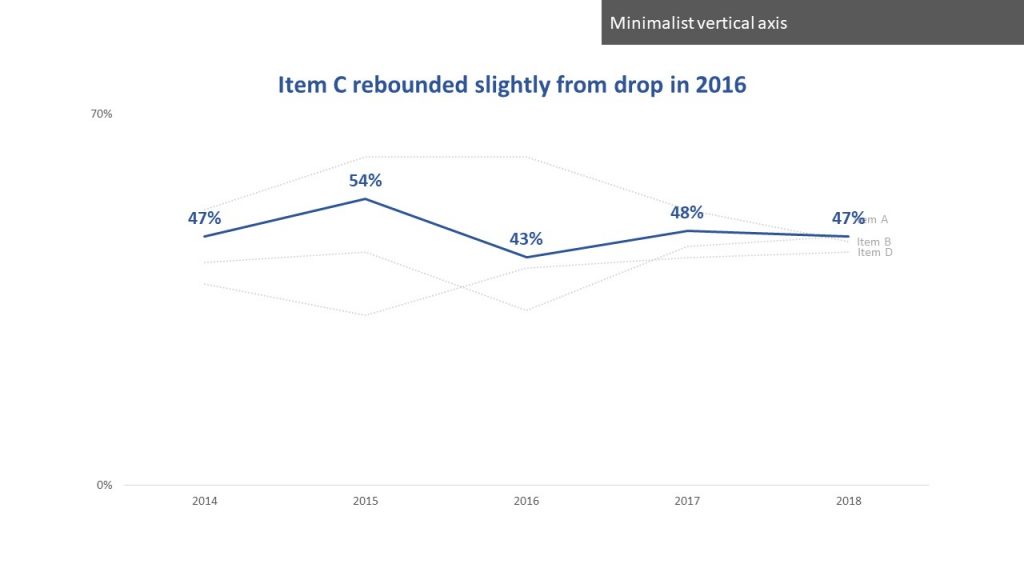
Use a minimalist vertical axis
Now that the data labels have been added, there is less need for all the values on the vertical axis. Instead of removing it altogether, use a minimalist axis where the zero and maximum values are the only ones shown. This indicates to the viewer the context for the graph and eliminates any questions about whether the slope is accurate due to axis scale manipulation.
Use these 7 steps to focus the viewer on one line in a spaghetti line graph.
Create a panel of line graphs, each with their own focus line
Do you have a set of data where you want multiple line graphs, each with their own focus line for one of the data series, and have them lined up and looking good like this?
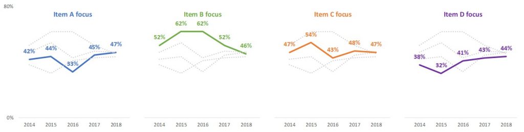
The video and Excel template download below will teach you the techniques you need to know and get you started creating these small multiple, or panel, graphs immediately.

Dave Paradi has over twenty-two years of experience delivering customized training workshops to help business professionals improve their presentations. He has written ten books and over 600 articles on the topic of effective presentations and his ideas have appeared in publications around the world. His focus is on helping corporate professionals visually communicate the messages in their data so they don’t overwhelm and confuse executives. Dave is one of fewer than ten people in North America recognized by Microsoft with the Most Valuable Professional Award for his contributions to the Excel, PowerPoint, and Teams communities. His articles and videos on virtual presenting have been viewed over 4.8 million times and liked over 17,000 times on YouTube.