On a graph that uses a measurement axis, like column, bar, and line graphs, one question that comes up is how the graph should be labelled. Should you use an axis, use data labels, or use both? The default in Excel and PowerPoint is to have the axis only. In this article I want to explain how you can decide between an axis or data labels depending on the message the audience needs to hear.
I have summarized the approach in this decision tree.
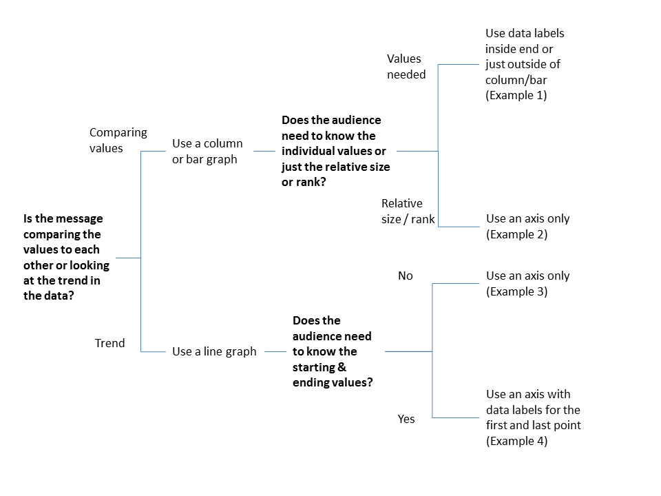
Let me walk you through the decision points and outcomes.
The first decision is what type of message you are communicating. As I explain in my book Select Effective Visuals, two of the groups of messages that business professionals communicate when using numbers are a comparison of values to each other, or looking at the trend in the data. Decide which message you are communicating for this slide.
If you are comparing values to each other, you can use a column or bar graph. After you have decided which one to use (this article will help you decide), the next question you need to ask is whether the audience needs to know the individual values or whether the message is more about the relative size of each value, usually in regards to ranking the values.
If the values are needed, then you will want to use data labels. I suggest placing them inside the end of the column or bar, or just outside the column or bar. This example shows a column graph with data labels only.
Example 1

If the message is more related to the ranking of the values, then you can use an axis. You don’t need data labels, the axis gives the audience the scale they need to compare the values. This example shows a column graph with an axis because we are ranking the values from least frequent to most frequent.
Example 2

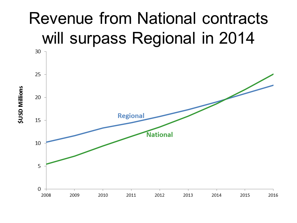
If you are talking about a trend, you will use a line graph. See this article about why line graphs are better than column graphs at communicating trends to the audience. The question you need to ask when using a line graph is whether the audience needs to know the starting and ending values of the line. Sometimes these are important, and sometimes it is just the slope of the line that is important.
If the slope is the most important, then just use an axis. In this example, the slope of each line is the key message because we want the audience to see which type of contract is growing at a faster rate and when the revenue from National contracts will surpass the revenue from Regional contracts.
Example 3
If the starting and ending values of the line are important for the audience to know, then add data labels to just those two points on the line. This example uses data labels for the first and last value to emphasize the change over the time period.
Example 4

When you are using a column, bar, or line graph, use the information above to decide how it should be labelled so the audience understands your message.
Labeling is just one aspect of making graphs look professional. I have articles that give you the steps needed to make professional column, bar, and line graphs In Excel or PowerPoint.

Dave Paradi has over twenty-two years of experience delivering customized training workshops to help business professionals improve their presentations. He has written ten books and over 600 articles on the topic of effective presentations and his ideas have appeared in publications around the world. His focus is on helping corporate professionals visually communicate the messages in their data so they don’t overwhelm and confuse executives. Dave is one of fewer than ten people in North America recognized by Microsoft with the Most Valuable Professional Award for his contributions to the Excel, PowerPoint, and Teams communities. His articles and videos on virtual presenting have been viewed over 4.8 million times and liked over 17,000 times on YouTube.