A line graph is used to show a trend, usually over time. There can be a single data series to show one trend or multiple data series to show trends that can be compared to each other. It is simple to create a line graph in Excel or PowerPoint but to make it look professional you need to use these 7 steps to turn the default line graph into one that looks professional.
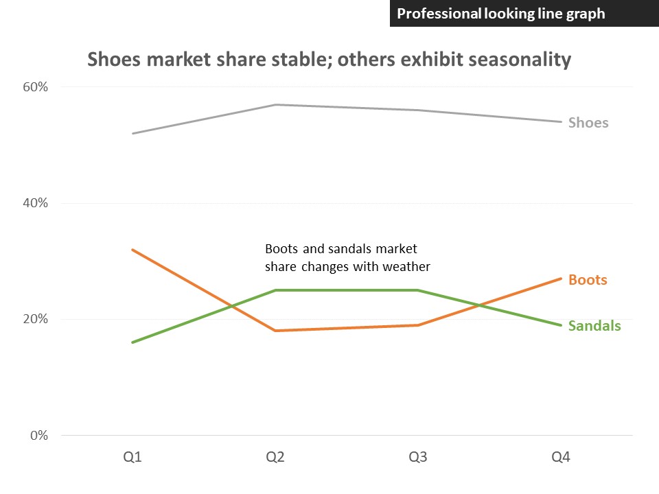
Replace the legend with direct labels
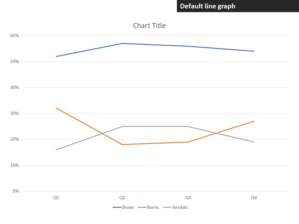
Whether you have one or multiple lines, the default in Excel and PowerPoint is to add a legend to the graph, usually below, in order to identify each line. Making a viewer jump back and forth between the legend and the line is distracting. Instead, add direct labels to each line with the text in the same color as the line. This way it is easier for the viewer to know what the line represents.


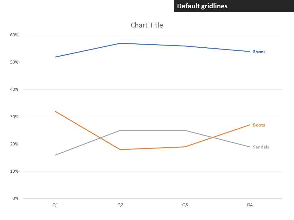
Remove gridlines or make them lighter
In most cases, the horizontal gridlines on a line graph compete visually with the lines that represent the data and can be removed. If you need the viewer to be able to compare the trend in the data to a known horizontal line (as explained in this article) then the gridlines should remain but made lighter. Using a medium grey and setting the line to be dotted often makes the gridlines less prominent and helps the data stand out.

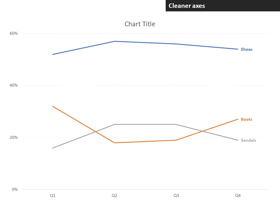
Clean up the axes
By default the vertical axis has values spaced evenly between the minimum and maximum values. Often there are more values than are really required and the extra labels distract the viewer from the data. Reduce the number of values shown on the vertical axis. This also reduces the number of gridlines which allows better focus on the data.

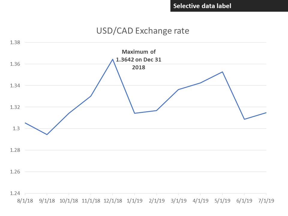
Consider selective data labels
Data labels should not be added to each data point because in a line graph the message is about the trend, not the individual values. You may consider adding a data label to selected points to make the message clearer. One example is when you add data labels to just the first and last point on the line in order to emphasize the change from the beginning to the end of the line. Another example, illustrated below, is when you add a data label to a certain point because of its value compared to the other values, usually the maximum or minimum value (creating a customized label such as the one shown below is explained in this video).
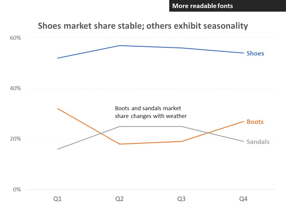
Add text that explains the message
Without text that helps the viewer understand the message of the graph, you run the risk of misinterpretation. The chart title should explain the message. You can also add explanatory text that directs the audience to a particular place in the graph where the message is shown.


Increase font sizes so they are easy to read
The default font sizes for graphs are often too small for the viewer to easily read. Increase the font sizes so that the text can be easily read and understood. The chart title should usually be the largest font (and can be in bold), the direct labels on each line and explanatory text next largest, and the axis labels can be slightly smaller.

Use color to focus attention
By default each line is a different color based on the order of colors in the color theme. Use one (or more) bold colors to emphasize the one (or few) lines that are most important to the message and use a muted grey for the other lines and labels. You can also make the colored lines thicker so they stand out from the rest of the lines. This helps the viewer focus on the line(s) that are most important to the message.
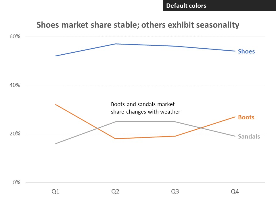

To create a professional looking line graph in Excel or PowerPoint is relatively simple. The steps listed above took us from the default graph in Excel and PowerPoint:
to a more professional looking line graph that the viewer can easily understand:

Dave Paradi has over twenty-two years of experience delivering customized training workshops to help business professionals improve their presentations. He has written ten books and over 600 articles on the topic of effective presentations and his ideas have appeared in publications around the world. His focus is on helping corporate professionals visually communicate the messages in their data so they don’t overwhelm and confuse executives. Dave is one of fewer than ten people in North America recognized by Microsoft with the Most Valuable Professional Award for his contributions to the Excel, PowerPoint, and Teams communities. His articles and videos on virtual presenting have been viewed over 4.8 million times and liked over 17,000 times on YouTube.