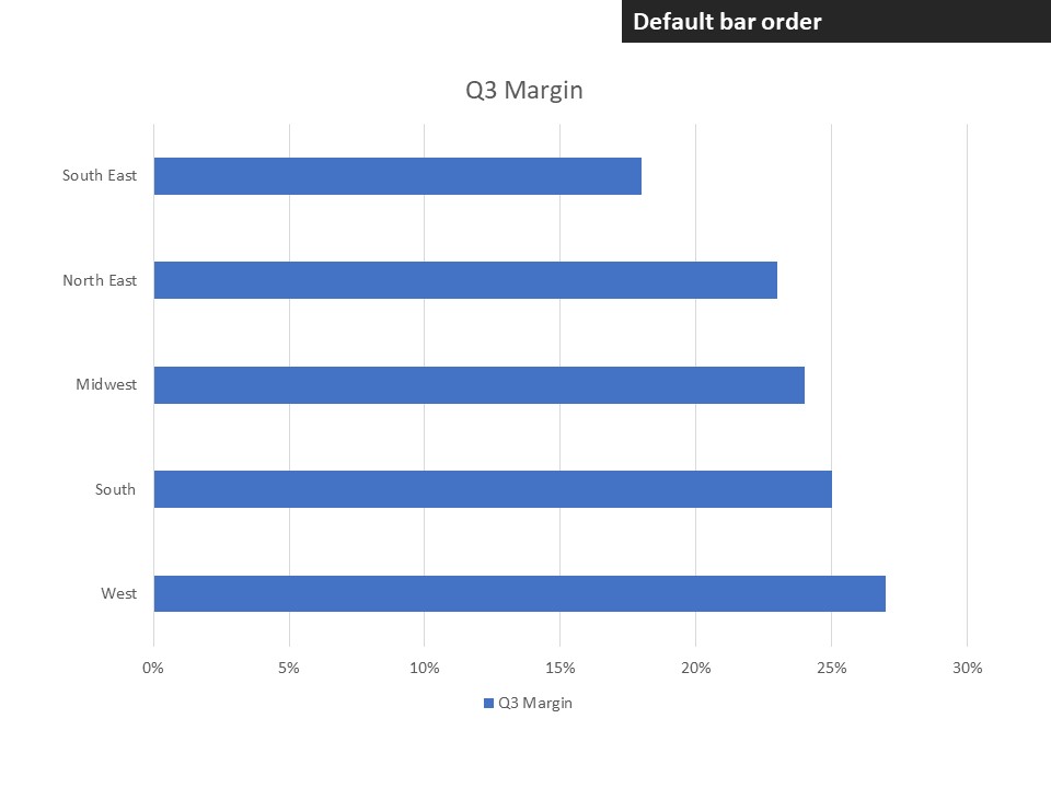
A bar chart is used to rank values from largest to smallest, usually in a single series of data. Creating a bar chart in Excel or PowerPoint is simple, but making it look professional requires you to change some of the defaults in the chart. Here are 8 steps to turn a default bar chart into a professional looking bar chart.
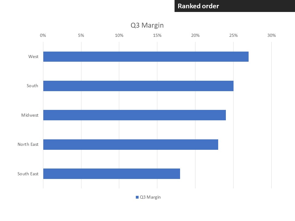
Arrange the bars in ranked order
If you rank order the data used for the bar chart, you will discover that the default order of bars is in reverse rank order. That is because the bars are ordered with the first data point at the bottom of the chart. To rank the bars with the longest bar at the top, check the Categories in reverse order checkbox in the vertical axis settings.
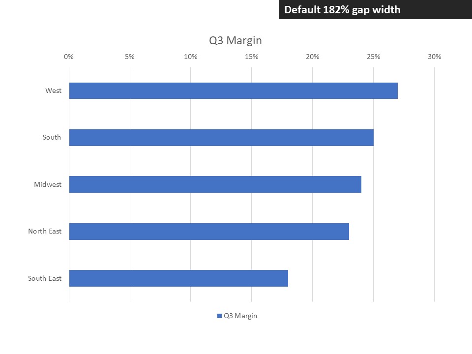
Increase the ratio of bars to background
By default, Excel and PowerPoint make the bars thin so that there is more background showing than bars. This ratio is controlled by the Gap Width setting on the bar data series. The default is usually 182%, meaning that the gap between the bars is 182% the height of the bars, leading to more background than bars. I suggest the bars should have more prominence and setting the Gap Width to 40-60% does that.

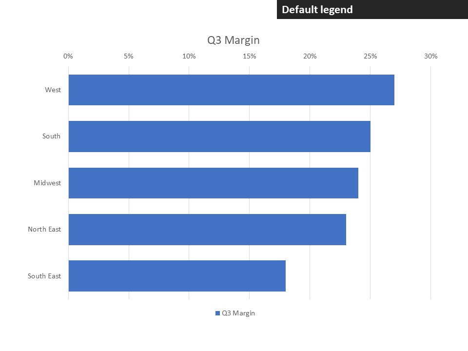
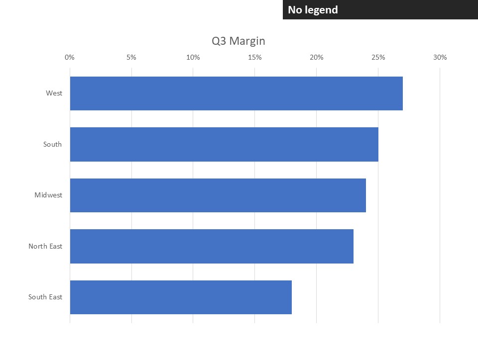
Remove the legend
Since bar charts almost only have a single data series, the legend is not needed because the chart title will include the information explaining what the viewer is seeing. Removing the legend gives more space for the chart.
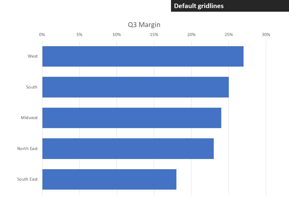
Add data labels and remove gridlines
By default vertical gridlines are added to the chart. The intention is to help the viewer determine the value of each bar by relating the end of the bar up to the horizontal axis values. It is much easier to add data labels that tell the viewer the values and then the gridlines are not needed.

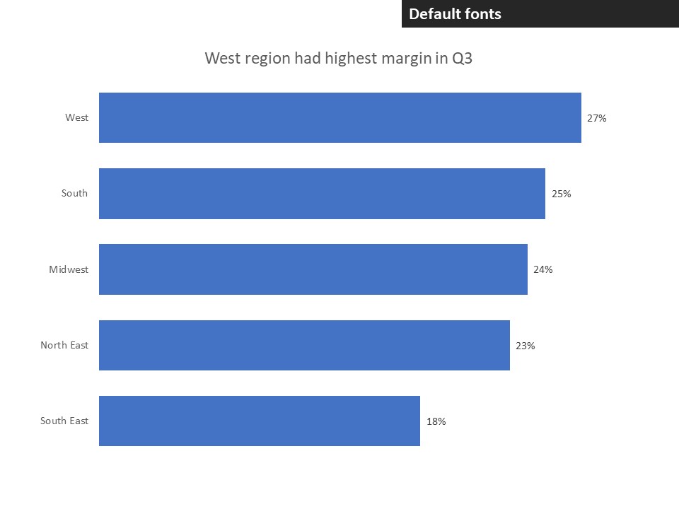
Clean up the axes
By default, the vertical axis includes a line that acts as the baseline for the bars. This line is not needed as the bars clearly all start at the same baseline. The horizontal axis by default has values spaced evenly between the minimum and maximum values. In many cases the addition of data labels makes the horizontal axis redundant and it can be removed.


Add text that explains the message
Without text that helps the viewer understand the message of the chart, you run the risk of misinterpretation. The chart title should explain the message clearly. If necessary, you can also add explanatory text that directs the audience to a particular place in the chart where the message is shown.


Increase font sizes so they are easy to read
The default font sizes for charts are often too small for the viewer to easily read. Increase the font sizes so that the text can be easily read and understood. The chart title should usually be the largest font (and can be in bold), the data labels and explanatory text next largest, and the axis labels can be slightly smaller.
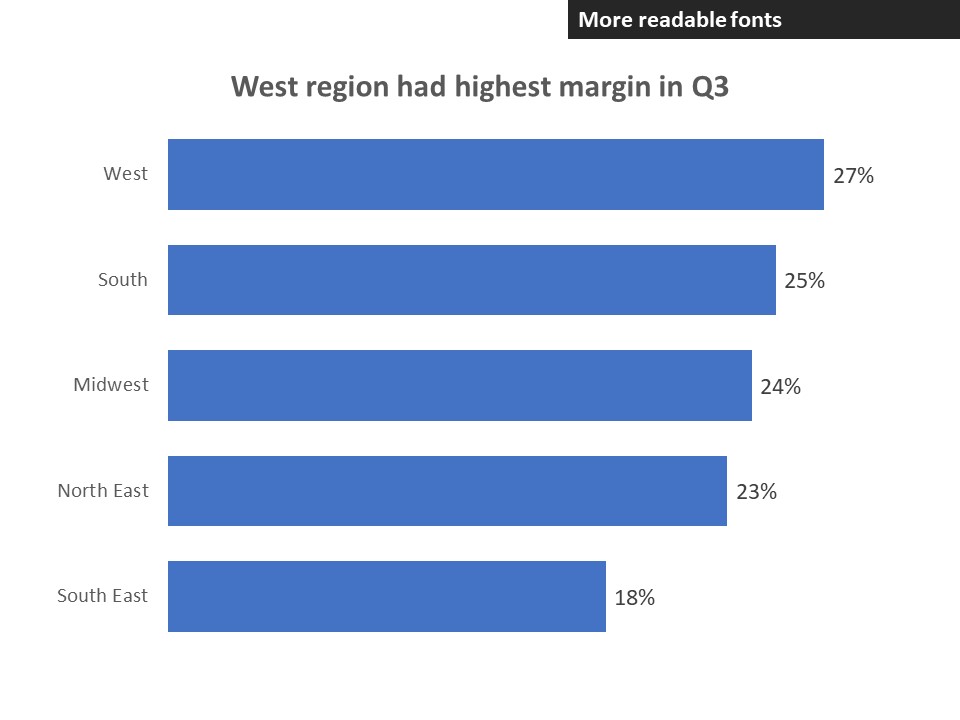
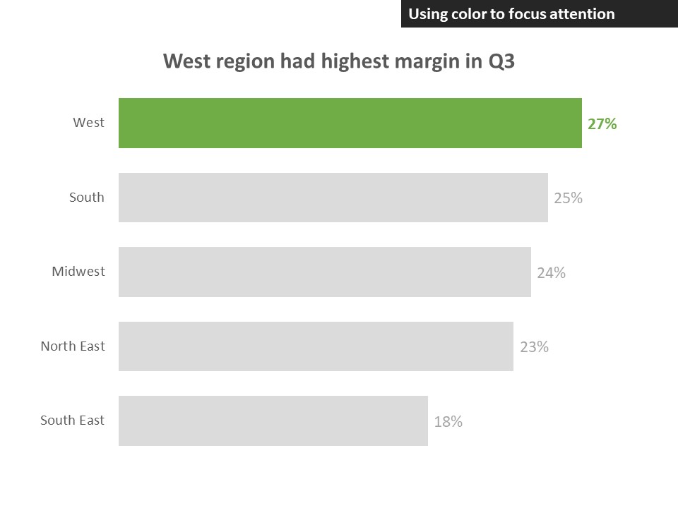
Use color to focus attention
By default all of the bars are the same color and all of the data labels are the same color. By making one bar and its data label stand out, you help the viewer to focus on the bar that is most important to the message. Since the message from bar charts is about ranking values, it is common that the most important bar will be the top or longest bar.
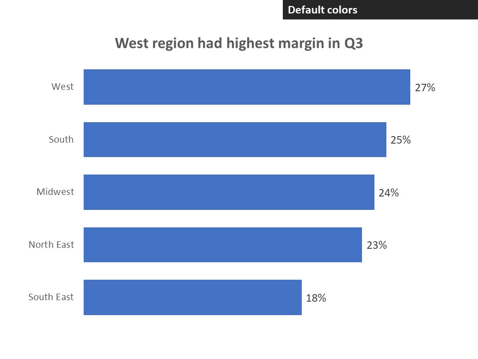
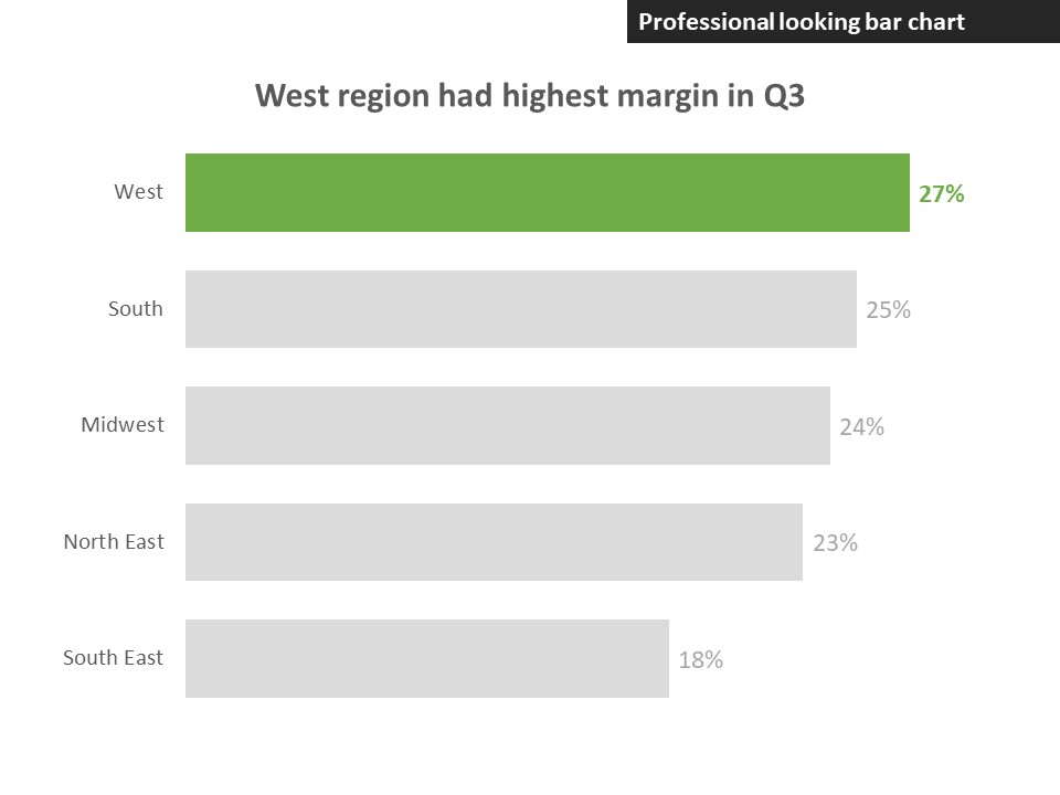
To create a professional looking bar chart is simple in Excel or PowerPoint. It just takes attention to the details of the chart and changing from the defaults to settings that make it easier for the viewer to quickly understand the message from the chart. The above steps took us from the default chart in Excel and PowerPoint, which looks like this:

to a professional looking bar chart:

Dave Paradi has over twenty-two years of experience delivering customized training workshops to help business professionals improve their presentations. He has written ten books and over 600 articles on the topic of effective presentations and his ideas have appeared in publications around the world. His focus is on helping corporate professionals visually communicate the messages in their data so they don’t overwhelm and confuse executives. Dave is one of fewer than ten people in North America recognized by Microsoft with the Most Valuable Professional Award for his contributions to the Excel, PowerPoint, and Teams communities. His articles and videos on virtual presenting have been viewed over 4.8 million times and liked over 17,000 times on YouTube.