In my book Select Effective Visuals, I explain that there are many different visuals to use when comparing values in a single data series. The most common visuals are the column graph and the bar chart. They look like each other, just rotated 90 degrees. Does that mean that presenters can choose either one and it will be just as easy for the audience to understand the message? I don’t think so.
In my experience I have found that there are two scenarios where a column graph communicates the message better and one scenario where a bar chart works better. The bar chart may also be helpful in dealing with one exception to the use of column graphs. Let’s look first at the column graph scenarios and the exception to keep in mind.
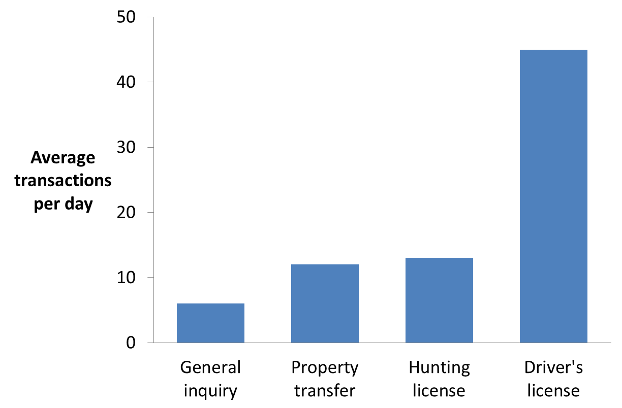
Scenario 1: The message is showing the rank of values from smallest to largest in order to focus on the largest value items
In this scenario, a column graph works best. It shows columns that grow from smallest on the left to largest on the right. Some examples of this would include:
- Showing regions ranked by sales last month to show which regions performed the best
- Showing call center call volumes to show which centers were the busiest
- Showing manufacturing plant efficiency scores to show which plants were most efficient last week
Here is an example of a column graph showing a ranking from smallest to largest.
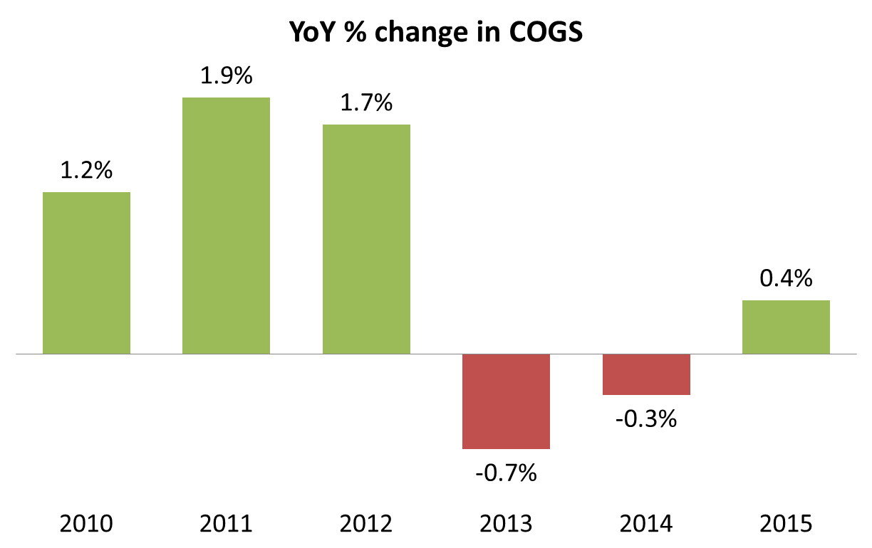
Scenario 2: The message is to compare values between items that have a specific sequence
A column graph works best for this scenario. In this scenario, the order of the values is determined not by rank, but by another criteria that is typically used to sequence the items. This could be a geographic sequence, a time sequence, or another grouping that the audience would expect to see used to order the items from left to right on the graph. Some examples of this would include:
- Showing inventory levels in warehouses from west to east
- Showing the increase or decrease in market share each quarter over the last two years (some values may be negative)
- Showing data organized in a histogram grouping
Here is an example of a column graph showing the sequence of values over time.
If you want to create a professional looking column graph instead of the default graph, follow the 7 steps in this article.
Exception to Scenario 1 & 2: Long category labels
Where column graphs get hard to understand is when the labels on the horizontal axis are long and they get cut off or placed at an angle by Excel or PowerPoint. When the audience has trouble figuring out what each column represents, your message gets lost. In these situations, you may want to consider using a bar chart. It allows for much longer label text because the labels are above each other, not beside each other. Here is an example of a column graph with long labels and the bar chart that could be used instead.
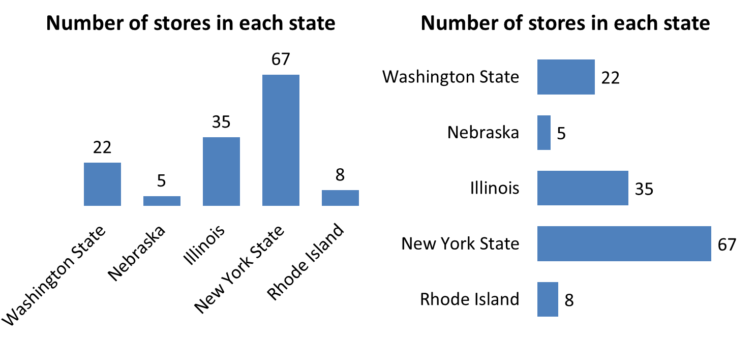
If you want to control the amount of space available for the labels in a bar chart, consider the technique in this article and video on bar charts with long category labels.
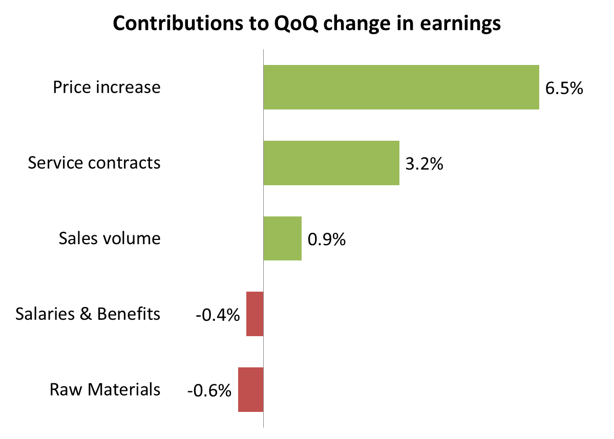
Scenario 3: The message is showing the rank of values from largest to smallest in order to focus on the largest value items
A bar chart works best in this scenario. It shows the values from largest at the top to smallest at the bottom. Some examples of this would include:
- Survey results showing the most popular to least popular answer
- Showing the breakdown of the total cost of a piece of equipment from the component that represents the highest percentage of cost to the component that represents the lowest percentage of cost
- Showing the departments that contributed to a change in earnings ranked from most positive contribution to most negative contribution
Here is an example of a bar chart showing the components that contributed to a change in earnings.
If you want to create a professional looking bar chart instead of the default graph, follow the 8 steps in this article.
When you are comparing values in a single data series and are considering a column graph or bar chart, use the decision tree below and the descriptions of the scenarios above to help decide which visual will work best for your message.


Dave Paradi has over twenty-two years of experience delivering customized training workshops to help business professionals improve their presentations. He has written ten books and over 600 articles on the topic of effective presentations and his ideas have appeared in publications around the world. His focus is on helping corporate professionals visually communicate the messages in their data so they don’t overwhelm and confuse executives. Dave is one of fewer than ten people in North America recognized by Microsoft with the Most Valuable Professional Award for his contributions to the Excel, PowerPoint, and Teams communities. His articles and videos on virtual presenting have been viewed over 4.8 million times and liked over 17,000 times on YouTube.