You are familiar with data labels for Excel graphs, typically they are used for adding the values to columns or bars (part of my suggestions for making professional column or bar charts). Next level usage is to replace the legend in a line graph with series name labels on the end of each line (part of my suggestions for making professional line graphs). In this article we will take labels even further and explore how we can create totally custom labels for your Excel chart. There is also a video of these steps at the end of the article if you prefer that method of learning.
Starting data table
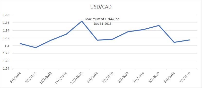
The example I will work with is the end-of-month CAD-USD exchange rate as reported by the Bank of Canada. Here’s the basic data.

I want to create a line graph and add a custom label that indicates the maximum rate and the date in an easier to read format. I don’t want to use a text box on the graph because I want the label to be able to change position and update the label text if the data changes. This will reduce the work we do next month when the data is updated.
Add a custom label column
To create the custom label I add a column to hold the label.

The formula in column C creates the custom label.
Using the CONCAT function to create the custom label
Here is the formula in cell C6:

Let’s look at each part of the formula.
The IF condition: The IF function is used so that there is only a label in the cell that corresponds to the maximum value. The condition argument tests the value for this row (B6) against the maximum value for all the cells in the data series ($B$5:$B$16). The maximum locks the cell range so that the formula can be copied to other rows without breaking it.
The custom label: If the cell in this row is the maximum value, the CONCAT function puts together text strings into a single text string (if your version of Excel does not have the CONCAT function, use the CONCATENATE function instead; the CONCAT function was introduced in Excel 2016). Each string is separated by a comma and character strings are surrounded by double quotes. The parts of the custom label are:
1) The string “Maximum of ” (notice the space after the f; any spaces must be added because no spacing is put between elements in this function),
2) The exchange rate value (here I have just used the value as input into the cell, but you can format this value using the TEXT function),
3) the text that separates the value and the date, again with spaces at the start and end of the string, and
4) the formatted date created using the TEXT function that allows you to create a text string from a number or date in a specified format (learn more about the different format codes here and see many examples in this article).
No label: If the value in the cell is not the maximum value, a null value is entered as the label value.
Adding the custom labels to the data series
You can create the standard line graph by selecting the data in cells A4 to B16 and creating a line graph. Notice that we do not select the custom label column when selecting the data to create the graph. Format the graph as you want (here are tips on making it professional looking).
Use the chart skittle (the “+” sign to the right of the chart) to select Data Labels and select More Options to display the Data Labels task pane. Check the Value From Cells checkbox and select the cells containing the custom labels, cells C5 to C16 in this example. It is important to select the entire range because the label can move based on the data. Uncheck the Value checkbox because the value is incorporated in our custom label. The dialog box will look like this.

You can select the Label Position that best suits your data, here I used the default Right position.
The chart now looks like this.
Benefits of formula based custom data labels
The easy way to add a custom data label would have been to just add a text box and type in our label. The challenge comes when the data is updated next month and the label should change position, change content, or both. This becomes a manual task we need to remember to do or else the chart is not correct.
By using a formula to create the label based on the data, when the data changes the label automatically updates. By using a formula to determine which data point the label should be associated with, the label will automatically move to the correct data point when the data changes. This gives us much more flexibility and ensures that the chart is labelled correctly when the data is updated without any manual work or need to remember to update a text box.
As much as possible, drive explanatory text in charts from the data table and use the CONCAT function to create the custom data labels that will best serve the viewer of the chart.
Video of these steps
Watch the video below to see me demonstrate these steps in Excel.

Dave Paradi has over twenty-two years of experience delivering customized training workshops to help business professionals improve their presentations. He has written ten books and over 600 articles on the topic of effective presentations and his ideas have appeared in publications around the world. His focus is on helping corporate professionals visually communicate the messages in their data so they don’t overwhelm and confuse executives. Dave is one of fewer than ten people in North America recognized by Microsoft with the Most Valuable Professional Award for his contributions to the Excel, PowerPoint, and Teams communities. His articles and videos on virtual presenting have been viewed over 4.8 million times and liked over 17,000 times on YouTube.