Often in my sessions for accountants or finance professionals I get asked how they can better present an income statement or profit & loss (P&L) statement. These statements show the income for the period and the different expenses, resulting in a bottom line net income. Financial presentations often include this statement as a spreadsheet or table of numbers on a slide that overwhelms the executives in the audience, leading to numerous questions.
How can this statement be presented more effectively? It can’t. Before you stop reading, hear me out. I don’t think the statement is what the executives want presented. Yes, they need to get the statement in printed or PDF format because it is an audit requirement. But that’s not what they need presented. They need to know what is behind the numbers on the statement. What issues or concerns do they need to act on in order to help the organization reach its goals.
The Revenue value is made up of the revenues from the different products and services the organization sells. Each product or service has a units sold and price. What is more interesting to the executives is how the total revenue was achieved. Was there a change in units sold? Did the price of a product or service change? Did the mix of products and services change from a previous period? What trends do the executives need to be aware of to make decisions that will keep the revenue value moving towards the goal for the year? These are the questions the executives need the answers to.
For each expense item, there are cost drivers. For Cost of Goods Sold, it may be raw materials, sub-contractors, labor, or other factors that drive cost. For salaries, it will be the number of employees and the salary & benefits for each employee. For utilities, it will be the units used and the per unit cost. Each expense item will have its own drivers of cost.
For each expense line, there will have been a budget set at the start of the year based on expectations in the organization. The executives want to understand why the actual expense value differs from the budget amount. This is usually explained based on the cost drivers for that item. The executives need to know if there are decisions required based on the reasons for the differences.
After each time period (month or quarter), a forecast is usually updated based on more knowledge of the situation and environment. Changes in the various factors for each contributor to the revenue and expense lines will explain the changes to the forecast. The executives need to understand why the changes have been made and what impact those changes will have on the ability of the organization to reach their goals. They may need to make decisions that will alter some of the plans to bring the financial results back in line with the original goals.
How can you make each of the key insights clear and easy to understand for the executives? Use visuals to communicate your message instead of spreadsheets on slides. Below are some visuals that can be used to communicate some of the common messages that result from analysis of items in the income statement. You can choose to view videos of some visuals and below the playlist are examples visuals. To see all the videos in the playlist, click on the hamburger (three lines) menu in the top left of the video.
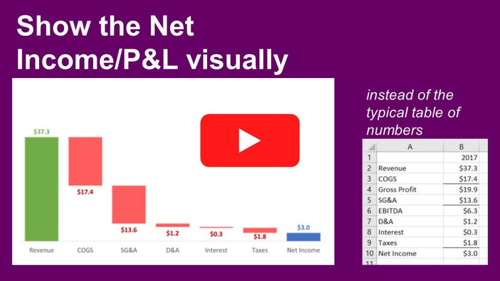
Show how revenue less expenses results in net income
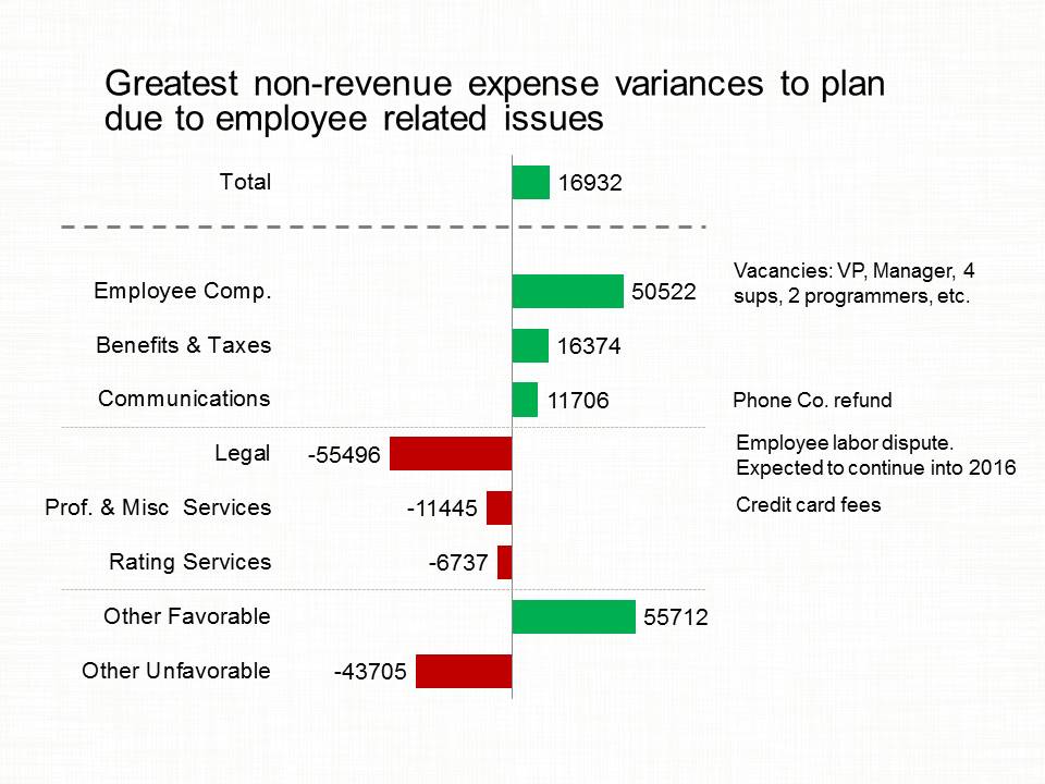
Show Budget and variance walk of expense categories
Show components that make up the total expenses
How to highlight the largest revenue segment or expense item
Compare values to a common goal
Bar chart to show key differences between actual and budgeted values
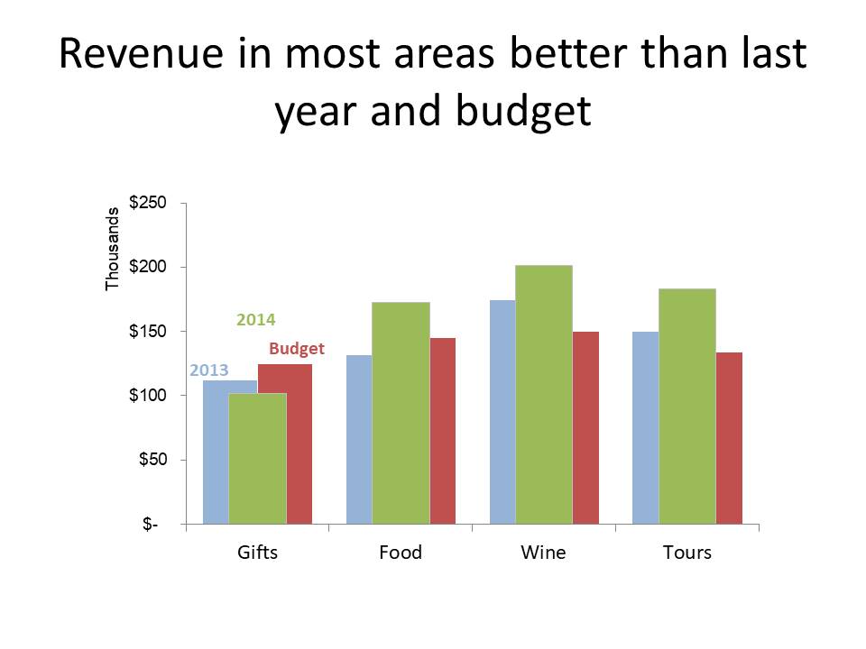
Multiple Width Overlapping Column Graph to show revenue performance compared to budget and previous year
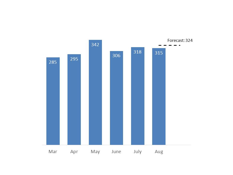
Column graph to show sales calls made over the last few months with a comparison of the last month to the latest forecast
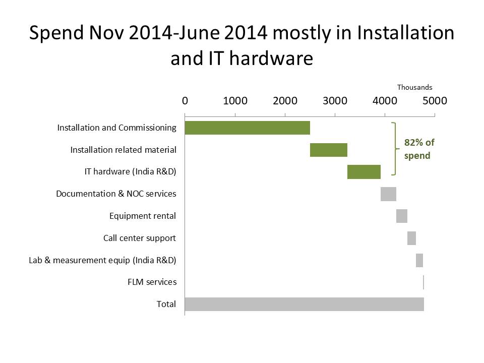
Steps to a total bar graph to show where most of the cost is
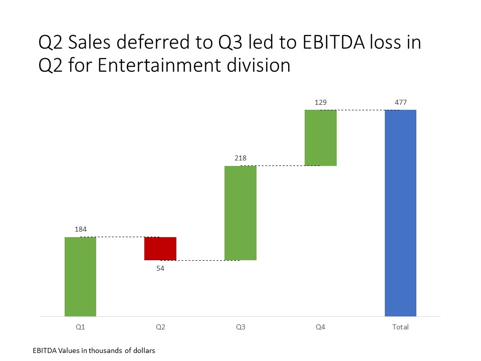
Steps to a total graph to show contributions of different quarters to full year EBITDA result
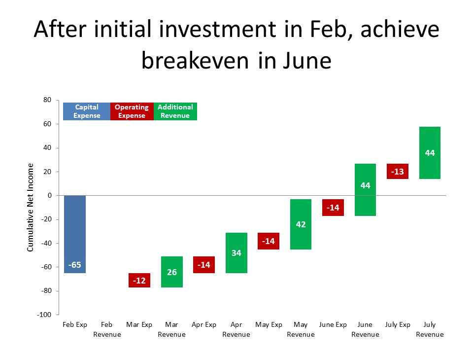
Steps to a total graph to show breakeven on initial investment
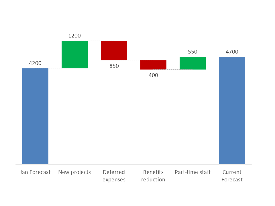
Waterfall graph to explain difference between previous and current forecast
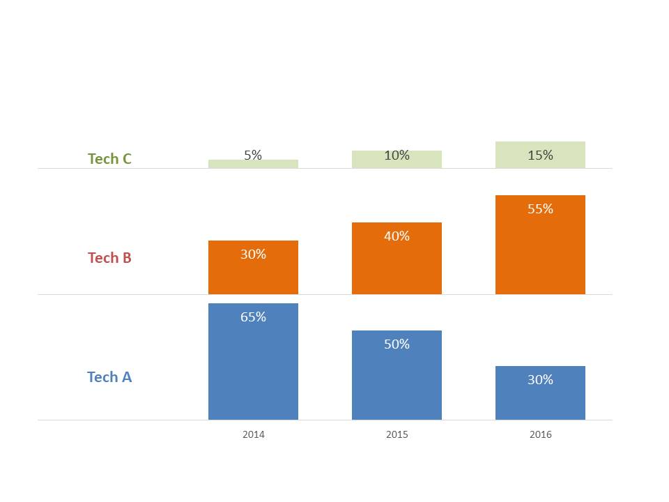
Small multiple column graphs to show change in mix of technologies sold over time
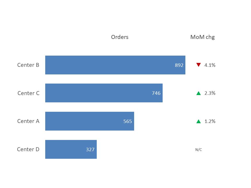
Bar graph to show numbers of orders processed in each center with change to previous month
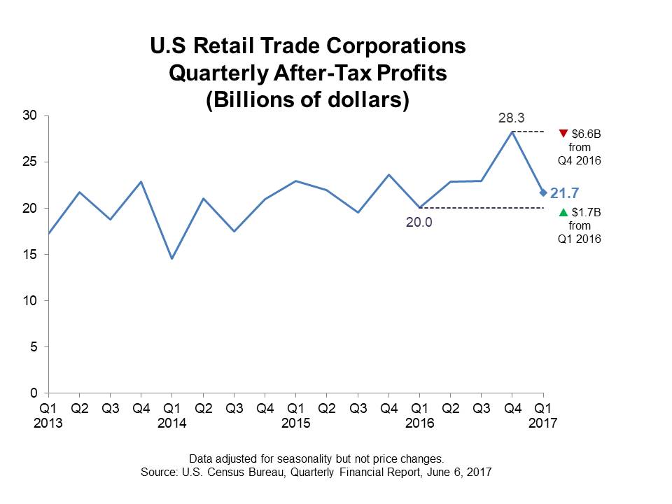
Line graph to show trend of sector profit with comparison of latest value to previous quarter and same quarter in previous year
(Note: All the visuals above were created in plain, out-of-the-box PowerPoint or Excel without any add-ins, plug-ins, VBA, or programming, so you can create effective visuals with the tools you already use.)
What executives need to know is what is behind each number in the income or profit & loss statement, not just the statement itself. Next time you are asked to present this type of statement, send it out in advance, don’t copy and paste it onto a slide. Explain that during the time you have with the executives, you want to explain the important items behind the numbers that the executives need to act on. By taking this approach, you will give the executives actionable insights while satisfying the regulatory requirement to distribute the income or P&L statement.
[If you are responsible for presenting financial statements, check out the other articles in this series on presenting a cash flow statement and presenting a balance sheet.]

Dave Paradi has over twenty-two years of experience delivering customized training workshops to help business professionals improve their presentations. He has written ten books and over 600 articles on the topic of effective presentations and his ideas have appeared in publications around the world. His focus is on helping corporate professionals visually communicate the messages in their data so they don’t overwhelm and confuse executives. Dave is one of fewer than ten people in North America recognized by Microsoft with the Most Valuable Professional Award for his contributions to the Excel, PowerPoint, and Teams communities. His articles and videos on virtual presenting have been viewed over 4.8 million times and liked over 17,000 times on YouTube.