The media makes a big deal of every product introduction presentation that Apple makes, such as the recent introduction of the newest Apple MacBook and Apple Watch. Presentation experts watch the sessions carefully and comment on how corporate presenters can learn from the slides Apple uses. These commentators suggest all presenters should use images and minimal text on slides, referring to this as “the Apple way”. They suggest you copy Apple’s black background, huge pictures, and bold text. I want to suggest that copying these slides is a waste of time for most corporate presenters.
Why? First, because the context is so totally different from what most presenters face every week. Very rarely do you have to give a major product launch presentation. Even Apple only does it a few times per year. Every week the typical corporate presenter gives updates on project or department performance, reports on analysis of data leading to a decision, or presents a customized solution to a prospect’s situation. And these presentations are very different from a product launch. These presentations require different types of visuals.
Second, corporate presenters have a company mandated template that they must use for every presentation. It usually has a white background, corporate colors, and a logo. It uses standard fonts that will work when the presentation file is shared. Corporate presenters don’t have the luxury of picking any design or font they want.
One of the biggest differences between a product launch presentation and a typical corporate presentation is in the amount of data that needs to be presented. A flashy product launch includes only high level product features, whereas a typical corporate presentation needs to include analysis and discussion of details. But, you might wonder, Apple reports its quarterly financial results and must use slides that include data in those presentations, since that is what almost every major public company does. Surely, corporate presenters can learn from those slides, even if they shouldn’t copy the product launch slides.
Again, Apple is different. You can see what Apple releases on its investor website at investor.apple.com. You won’t find a single slide there. All they release is a statement for the press and do an audio call that is recorded and available for two weeks after the live call. So Apple gives no insight into how a corporate presenter can format data “the Apple way”.
The long text of their statement makes the reader figure out what is going on and refer to previous documents to get context. Most of the media just report the results as written in the statement provided by Apple. Let me show you what I think corporate presenters can do with this financial data to make it as impactful as the slides you see in an Apple product launch.
The latest financial statement provides guidance for the upcoming second fiscal quarter. For revenue, it reports that they expect revenue to be between $52 and $55 billion. That is a nice number, but it gives the reader no idea of whether that is an increase or decrease from the same quarter in previous years. For that, we have to go to other documents on the Apple investor website to look up the figures. I did that work and created this visual.
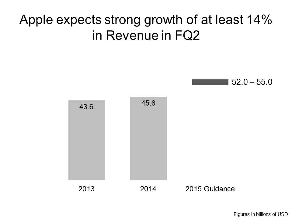
Creating the visual that shows the guidance in relation to previous performance allows us to write a meaningful headline. Now it is much easier to understand the context of the single range that was given.
Let’s look at another figure they release guidance on, Gross Margin. The latest guidance for fiscal Q2 is a range of 38.5% to 39.5%. Again, let’s look at a visual comparing this guidance range to previous results.
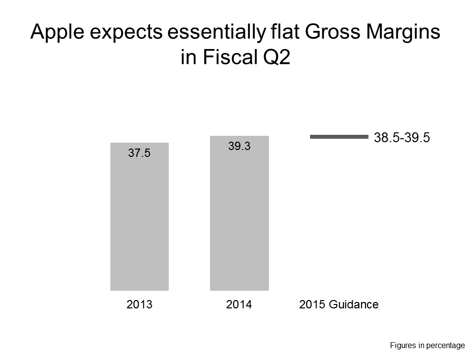
The visual again allows us to see that the guidance is in line with previous results, with little opportunity for a gain from 2014, and quite possibly a reduction in Gross Margin. The headline summarizes that for the viewer.
How are these visuals similar to what you see in an Apple product launch? They contain meaningful visuals and little text. How are they different? They report data using graphs, they don’t use pictures.
Visuals and meaningful headlines are what you should strive for when creating slides for your presentations. Don’t just blindly copy Apple product launch slides. Data related presentations require data based visuals, not fancy pictures.
Resources:
This SlideShare shows a six category decision model that helps select effective visuals for business presentations.
This article shows two types of visuals that are effective when presenting performance data.
This slide makeover shows a spreadsheet transformed into a meaningful graph.
Data source: Apple’s investor website, March 2015

Dave Paradi has over twenty-two years of experience delivering customized training workshops to help business professionals improve their presentations. He has written ten books and over 600 articles on the topic of effective presentations and his ideas have appeared in publications around the world. His focus is on helping corporate professionals visually communicate the messages in their data so they don’t overwhelm and confuse executives. Dave is one of fewer than ten people in North America recognized by Microsoft with the Most Valuable Professional Award for his contributions to the Excel, PowerPoint, and Teams communities. His articles and videos on virtual presenting have been viewed over 4.8 million times and liked over 17,000 times on YouTube.