A few months ago I delivered a webinar on turning spreadsheets into visuals because far too often presenters just copy their analysis from a spreadsheet onto a slide and think that the audience will figure it out somehow. Today’s insight comes from that webinar.
You can’t just copy dozens of numbers onto a slide. In my survey of audience members that see financial presentations, it was clear that people want you to explain what the numbers mean. They want the message to be visual, not a wall of numbers. In the webinar (full recording is available here) I covered ten messages you might be communicating from analysis done in a spreadsheet and how to make those messages visual.
In this article I want to share a couple of those messages that fall into the category of showing performance. Performance is determined by comparing current measured values to either past/projected values, or some standard that you are trying to achieve.
Let’s first look at comparing values to a standard. How would you know this is the message that you are trying to communicate? Look for words that indicate this message, such as “goal”, “target”, “above”, or “below”. You may have been asked a question such as “How are we doing against the goal?” When you are communicating performance by comparing to a standard, I find that using a graph that shows the values and a dashed line that shows the goal is an effective visual. Here is an example:
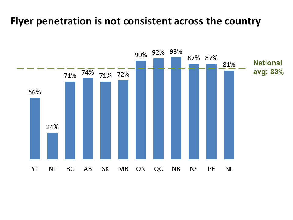
In the slide above, we started with a spreadsheet that required the audience to scan back and forth between columns to see whether the province being discussed was above or below the national average. By using a column graph with a dashed line, it is very easy for the audience to see the comparison between the value and the average.
The second performance message I want to share is about comparing current values to values in either a previous time period or a projection of what the values were expected to be. This is the message when you hear words or phrases such as “last year”, “same quarter last year”, “projection”, or “budget”. You may have been asked a question such as “How was performance in this category compared to what we thought it would be?” Here you are dealing with multiple series of data, one for the current values, and one for the comparison values. A visual that I find excellent for communicating this message is a multiple width overlapping column chart, such as this example:
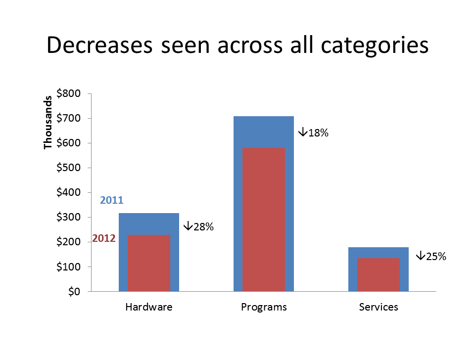
By placing the column indicating current performance in front of the column for the previous year’s performance, it makes it easy to see that this year has not been as good as last year.
With organizations measuring more results than ever before, analysis of performance is becoming more and more important. Remember what I have said in the past, “Spreadsheets are for calculation, not communication.” Don’t copy the spreadsheet onto the slide, use a visual to clearly communicate the message you want the audience to understand.

Dave Paradi has over twenty-two years of experience delivering customized training workshops to help business professionals improve their presentations. He has written ten books and over 600 articles on the topic of effective presentations and his ideas have appeared in publications around the world. His focus is on helping corporate professionals visually communicate the messages in their data so they don’t overwhelm and confuse executives. Dave is one of fewer than ten people in North America recognized by Microsoft with the Most Valuable Professional Award for his contributions to the Excel, PowerPoint, and Teams communities. His articles and videos on virtual presenting have been viewed over 4.8 million times and liked over 17,000 times on YouTube.