The default column, bar, and line graphs in PowerPoint or Excel have gridlines. When I teach hands-on techniques in my customized workshops I suggest that the gridlines be turned off in almost all cases. The basic principle is to remove any element of a graph that does not add to the understanding of the data (this article gives 7 steps to create a professional looking line graph). It is rare that the gridlines are useful for the audience.
One situation where I do suggest gridlines can be helpful for the audience is when your lines on a line graph have a slight up or down slope. In this case, it can be helpful for the audience to have a known horizontal line to compare the trends to. It can help them understand whether the trend of that data series is increasing or decreasing. Here is an example of where the gridlines help.
When you do add gridlines, make sure they do not compete visually with the data series. Use a light muted color for the gridlines so they are visible, but not prominent. You may even make them dotted so they have a visual difference from the lines for the data series. Set the spacing using the major units setting so that there are only five to eight gridlines.
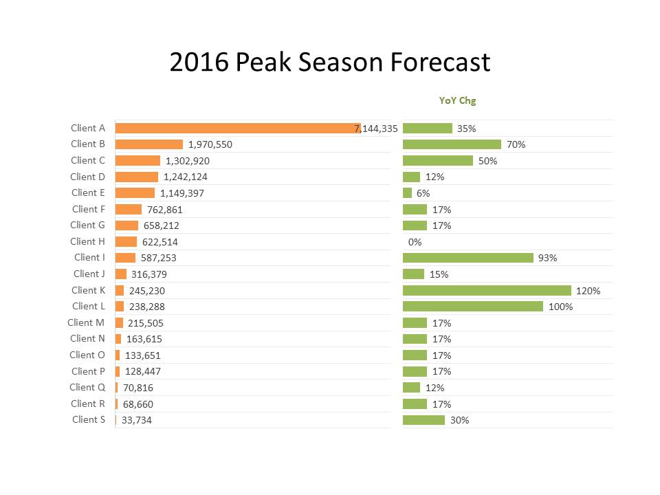
The other use for gridlines is to help align graphs side by side that represent related data. Here is an example based on a slide makeover from a recent workshop.
By adding gridlines between each row it helps you align the two graphs on the slide. It also helps the audience align the related data for each category. This is especially helpful if you have more than a few categories in the graphs.
How do I decide whether to use gridlines on a graph? I follow the guideline I use for all elements of a graph: Do they help the audience understand the message of the graph? Most of the time they don’t, so I remove them. In the two situations above, the gridlines help, so I make them a muted part of the graph allowing the data to still be the focus of the graph.

Dave Paradi has over twenty-two years of experience delivering customized training workshops to help business professionals improve their presentations. He has written ten books and over 600 articles on the topic of effective presentations and his ideas have appeared in publications around the world. His focus is on helping corporate professionals visually communicate the messages in their data so they don’t overwhelm and confuse executives. Dave is one of fewer than ten people in North America recognized by Microsoft with the Most Valuable Professional Award for his contributions to the Excel, PowerPoint, and Teams communities. His articles and videos on virtual presenting have been viewed over 4.8 million times and liked over 17,000 times on YouTube.


