A few dataviz experts tweeted about a great new article by Lisa Charlotte Muth called “10 ways to use fewer colors in your data visualizations”. I highly recommend you read it because it is very well written and has great ideas.
If you create data visuals in Excel like many business professionals do, let me add some thoughts on how you can apply some of the ideas from the article. I suggest you use color in charts strategically, which often does reduce the number of colors in the chart. It is about using color to help communicate the key message.
Use a second color in a standard column or bar chart only to focus on the important value(s)
The first suggestion in the article is that you don’t need different colors for every column or bar in a standard chart. I totally agree. This happens sometimes if you don’t set up your data properly in Excel and it thinks the data are all different series as opposed to different values in the same series.
Where using a second color in a standard column or bar chart does help is when you use a bold color to draw attention to one or more values. The viewer’s eyes will naturally go to what is different, not what is the same. Use this to your advantage to draw their focus to the key values that illustrate your message.
In this video I show you how to build a column chart that emphasizes one (or more than one) column using color. It is built so that when the data is updated and the message changes, it is easy to adjust the data for the chart and all of the formatting changes automatically.
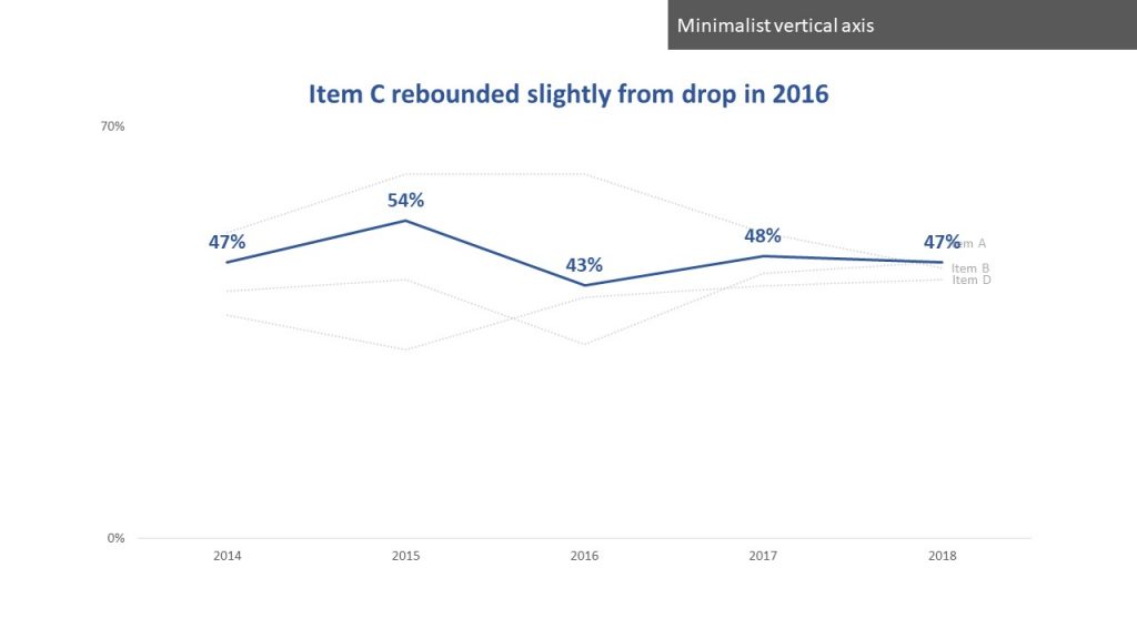
Use color for one line and grey for all the others
The third suggestion in the article is to use a muted grey for all the lines in a multi-line graph except for the one (or few) that are important. I’ve shown this technique in many workshops. Using color to focus attention in a line graph is one of the steps in this article on making one line stand out in a spaghetti of lines.
Direct label lines
The fourth suggestion in the article is another technique that I recommend in my workshops all the time. Directly labelling the lines instead of using a legend with the different line colors is one of the steps to clean up the default Excel line graph in this video.
Use an “All Others” category for less important values
I wrote an article advocating the same approach as the fifth suggestion in the article. When there are some smaller values that are not important to the key message, group them into an “All Others” category. It allows the viewer to focus on the important values in the chart and reduces the number of different colors in the graph. In a recent session with a repeat client I saw how they used this exact approach in one of their graphs. It was great to see how well this suggestion really works in a business setting.
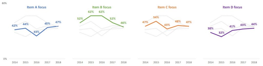
Explore small multiples graphs
The eighth suggestion is one I show in courses and almost always amazes people. By splitting a single line graph with multiple lines into multiple small graphs, each containing one line, it makes it much easier to understand. This is a technique I show in almost every course that includes creating Excel charts. I show how to use one graph to create the multiple graphs so that everything is perfectly aligned and has the same axis so comparisons are valid. I show an example of this type of small multiple line graph at the bottom of my article above on making one line stand out in a spaghetti of lines.
Change marker or line formatting
The second last suggestion in the article is to change other characteristics of the chart, such as the marker shape or line style for a line graph, instead of using colors to distinguish the different data series. This is something I see from my clients who create scientific research graphs. It is common there to distinguish series by using different shapes for the markers on lines. Since these charts are created by other programs or devices, I focus in my session on how to add direct labels instead of legends to make it easier for the viewer to tell which line is which.
Strategically use color in charts
Don’t accept the Excel defaults for color or many other formatting choices that the default graphs have. Make strategic choices so your graphs are clear, understood, and acted upon.

Dave Paradi has over twenty-two years of experience delivering customized training workshops to help business professionals improve their presentations. He has written ten books and over 600 articles on the topic of effective presentations and his ideas have appeared in publications around the world. His focus is on helping corporate professionals visually communicate the messages in their data so they don’t overwhelm and confuse executives. Dave is one of fewer than ten people in North America recognized by Microsoft with the Most Valuable Professional Award for his contributions to the Excel, PowerPoint, and Teams communities. His articles and videos on virtual presenting have been viewed over 4.8 million times and liked over 17,000 times on YouTube.