In my surveys of what annoys audience members about PowerPoint, information overload is a big issue. It is not just the slides that are filled with paragraphs of text or the spreadsheets copied onto slides. Visuals can also overload the audience and leave them confused.
One of the examples I see often is a graph that has a lot of columns or bars. In a recent workshop I had an example of a column graph with 72 columns! With so much to look at no wonder the audience couldn’t figure it out. Why does this happen and what can we do about it?
I think graph overload happens for the same reason that number overload happens when a spreadsheet is copied on a slide: we have all the data, so why not include it all for the audience. The mistake is thinking that the audience wants to see all the data. What they want is to understand the key messages from your analysis so they can make the decisions that are needed.
If you think the audience may want to see all the data, make it available outside the presentation. In my latest book GPS for Presentations, I suggest making it available before the presentation in a pre-read document, or after the presentation by sending a link to a file on SharePoint or a network drive.
What I suggest you do in the presentation is use an All Others category to consolidate all the data that is not important to the point. Here is a graph that illustrates visual overload based on one from a recent customized workshop.
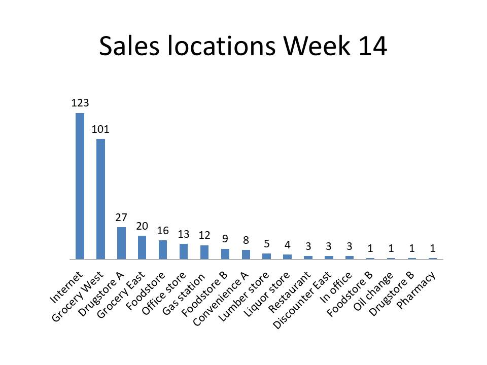
Our data collection systems can provide a lot of data. If we just dump all the data into a graph, we end up with these overloaded visuals. Not only are they confusing, but, like spreadsheets on slides, they invite questions about data that is not relevant to the important message.
What I suggest is that you consider consolidating any categories where the value is less than 10% of the largest (or average of the two largest) values in the data series. The aim is to get to eight or fewer data points to be shown in the graph. Use your judgement when consolidating so that no important categories are removed. The consolidated values will be shown as an All Others category. Here is what the above graph looks like when applying this approach.
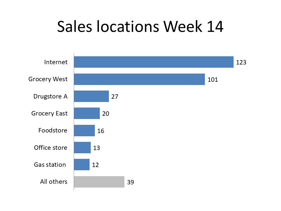
When using an All Others category, change the fill color to a muted color (grey in the above example) so that it is not as prominent as the data you want the audience to focus on. I also changed the graph to a bar chart so that the category labels are easier to read (this article gives suggestions on when to choose a column or bar graph).
By using consolidation and choice of color, the audience will be able to focus on the important data and the message we want them to understand. Try this the next time you have a data series with many categories.

Dave Paradi has over twenty-two years of experience delivering customized training workshops to help business professionals improve their presentations. He has written ten books and over 600 articles on the topic of effective presentations and his ideas have appeared in publications around the world. His focus is on helping corporate professionals visually communicate the messages in their data so they don’t overwhelm and confuse executives. Dave is one of fewer than ten people in North America recognized by Microsoft with the Most Valuable Professional Award for his contributions to the Excel, PowerPoint, and Teams communities. His articles and videos on virtual presenting have been viewed over 4.8 million times and liked over 17,000 times on YouTube.