It is not uncommon that to communicate a message you need to show two or three related data series. It is relatively easy to create a single graph that has all the data series shown. The challenge comes when you have values in the data series that are different by an order of magnitude or larger.
If you create a column graph with some values in the billions of dollars and some in dollar and cents, the smaller values won’t be seen at all because the columns will be barely visible lines beside the axis. In this situation, the solution is to scale one or more of the values so that they are all visible on a single graph.
In a recent article and video I addressed how to scale values to create a single graph like this.
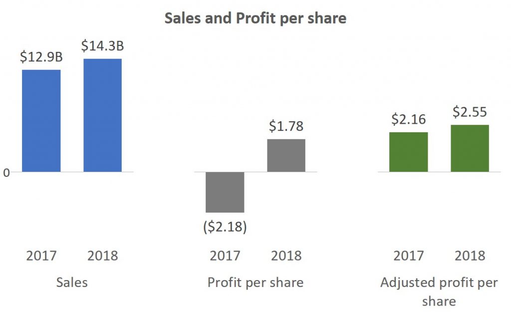
The article and video give detailed instructions on how to determine the scaling factors and how to use the feature in modern versions of Excel to add data labels from cells that are not graphed. These techniques work in both Excel and PowerPoint since these programs share the same charting engine.
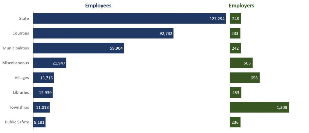
Scaling is also used when we want to create a single bar chart that looks like multiple bar charts. In this chart, the number of employees is much larger than the number of employers. So I used a simple scaling approach of multiplying the number of employers by thirty so that the bars were more visible. Here’s the graph I created.
The same scaling technique was used in one of my FinancialViz makeovers that had data series of population in millions of people and percentages.
If you are wondering how I made two bar charts in a single bar chart, it uses a stacked bar chart with an invisible segment. This is one of the advanced Excel chart techniques in my Excel Chart Skills 501 online course. If you want to take your Excel chart techniques to the next level and create advanced data visuals, check out this online course.
When you are faced with related data series having values that differ by an order of magnitude or more, use scaling and custom data labels to create a single graph that shows all of the values.

Dave Paradi has over twenty-two years of experience delivering customized training workshops to help business professionals improve their presentations. He has written ten books and over 600 articles on the topic of effective presentations and his ideas have appeared in publications around the world. His focus is on helping corporate professionals visually communicate the messages in their data so they don’t overwhelm and confuse executives. Dave is one of fewer than ten people in North America recognized by Microsoft with the Most Valuable Professional Award for his contributions to the Excel, PowerPoint, and Teams communities. His articles and videos on virtual presenting have been viewed over 4.8 million times and liked over 17,000 times on YouTube.