The challenge
If you have related column graphs, how do you line them up so the horizontal axis in each graph is aligned? If you’ve ever tried to position the graphs manually in Excel or PowerPoint, you know that it is impossible to do it by trying to drag the graphs into the right position.
If the values in the graphs are similar, you can create a single graph that has blank rows in the data table to put space between the different graphs. Since it is a single graph, there is only one horizontal axis and all the graphs will line up.
But what if the values in the graphs are different by orders of magnitude or measured in different units? Like this example from a quarterly financial analyst presentation: for the latest quarter, you want to show Sales (in $ billions), Margin (in %), and Adjusted profit per share (in $). To line up those three values in a single chart you need to scale the values, which is what this article (& accompanying video) is going to show you.
How scaling works
In order to create a single column graph where all the columns for the values can be easily seen, we need to transform each of the series into the same units and values that are in a reasonable range. The most common approach is to scale up smaller values to be in the range of the largest values.
To be able to show the actual values and units as data labels on the different columns, we will use the feature introduced in Excel 2013 that allows data labels to be from different cells than the ones used to create the columns. We can create custom data labels that include dollar signs, percentage signs, and abbreviations so it is most meaningful to the viewer.
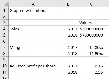
The actual values
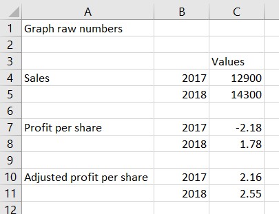
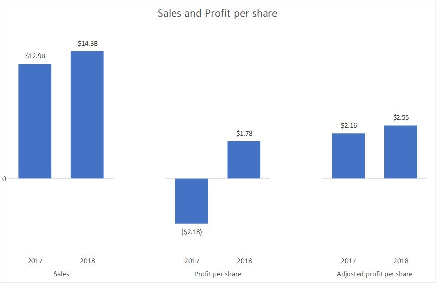
To demonstrate scaling I will use the example I cited above of a financial presentation that wants to show Sales, Margin, and Adjusted profit per share for the latest quarter compared to the same quarter in the previous year. Here is the data that is supplied.
Scaling the values
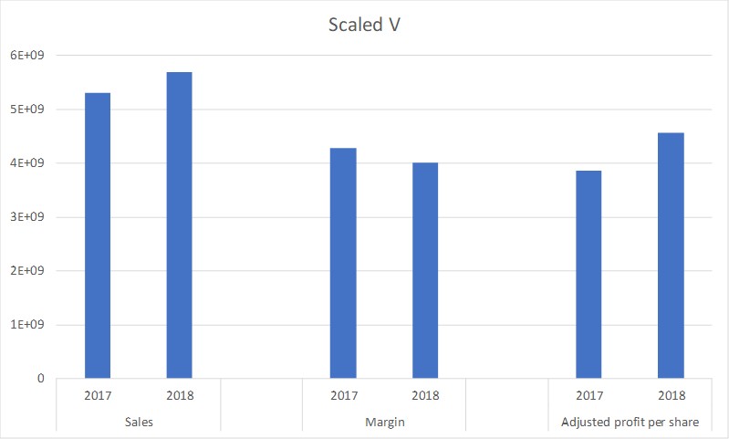
Because the Sales values are the largest, we will scale all of the series to be in the range of those values. Here is the scaled values data table.
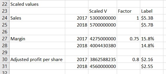
Cells A24 to B31 simply refer to the cells from the raw data for the series names and years. I kept the blank rows so that there is a gap between the graphs for each series.
Column C contains the scaled values. The formula in cell C27 is:
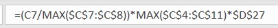
There are three parts to this formula.
The first part divides the value for this year in the series by the maximum of all values for this series. This gives us a proportion of the tallest column that will be shown for this series.
The second part finds the largest value from all series because we are scaling up to the largest values to show columns of similar size.
The third part includes a scaling factor in cell D27. The scaling factor is included because it gives us an easy way to adjust the height of the columns in a data series by changing just one factor. Depending on the values being represented, you may want to make a data series taller by using a scaling factor larger than 1 or make the columns shorter by using a scaling factor smaller than 1.
When we multiply these three parts we get the scaled value for this year in the series.
Column E is used to create the custom data labels that will be used in the graph. The formula for cell E25 is:
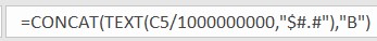
I am using the CONCAT function, which is the current function that will replace the CONCATENATE function. This function allows us to combine text strings and values into a single text string. If you want to format a number, you can use the TEXT function as I have done here. You can use the custom number formatting values to convert a number into dollars, percentage, etc. In this case because the number is so large I divided it by 1 billion and added the letter B on the end to create a compact but meaningful label to use in the graph.
For the other cells in column E I used similar formulas and formatted the values as either percentages or dollars with two decimal places.
Creating the graph
To create the graph, we select cells A23 to C31. Notice that the scaling factor and custom data label cells are not included when initially creating the graph. We insert a regular clustered column graph that will look like this.
Notice that by splitting the series names and years into two columns, Excel recognizes the two levels of the horizontal axis.
To format the graph we:
- Remove the gridlines
- Remove the vertical axis since the values there are not the values we want to show for the columns
- Remove the lines from the horizontal axis
- Make the columns wider
- Add a meaningful title
The graph now looks like this.
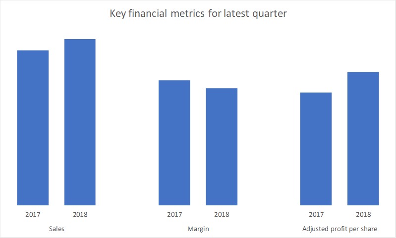
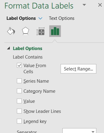
The final step is to add the data labels from cells E24 to E31. We select the columns and use the skittle to add Data Labels and use the More options selection to open the Format Data Labels task pane. In the Label Options section of the Label Options tab, we check the Value From Cells option and select cells E24 to E31. We uncheck the Value and Show Leader Lines boxes. We can use the default Outside End label position. The task pane will look like this.
The final graph now looks like this.

Advanced applications
The above example shows the basic scaling of values so that you can create a single graph for related data series. I want to use another example to illustrate three situations that go beyond basic scaling and what adjustments to the above methods are required.
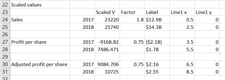
The example will use this set of data.
Situation 1: Related series
The two profit per share series are related and need to be scaled so they are consistent with each other, not just within each series. In this case, the first part of the formula for the scaled values divides each value for both of the series by the maximum values across both series. The scaling factor for both series is also set to be the same value. This ensures that the columns is both series are accurate when compared to each other. The formula used for cell C27 is.

Situation 2: Negative values
In this data the Profit per share in 2017 is negative. In the formatting of the custom data label the TEXT function needs to account for this and format the number in round brackets if the number is negative. This is accommodated by setting the custom number formatting in the TEXT function. The formula in cell E27 is.

Since at least one column will be below the axis, you will also need to move the horizontal axis labels to the Low position instead of the default Next to Axis position.
Situation 3: Need to show horizontal axis
When some columns are above the horizontal axis and some are below it may be helpful to include the horizontal axis. If you use the default line in the horizontal axis in Excel it will also add lines between the segments of the axis labels as well. We can create our own horizontal axes for each graph individually using a combination graph. Here is the data table used for the graph.
Columns F & G define a scatter with straight lines graph that creates horizontal axes by placing a line segment that extends from the left of each set of columns to the right of that set of columns. Column F values define the horizontal start and end of each segment and Column G has the values which are all zero. In a column graph the center of each column is on the whole number values such as 1, 2, 3, etc. when considering scatter graph horizontal values. By using X values of 0.5, 2.5, etc. we can extend the lines to the left and right of the columns. The graph looks like this.
You will notice that I have also added a data label of the value to the first point on this data series in order to make it clear that the columns all start from a base value of zero. This is optional and can be excluded if you don’t feel it is needed.
Conclusion
When you have related column graphs that you want to line up and the values are different in magnitude or measured in different units, use scaling and custom data labels to create a single graph that will always be aligned.

Dave Paradi has over twenty-two years of experience delivering customized training workshops to help business professionals improve their presentations. He has written ten books and over 600 articles on the topic of effective presentations and his ideas have appeared in publications around the world. His focus is on helping corporate professionals visually communicate the messages in their data so they don’t overwhelm and confuse executives. Dave is one of fewer than ten people in North America recognized by Microsoft with the Most Valuable Professional Award for his contributions to the Excel, PowerPoint, and Teams communities. His articles and videos on virtual presenting have been viewed over 4.8 million times and liked over 17,000 times on YouTube.