It is relatively easy to create a graph in Excel or PowerPoint. But is the default graph good enough for a business presentation? I don’t think so. Recently I wrote three articles on how to make professional looking graphs for the three most common types of graphs: column graphs, line graphs, and bar charts. I also recorded videos of the steps to transform the default graph into a professional looking graph.
Click on the images below to read the articles for each graph type. The videos are at the end of each article.
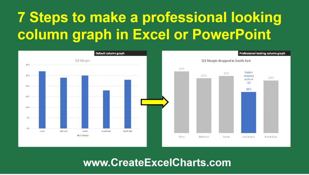
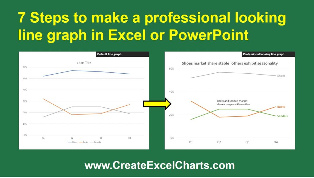

It takes a few minutes to transform the default graph into a professional looking one. The benefit of that time investment is much better understanding of the message by the viewers of the graph. Next time you create one of these graphs, take the time to follow the steps to make it a professional looking graph.

Dave Paradi has over twenty-two years of experience delivering customized training workshops to help business professionals improve their presentations. He has written ten books and over 600 articles on the topic of effective presentations and his ideas have appeared in publications around the world. His focus is on helping corporate professionals visually communicate the messages in their data so they don’t overwhelm and confuse executives. Dave is one of fewer than ten people in North America recognized by Microsoft with the Most Valuable Professional Award for his contributions to the Excel, PowerPoint, and Teams communities. His articles and videos on virtual presenting have been viewed over 4.8 million times and liked over 17,000 times on YouTube.