To see how well we are doing in the current year, we compare this year’s results to last year’s results and to the budget we set at the start of the year. Too often presenters show a spreadsheet of the numbers and expect the audience to figure out the result. My latest slide makeover video shows how you can use diverging bars to focus on the differences that are important to the audience.
The original slide is a typical table of numbers from a spreadsheet that has been copied onto a slide.
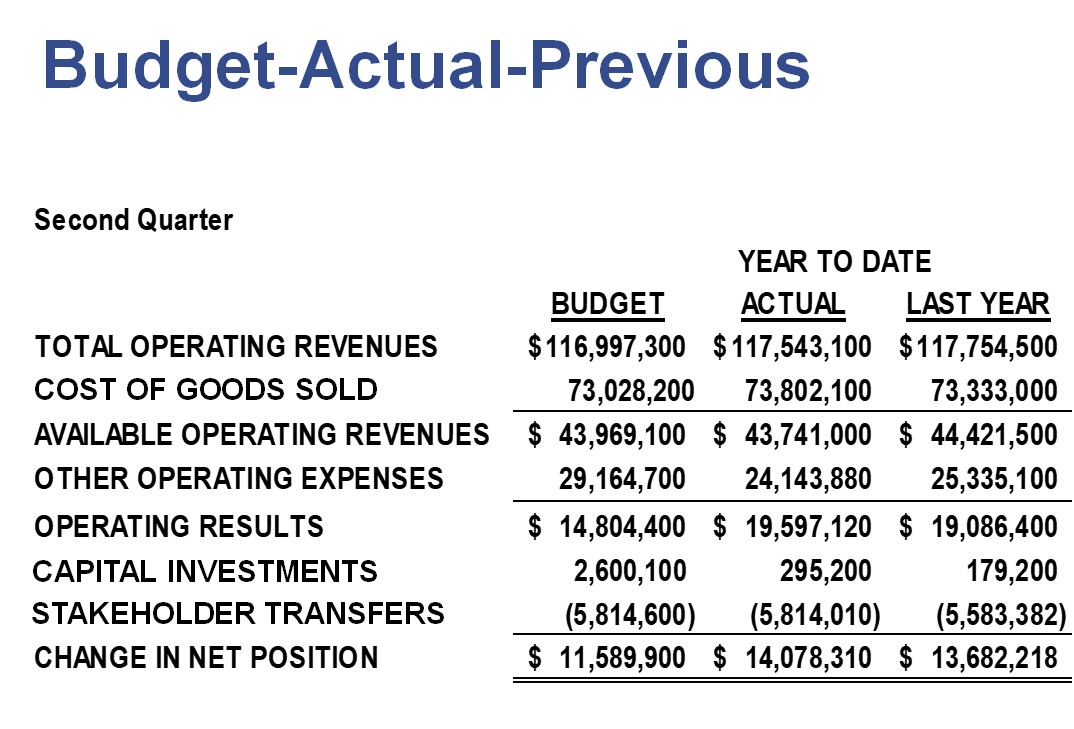
One of the biggest issues I have with this slide is one I see far too often. The message is the difference between the Actual column for this year and the column for last year and the budget. That tells us how we are doing compared to two important reference points. But by just putting the numbers on the slide, the audience is forced to do the math using nine digit numbers! Audiences won’t do math. The presenter’s job is to determine the message and make it clear to the audience.
In the makeover slide I make the differences in values clear and present them visually.
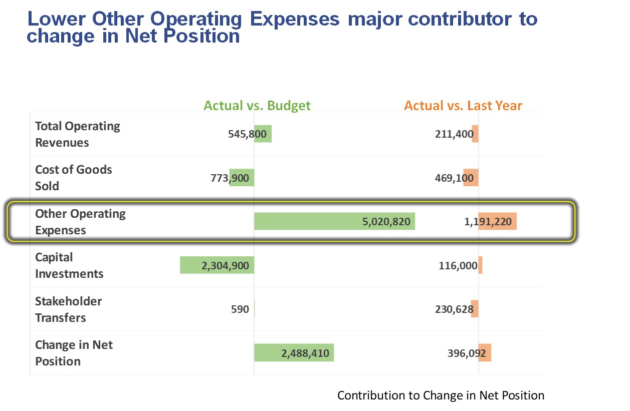
If the message is the difference between numbers, then just show the difference and leave the numbers to a backup document. I chose a diverging bar chart because it shows the differences either above or below the comparison value by using both sides of the axis. When the actual value is greater than the comparison value, the bar goes to the left of the axis. When the actual value is less than the comparison value, the bar goes to the right of the axis.
As you will see in the full video, I created the visual using a single graph instead of two graphs, have used labels creatively to make the text and axis lines line up properly, and added a callout to focus the attention of the audience. I have an article on creating a diverging bar chart using a stacked bar chart to have more control over the data label format and an article on using data labels instead of category labels when you need more control of the formatting.
When you want to communicate the difference between two values, just show the difference, not all the source values. Turn that difference into a visual by using a diverging bar chart that makes the differences easy to understand.

Dave Paradi has over twenty-two years of experience delivering customized training workshops to help business professionals improve their presentations. He has written ten books and over 600 articles on the topic of effective presentations and his ideas have appeared in publications around the world. His focus is on helping corporate professionals visually communicate the messages in their data so they don’t overwhelm and confuse executives. Dave is one of fewer than ten people in North America recognized by Microsoft with the Most Valuable Professional Award for his contributions to the Excel, PowerPoint, and Teams communities. His articles and videos on virtual presenting have been viewed over 4.8 million times and liked over 17,000 times on YouTube.