How do we create graphs with category labels that contain a lot of text? If you are comparing values to each other, a column graph can get tricky since Excel and PowerPoint will turn the text at an angle and cut off labels that are really long. This makes it very hard for the audience to interpret the graph. In my workshops I explain how a bar chart is preferable in these situations because it allows for more space for long category labels.
Recently data visualization expert Stephanie Evergreen wrote about this and reinforced what I suggest. One of her solutions for a really long label was to use a condensed font. If you have the freedom to choose fonts, this can work. But if you are in a corporate environment where you don’t have the option of choosing fonts for your slides or reports, this will not work.
It got me thinking of how we might be able to use the features of Excel to allow the user to control how much space is used for the category label. You can adjust the Plot Area in the graph to change the proportion of space allocated to labels vs. bars. One downside is that Excel will automatically word wrap some long labels, which may not be the look you want.
The technique I want to share today uses Excel’s ability to use the Category Name as the data label. Here is the finished graph based on the data Stephanie used in her article.

While it may look like a standard bar chart, it is not. The text that appears to be the category labels are actually data labels inside a data series that extends to the left of the axis line. Here are the cells used for the graph in Excel.
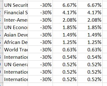
The graph is a stacked bar graph. The labels on the horizontal and vertical axes are turned off so we can add our own labeling.
The first data series is a negative value so it extends to the left of the axis and all values are the same so the graph has the same space for all labels. You can set the value to as large as you need it for the labels you have and you may need to experiment in order to find the right value. The fill color of this segment is set to No Fill and the data labels are set to be the Category Name, not the default of the Values, at the Inside End position. To make the labels all one line each, turn off the “Wrap text in shape” option in the data label Alignment options section (turning off word wrap is not an option for axis labels and is not available for data labels in Excel 2010 or earlier).
The second data series is the actual values for the bars. These bars can be formatted based on your organization’s template of colors. The third data series is a copy of the second data series. I use this segment in the stacked bar chart to contain the labels for the bars. I like labels on bar charts to be outside the end of the bars but a stacked bar chart does not allow this label position. To create the labels where I want them to be, I add another data series which I set to No Fill and add data labels at the Inside Base position so it looks like the typical bar chart data label outside the end of the bar. Depending on your values, you may need to adjust the maximum and minimum range of the horizontal axis to remove an extra space to the right of the bars that is created by this invisible extra data series.
I created a video below so you can see exactly how to do this in Excel.
If you find yourself with long category labels for a chart where you are comparing values to each other, consider whether the technique of using data labels instead of the default category labels will give your graph the look you want.

Dave Paradi has over twenty-two years of experience delivering customized training workshops to help business professionals improve their presentations. He has written ten books and over 600 articles on the topic of effective presentations and his ideas have appeared in publications around the world. His focus is on helping corporate professionals visually communicate the messages in their data so they don’t overwhelm and confuse executives. Dave is one of fewer than ten people in North America recognized by Microsoft with the Most Valuable Professional Award for his contributions to the Excel, PowerPoint, and Teams communities. His articles and videos on virtual presenting have been viewed over 4.8 million times and liked over 17,000 times on YouTube.