A couple of weeks ago I wrapped up my 2016 State of Financial Presentations survey. Thanks to everyone who participated and promoted it. Today I want to share the highlights of the results and what they mean for presenters in general. The full report of results is on my website.
In the first survey question I asked respondents to select the top three things that annoy them about financial presentations from a list of ten items. Here are the top four choices:
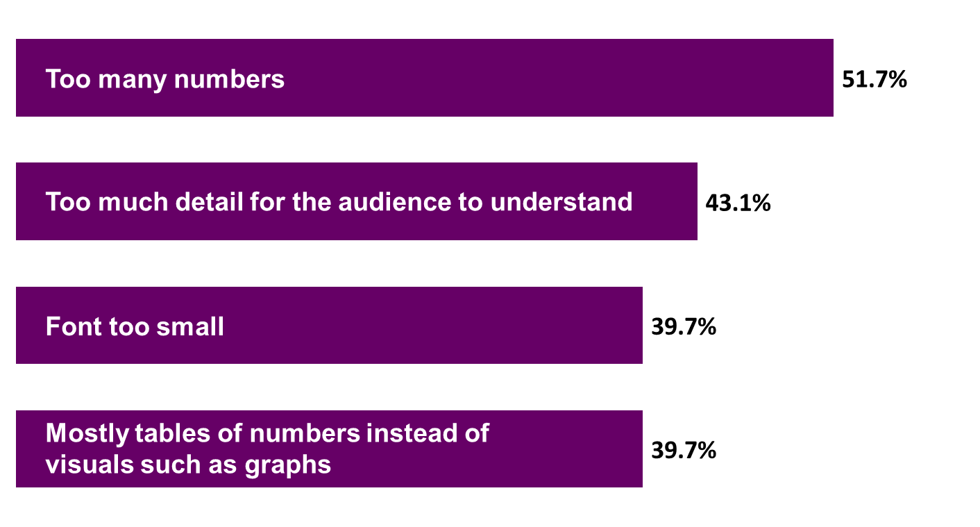
The results did not surprise me. In the general survey on PowerPoint presentations information overload comes out as the top issue in presentations today. In financial presentations, this shows up most often as spreadsheets on slides. But this is a lesson for all presenters as well. Whenever you have to present numbers, be careful about how many you use. The audience isn’t looking for every number, just those that are important to them.
I also asked respondents to share three words or phrases that they hear when people in their organization talk about financial presentations. As I did with a similar question in the broader survey, I used the list of terms to create a word cloud, where the size of the word is related to the frequency of the word in the list. Here is the word cloud:
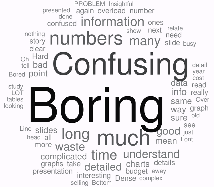
As in the general survey, boring comes out by far as the most frequent word used to describe financial presentations. The root cause is information overload, not just spreadsheets in financial presentations, but paragraphs of text in other presentations as well. When there is an overload of information, people get confused and tune out. By the end of the presentation, they say they are bored because it has been so long since they got anything of value from the presentation.
I then moved to asking respondents about what good presenters of financial information do well, and what advice they would have to improve financial presentations. Three themes emerged, and they can really apply to all presenters, not just those who present financial information.
First, respondents want presenters to be message driven, not data driven. In financial presentations, audiences don’t need to see every number you used. In other presentations, audiences don’t need to hear every step or every thought you considered. Audiences want to know the conclusion of your analysis and what message you need them to take away.
Second, respondents said they want the presentation to be relevant to this audience. Every audience is different. Select only the numbers or other information that is relevant to them and their roles. Another aspect of relevance is speaking the language they understand. I hear so often that presenters in all areas throw around acronyms and expect that everyone knows what they mean. Anyone outside your area probably gets lost trying to figure out what sounds like a foreign language. Use language this audience will understand.
Third, respondents said they want to see clear visuals. For financial presentations, this means graphs instead of spreadsheets. Any time you have to present numbers, consider how a graph could show the message better than a table of numbers. And with other topics, consider how visuals such as diagrams, timelines, or images would communicate more clearly than text.
You can read the full report on my website or you can view the visual document summarizing the key results on SlideShare. Financial presentations can be effective if presenters listen to what the respondents of the survey said and take action to improve their presentations.

Dave Paradi has over twenty-two years of experience delivering customized training workshops to help business professionals improve their presentations. He has written ten books and over 600 articles on the topic of effective presentations and his ideas have appeared in publications around the world. His focus is on helping corporate professionals visually communicate the messages in their data so they don’t overwhelm and confuse executives. Dave is one of fewer than ten people in North America recognized by Microsoft with the Most Valuable Professional Award for his contributions to the Excel, PowerPoint, and Teams communities. His articles and videos on virtual presenting have been viewed over 4.8 million times and liked over 17,000 times on YouTube.