The 2016 State of Financial Presentations Survey Report
Over the last few years I have focused my work with financial professionals and other business professionals who present a lot of data. Their presentations differ from a sales or educational presentation due to the data that is integral to the message. In March I decided to update my survey from 2014 on what audiences think of financial presentations. If financial presentations are to be more effective, we need to understand how they are perceived now, and what can be done to improve them based on audience feedback.
Financial presentations suffer from information overload
In my surveys of presentations in general, information overload has emerged over the past few surveys as the single biggest issue. It was no surprise that when more data gets involved, the issue is even more magnified. I gave respondents a choice of ten possible problems with financial presentations and asked them to select the three that bother them the most. Here are the top four items as selected by the 116 people who completed the survey.
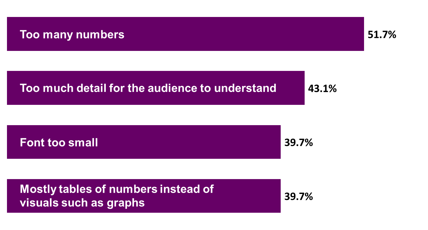
The top three issues relate to too much data being included in the presentation. Unfortunately, this isn’t a change from the previous survey, where the top three issues were also related to information overload. The fourth most common answer is related to how the data is shared. Audiences prefer visuals that are easy to understand, but they aren’t seeing them. They continue to see spreadsheet after spreadsheet of numbers.
I didn’t want to assume that I had covered all the possible issues in the list I presented, so I gave respondents a free form space to add any other issues that annoy them about financial presentations. After reading all of the responses, there are two issues that stood out.
First, the presenters focus on the numbers, not what the numbers mean. One participant put it well when they said, “Too often the material is the supporting detail and the conclusion is left to audience.” Presenters tend to report lots of numbers, but don’t take the next step to explain what actions the audience should take based on those numbers.
Second, audiences don’t like it when presenters use terms that they don’t understand. The financial world has a language that everyone who is in that world understands. The acronyms and terms get thrown around and presenters often assume that everyone must know what they mean. Audiences told me that when these terms are used, it is like the presenter is speaking a foreign language. They don’t understand what the presenter is saying and pretty soon they just tune out.
Audiences see financial presentations as boring and confusing
In order to better understand what people say about the financial presentations they see, I asked respondents to the survey to share three words or phrases that they hear when people talk about financial presentations. I took the long list and created a visual called a word cloud. The size of each word is related to the frequency of the word in the list. Here is the word cloud from the terms shared in the survey.

Two words stand out clearly in the group: boring and confusing. This is really not a surprise given what the respondents had already shared. When there is an overload of information and terms that are foreign, people get confused and tune out. By the end of the presentation, they say they are bored because it has been so long since they got anything of value from the presentation.
As you look at the next level of words in the cloud, you see words such as: much, numbers, long, many, time, information, and understand. All of these reinforce the overload issue that has already been clearly stated. Overload is the root cause of the issues in financial presentations today.
Effective financial presentations are: Message Driven, Relevant, and Clear
After asking what audience members did not like about financial presentations, I switched over to focus on what could be done to improve these presentations. I asked what good financial presenters did in hopes of discovering the keys to a good financial presentation. More than one response was along the lines of this, “I haven’t seen a great one yet…but I have hope that someday…” But many other respondents did share what they have seen worked well when presenting financial data.
I then asked what advice respondents would have for presenters of financial information to make the presentations more effective. The responses gave sage advice, and really tied into the responses from the previous question on what effective financial presenters did. Three themes emerged from the responses to these two questions and I have summarized them as: Message Driven, Relevant, and Clear.
One response put it so well, “Start with the message, not the data.” Financial presenters need to understand that the numbers are not the message. There is a message or story the numbers are telling. That is what the audience wants to hear. They want to see only the conclusion of the analysis and what actions they should be taking. They only want to see the numbers that support the message, not every number you used. Presenters of financial information need to be message driven, not data driven.
The presentation must also be relevant to this audience. Every audience is different, and they need to know what the numbers mean to them and their situation. They know there is a story behind the numbers that measure their area. They want to hear that story. And they want the story told using language they understand. None of the financial lingo and acronyms, just business language that they can relate to.
The third theme was around clarity. They want the presentation of data to be in clear, easy to understand graphs, not tables of numbers they have to figure out. They find callouts with explanation of key points to be very helpful because it aids in understanding the message the presenter is delivering. One thing they don’t want to see are the spreadsheets that tend to dominate financial presentations today. A small table of key figures is OK, but the “eye test” spreadsheets need to go.
Steps financial presenters can take to improve their presentations
If you want to improve your presentation of financial information, here are some steps you can take, along with articles or resources that will help you implement the changes in your own presentations.
- Think message first instead of numbers first
Creating more effective financial presentations requires a fundamental shift in thinking. You need to move from a focus on the numbers and your analysis, to a focus on the message the audience needs to hear. This shift will impact the analysis you do because you will be searching for the insights in the analysis instead of just generating larger and larger spreadsheets. When you go to present, you will start with planning your message and the key actions the audience should take.
Resource: This article and video on using the GPS approach to plan your presentation gives you a method you can follow. This is part of my RAPIDS approach for planning an effective presentation that is in my book “Present It So They Get It.”
- Only use the numbers that support your message
Another shift in thinking presenters of financial information need to make is to realize that the audience does not love the numbers as much as the presenter does. Presenters are often convinced that the audience wants to see every number, hence the spreadsheets on slides. Audiences have clearly said they only want to see the numbers that are relevant to the message being communicated. They want to know what those numbers mean to them and their situation. They want to understand the story behind the numbers, and they want the explanation in business language, not the terms and acronyms of finance. Keep these desires in mind as you create your presentation.
Resource: I speak about this topic often in my customized workshops where I show makeovers of slides the participants send me in advance. This article shares an example of how the numbers alone don’t tell the story.
- Use clear visuals instead of spreadsheets
It is so easy to just copy a spreadsheet on to a slide. But that is not what audiences want financial presenters to do. They want to see graphs that are clear and uncluttered. You can create the graphs in Excel or PowerPoint since they have the same robust graphing capabilities. Add callouts that direct the audience’s attention to the most important spot on the graph and provide an explanation of why the spot is so important.
Resource: This free e-book gives an overview of using Excel data in a PowerPoint presentation and this video course goes into detail on the three approaches and 12 methods you can use. To select the right graph for your message, use the structured approach in my book “Select Effective Visuals.”
Conclusion: Improving financial presentations has a bottom-line impact
Financial presentations are a necessity in every organization and will continue to be an important part of the business world. By improving these presentations using the advice based on audience feedback, we can make better decisions, reduce delays in approvals, and take advantage of opportunities identified through analysis. Start today and see your organization benefit in the future.
To download this report in PDF format, right-click on this link and save the file to your computer: The 2016 State of Financial Presentations Survey Report. To view the visual document that summarizes the key findings on SlideShare, click through the slides below:
Results of previous surveys:
To download the reports from the 2014 survey, right-click on this link and save the file to your computer: 2014 State of Financial Presentations Survey Results. Fellow PowerPoint MVP Chantal Bosse translated the 2014 report into French here.