Last fall at the Presentation Summit conference, I started to evolve my focus, even though I didn’t realize it at the time. I have come to realize that how I help presenters the best is to show them how to make the numbers in their presentations visual. To take the spreadsheets, tables, and overly complex graphs and turn them into visuals that clearly communicate the story behind the numbers. Today I want to share two initiatives I am launching in this area.
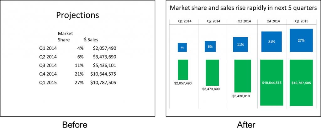
When I have been preparing for a client workshop and creating slide makeovers of their slides, I have found that the slides most in need of help were the ones talking about financial or operational results. Yes, the overly wordy paragraphs on the slides need help too, but the ones that presenters struggle the most with are the numbers. Here is an example based on a makeover I recently created. It shows a table from Excel transformed into a proportional shape comparison that visually shows the message.
Presenters think they need to be a graphic artist to come up with effective visuals. They have never been taught how to create visuals from numbers, either in their college/university education or the courses to earn a professional designation. I don’t believe you need graphics training. I believe any professional can learn to create effective visuals from the numbers in their presentation.
I am proof that it is possible. I have a Chemical Engineering undergrad degree and an MBA. I don’t have any design training or graphics background. I’ve figured out how professionals like us can create effective visuals and I am sharing my latest methods in two new ways.
First, I am launching a series of live, in-person workshops focused on teaching professionals how to create effective visuals instead of the spreadsheets that we see too often on slides today. The first two sessions are scheduled for April 10 in Toronto, ON and May 7 in Denver, CO. During this focused one-day workshop you will see a lot of different ways to visually present numbers and you will be hands-on on your laptop creating the visuals as I teach you. You will walk out with a library of visuals and the skills to create them. All the details and registration are here on my site. There is an early registration discount of $150 and there is a limit of 20 in each course, so I suggest you act quickly to reserve your spot.
I am also launching an online tool to help presenters decide which visuals will work for the specific message they are communicating. This is one of the roadblocks I hear from presenters all the time: they don’t have a library of visuals to draw from and know when they should use them. On the WhatVisualToUse.com site, you use a decision tree to reach a list of visuals that work for the message you want to communicate. You see thumbnail images of the visuals that will work. You select one, and you see full details on it, additional examples of its use in real presentations, and tips on creating and using the visual. All the details are on my site here. If you attend the in-person workshop, you will get 60 days of full access to this tool.
If you are a professional who presents financial or operational data, these two initiatives will make your work much easier. They address the two key challenges many professionals have told me prevents them from using effective visuals: 1) not having a library of visuals to draw from, and 2) not knowing how to create the visuals in PowerPoint. I look forward to seeing you at one of the in-person sessions and to hearing how you use the WhatVisualToUse.com site.

Dave Paradi has over twenty-two years of experience delivering customized training workshops to help business professionals improve their presentations. He has written ten books and over 600 articles on the topic of effective presentations and his ideas have appeared in publications around the world. His focus is on helping corporate professionals visually communicate the messages in their data so they don’t overwhelm and confuse executives. Dave is one of fewer than ten people in North America recognized by Microsoft with the Most Valuable Professional Award for his contributions to the Excel, PowerPoint, and Teams communities. His articles and videos on virtual presenting have been viewed over 4.8 million times and liked over 17,000 times on YouTube.

