Conditional formatting of Excel charts allows you to have the formatting of the chart update automatically based on the data values. A common approach is to use the values as the criteria as shown in the article and video on creating a conditional formatting column chart. In this article and video I want to show you how to have the formatting change in a bar chart where the criteria is not the values of the bars, but the month over month (MoM) change.
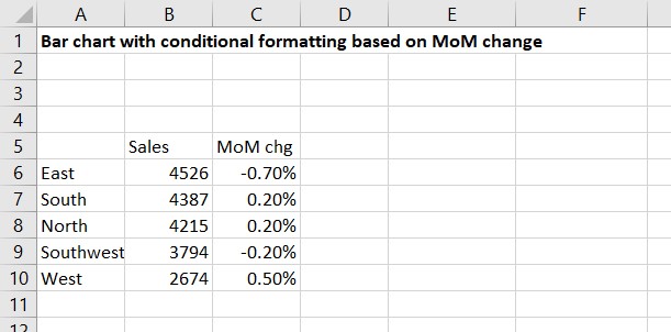
Source data table
The data table is usually from our analysis and contains two data series, one for the bars to be charted, and one for the criteria to decide the formatting. In this example, we will also use the MoM change to create a custom data label. Here is the data table from our analysis.
Graph data table
To create the chart, we need to create a table that reflects the data we will use for the chart. Here is the graph data table.
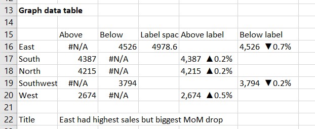
The criteria we are using to conditionally format the values is whether the MoM change is above zero or not. We create two data series for the bars, one for the bars that have a change above zero and one for the bars that have a change of zero or below. These are the Above and Below series in the table. The cells use a formula to determine whether they will contain a value or whether they will contain the #N/A value. The formula for cell B16 is =IF(C6>0,B6,NA()). The reason the NA() function is used to create the #N/A value is that this error value is not graphed and will not show up in the chart. The formulas for these two data series serve to separate the values from the source data into two series that can each be formatted and will update as the values change each month.
I have added a third data series, the Label spacer series in column D. It only contains a single value in cell D16 that is calculated using the formula =MAX(B6:B10)*1.1. The value is 10% more than the maximum value to be graphed. This series will be invisible and is included to give enough space to the right of the bars for the custom labels which are longer than the standard label width that Excel gives by default. A formula is used so that if the data changes the space on the chart will change.
Columns E and F are the custom labels that will be used beside each bar. The formula for cell F16 is:

The IF function tests to see if the change value is less than or equal to zero. If true, then the custom label is created using the CONCAT function that adds text strings together to create a single text string (learn more in this article and video). The first text string is the Sales value formatted to have comma separators. After a space, the UNICHAR function is used to create a filled downward triangle character (code 9660 is a downward triangle and code 9650 is a filled upward triangle). The last part of the custom label is the change percentage formatted for one decimal place (because the change is negative in this example, the ABS function is used to remove the minus sign as the filled downward triangle indicates a negative change). If the condition at the start of the IF statement is not true, a null is placed in the cell. These formulas will only place custom labels in the rows where the bar is also meeting this criteria.
Cell B22 contains the chart title. By referencing a cell instead of typing in the chart title, updating is easier because once the cell is updated, the chart title updates automatically.
Creating the chart
To create the chart we start by selecting cells A15 to D20. Notice that the cells containing the custom labels are not selected when first creating the chart. Add a 2-D clustered bar chart. It will look like this.

Initial formatting
The initial formatting cleans up the chart and gets it ready for the labels. Start by reversing the order of the bars. Select the vertical axis and press Ctrl+1 to make the Format Axis task pane appear. In the Axis Options section, check the “Categories in reverse order” checkbox.
Click on any bar and press Ctrl+1 to make the Format Data Series task pane appear if it is not already showing. In the Series Options section, set the Gap Width to 50% to give the bars more presence and set the Series Overlap to 100%.
Use the chart skittle (the “+” sign to the right of the chart) to remove the legend and gridlines. The graph will now look like this.

Adjust order of overlapping bars
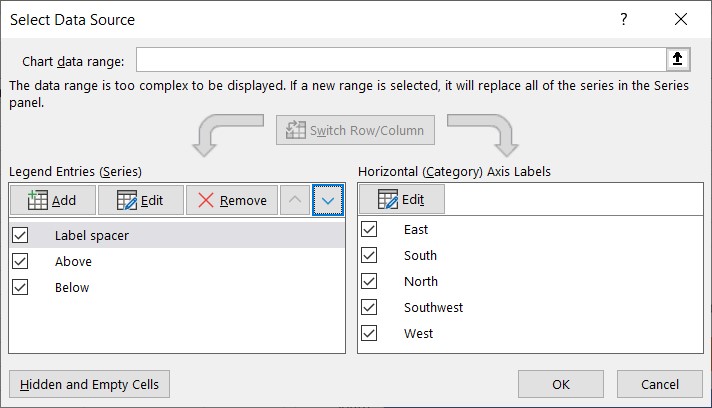
The bar for the East region is covered up by the bar I added for the Label spacer. The Label spacer bar needs to be moved behind the East bar and set to be invisible. Click on the Select Data button on the Chart Design ribbon to open the Select Data Source dialog box. In the list of Series, select the Label spacer series and use the arrows to move it to the top of the list (this places it behind all other series on the chart).
Click on the Label spacer bar and on the Chart Format ribbon set the Shape Fill to No Fill. This makes the bar disappear on the chart.
Add the custom data labels
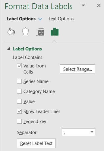
Select the Above series by clicking on one of the bars in the series (in this example I clicked on the bar for the South region). Use the chart skittle to select Data Labels and select More Options to display the Data Labels task pane. Check the Value From Cells checkbox and select the cells containing the custom labels for this series, cells E16 to E20 in this example. It is important to select the entire range because the label can move based on the data. Uncheck the Value checkbox because the value is incorporated in our custom label. The dialog box will look like this.
Keep the default Outside End label position. Use the font color tool on the Home ribbon to set the font color of the label to the same as the bars for this data series. In this example I chose to make the Above series bars a muted grey to focus better on the regions where sales dropped since last month so I set the font color to grey as well. You can also make the text bold if you want.
Use the same approach to add the labels to the Below data series from cells F16 to F20. The chart will now look like this.
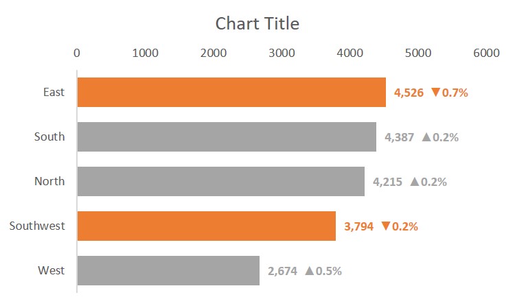
If you want, you can now remove the horizontal axis as the values are shown in the data labels.
Add the chart title
The final step is to add the chart title from cell B22. Click in the Chart Title box on the chart. Do not type in this box. Click in the formula bar above the sheet and type =Sheet1!B22 (include the sheet name in the reference to ensure no errors) and press the Enter key.
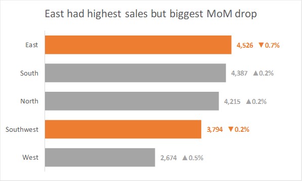
The chart title now shows the text in that cell. If the text in the cell is changed, the chart title will change. The final chart looks like this.
Benefits of conditional formatting using this method
Using the multiple data series, invisible bar, and custom data labels created by formulas gives us much more flexibility when the chart needs to be updated next month with new data. Almost all the work will be done by the formulas with only the new chart title needing to be entered based on the message from the new data and analysis.
Video of these steps
Watch the video below to see me demonstrate these steps in Excel.

Dave Paradi has over twenty-two years of experience delivering customized training workshops to help business professionals improve their presentations. He has written ten books and over 600 articles on the topic of effective presentations and his ideas have appeared in publications around the world. His focus is on helping corporate professionals visually communicate the messages in their data so they don’t overwhelm and confuse executives. Dave is one of fewer than ten people in North America recognized by Microsoft with the Most Valuable Professional Award for his contributions to the Excel, PowerPoint, and Teams communities. His articles and videos on virtual presenting have been viewed over 4.8 million times and liked over 17,000 times on YouTube.