Conditional formatting is a very popular feature of Excel and is usually used to shade cells with different colors based on criteria that the user defines. We can apply the idea of conditional formatting to column charts by using multiple data series because the Excel feature applies only to cells, not charts.
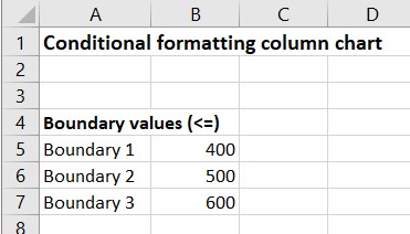
Define boundary values
The first step in creating a conditional formatting column chart is to define the segments that will give rise to the different colors. To do so we can define boundary values that break up the data values into segments. When defining boundary values, take into account if you want the boundaries to include or exclude the boundary value. In this example, I have defined four segments by defining three boundaries that will include the boundary value.
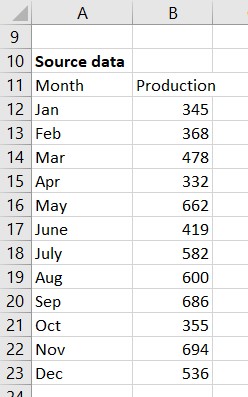
Source data
The source data likely comes from another data source or our analysis. Here is an example of some source data for monthly production values.
Graph data table
The conditional formatting column chart will use multiple data series, one for each segment that we want shown. In this example I want four segments, so the chart data table will define four data series.
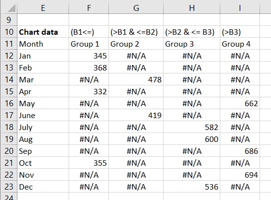
The cells in a data series column are filled with the production value if the value falls into that segment or filled with the #N/A error value if the value does not fall in that segment. The #N/A error value is used because columns with this value do not appear on a chart.
The data series Group 1 is the first segment and is for those values that are less than or equal to the first boundary value. The formula for cell F12 is =IF($B12<=$B$5,$B12,NA()). The IF function tests the value in this row to see if it is less than or equal to the first boundary value. If it is, then the production value is put in this cell because it fits in the first segment. If not, the NA function is used to enter the #N/A error value in this cell.
Data series Group 2 and Group 3 are for the second and third segments that are between two of the boundary values. The formula for cell G12 is =IF(AND($B12>$B$5,$B12<=$B$6),$B12,NA()). The IF function tests the value against two boundary values using the AND function. If the value is greater than the first boundary and less than or equal to the second boundary, the production value is put into this cell because it fits in the second segment. If not, the NA function is used to enter the #N/A error value in this cell. The formula can be adjusted based on which of the boundary values is included in the segment.
Data series Group 4 are for those values above the last boundary value. The formula in cell I12 is =IF($B12>$B$7,$B12,NA()). The IF function tests the value to see if it is larger than the last boundary value. If the value is greater, the production value is put into this cell because it fits in the last segment. If not, the NA function is used to enter the #N/A error value in this cell.
For any row in the graph data table, only one of the data series will have a value and the rest of the series will have the #N/A error value.
In this example I have used four segments. Adjust the number of data series you use and the formulas for each series based on how many segments you have for your data.
Create the column chart
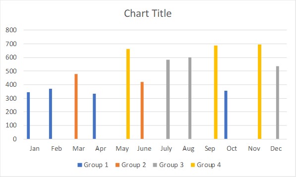
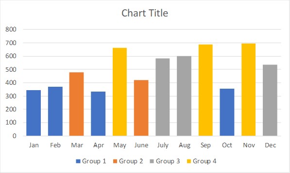
Select cells E11 to I23 and insert a 2-D clustered column chart, the default column chart. The chart will initially look like this.
Initial formatting
The initial chart looks strange because for each month there is room for four columns but only one of the columns is showing. Click on one of the columns. Press Ctrl+1 to open the Format Data Series task pane. Set the Series Overlap to 100% and the Gap Width to 50%. The Series Overlap layers the columns on top of each other but since there is only one visible column in each month, no data is hidden. The Gap Width settings makes the columns wider so they have more presence on the chart. Here is what the chart looks like now.
Additional formatting
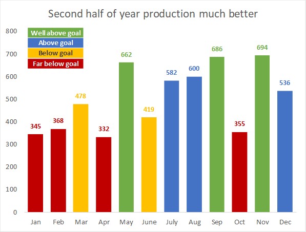
The colors used for each data series is from the color theme being used for this Excel file. You can assign more meaningful colors for each data series.
You can also add data labels to each series. It is a good idea to format the data label text to have the same color as the column it is representing. This allows you to remove the gridlines and the vertical axis.
You can remove the default legend at the bottom of the chart. If you feel the colors need to be explained, you can add explanatory text in the chart.
The chart title should explain the message of the chart so that the viewer instantly understands the message being communicated by the chart.
Applying this additional formatting could result in a chart that looks like this.
Benefits of using this method
By defining the boundaries in cells and using formulas that refer to those cells, if you want to change the boundary values, the chart will automatically update based on the new segments. This use of formulas also allows the formatting of each column to change when new values are entered for the next time period, another product line or a different production line. All the work is being done by the formulas with only the new chart title needing to be entered based on the message from the new data and analysis.
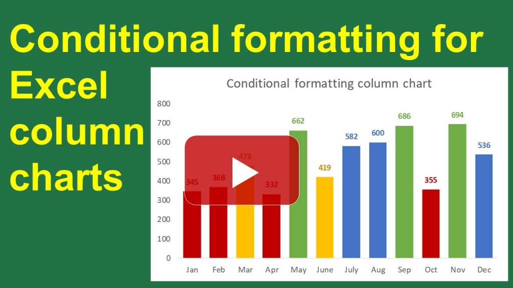
Video of these steps
Watch the video below to see me demonstrate these steps in Excel.

Dave Paradi has over twenty-two years of experience delivering customized training workshops to help business professionals improve their presentations. He has written ten books and over 600 articles on the topic of effective presentations and his ideas have appeared in publications around the world. His focus is on helping corporate professionals visually communicate the messages in their data so they don’t overwhelm and confuse executives. Dave is one of fewer than ten people in North America recognized by Microsoft with the Most Valuable Professional Award for his contributions to the Excel, PowerPoint, and Teams communities. His articles and videos on virtual presenting have been viewed over 4.8 million times and liked over 17,000 times on YouTube.