If you create a graph in Excel, how do you get the colors to match the organization’s PowerPoint template? The two most common approaches are: 1) spend time typing in the RGB values for the correct colors into Excel for every graph, or 2) ignore the desire to make the colors match because of the time it takes and just copy the Excel graph into your slide and hope for the best.
There is a more efficient and effective way to make graphs in Excel match the organization’s color scheme from the PowerPoint template: Apply the theme from the PowerPoint template to the Excel file. Here’s how you do this.
Step 1: Export the theme from the PowerPoint template
Open the current PowerPoint template you have downloaded from the organization’s intranet branding or marketing page. On the Design ribbon, click on the button to expand the Themes section and click on Save Current Theme.
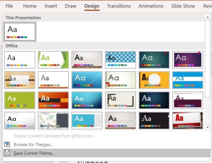
Save the theme file on your computer.
Step 2: Apply the saved theme to the Excel file
Open your Excel file. On the Page Layout ribbon, click on the triangle to expand the Themes button and click on Browse for Themes.
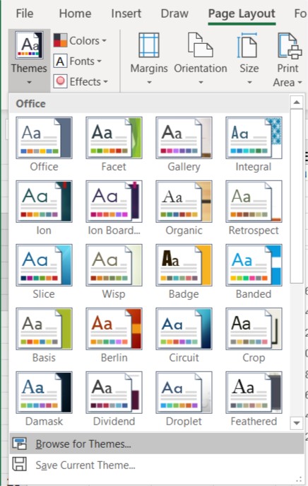
Select the file you saved in step 1 above and click on the Open button to apply the theme to this Excel file.
Step 3: Create graphs in Excel
With the Excel file now using the colors from the organization’s PowerPoint template, you can create the graphs you want knowing that they will be compliant with the PowerPoint template.
Step 4: Copy the graphs to PowerPoint
When you want to copy the graph as an image to your PowerPoint slide, select the graph in Excel and copy it. In PowerPoint, click on the triangle below the Paste button on the Home ribbon and click on Paste Special. Select the Picture (Enhanced Metafile) option and click OK. This pastes the graph in as a vector image which allows resizing without distortion or becoming fuzzy.
By following these steps, you can create color compliant graphs in Excel and copy them as images to your PowerPoint slides. I’ve recorded a video of these steps if you need more guidance. You can watch the video below.

Dave Paradi has over twenty-two years of experience delivering customized training workshops to help business professionals improve their presentations. He has written ten books and over 600 articles on the topic of effective presentations and his ideas have appeared in publications around the world. His focus is on helping corporate professionals visually communicate the messages in their data so they don’t overwhelm and confuse executives. Dave is one of fewer than ten people in North America recognized by Microsoft with the Most Valuable Professional Award for his contributions to the Excel, PowerPoint, and Teams communities. His articles and videos on virtual presenting have been viewed over 4.8 million times and liked over 17,000 times on YouTube.