The Problem with Timelines from PowerPoint Designer
When preparing slide makeovers for a recent client workshop I saw a number of slides that used some of the new timeline SmartArt that Designer in PowerPoint suggests if you enter a text slide with dates. The ones I’m referring to are the ones that look like these two examples.
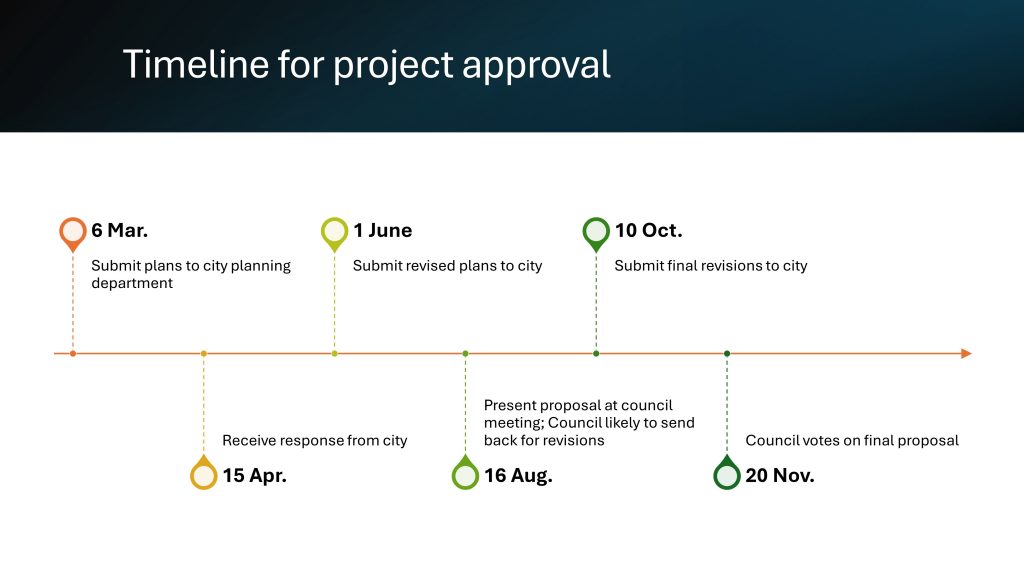
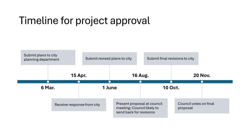
There is a horizontal line that indicates the timeline and then evenly spaced vertical lines and text that indicate each event. The first problem is that we don’t know what timeframe the horizontal line represents. The second problem is that the events are evenly spaced along the timeline so they do not accurately reflect the timing of the events along the timeline.
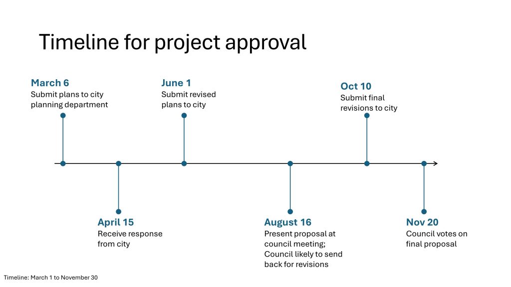
An Accurate Timeline
I believe that when presenting time-based information, we need to represent it accurately. The CFO whose team I was working with agreed that executives need to get a sense of how close some events are when making decisions. So I created the following slide that shows the events along a timeline with the correct spacing between them.
Creating the Timeline Visual
To create this visual, you need to decide on the time frame shown and calculate where each event lands along the timeline.
Selecting the timeframe is relatively easy. If the time frame is over a few months, as in this example, choose the first day of the first month and the last day of the last month. If the time frame is over a few years, consider selecting the first day of the first year and the last day of the last year. People tend to interpret years better when they see the whole year.
Calculating where each event should be positioned along the timeline is trickier but I’ve made it easier with an Excel spreadsheet that allows you to enter the start and end dates, how long the timeline is in inches (or cm), and when each event occurs. You can download the spreadsheet by right-clicking on this link.
I’ve found it easiest to set the length of the timeline as 10 inches on the slide as it gives space on both sides for text and it makes the math easier. That’s why you see the spreadsheet use 10 inches as the timeline length. This input is changeable so if you want to change it the sheet will recalculate the correct position for each of the events. If you are using centimeters you can use 20 or 25 cm as a standard length.
Steps to Draw the Visual in PowerPoint
Here are the steps to create the accurate timeline visual. A video showing these steps is below.
Step 1: Create the overall timeline
- Draw a horizontal line using the Shift+draw technique so it stays horizontal.
- Set length to 10 inches.
- Add an arrow on the end to indicate timeline direction (left to right).
- Add text at the bottom of the slide to indicate timeline dates so viewers have the correct context.
Step 2: Add the first event
- Add a line to position the event
- Draw a horizontal positioning line below the timeline using Shift+draw to keep it horizontal. Start it to the right of the left end of the timeline (use Shift+drag to move it if needed).
- Set the line length using the Shape Width to the position from the spreadsheet for the date of the event.
- Left align the positioning line with the timeline.
- Add a line for the event at the correct position
- Draw a vertical line using Shift+draw to keep it vertical.
- Format it as desired (balls on ends, size, color).
- Move it so it is left of the horizontal positioning line.
- Right align the vertical line and the horizontal positioning line.
- Align the event line with the timeline
- Use Shift+drag to vertically move the vertical line above or below the timeline depending on where you want it to be displayed (make sure it does not move horizontally).
- Align the vertical line and the timeline to the bottom if the vertical line is above the timeline or to the top if the vertical line is below the timeline.
- Add text for the event date and description. Format it as desired.
Step 3: Add the other events
- Adjust the length of the horizontal positioning line for the next event date.
- Ctrl+drag to duplicate the vertical line and position the new vertical line to the left of the horizontal positioning line.
- Repeat the alignment steps using the positioning line and timeline to move the new vertical line into the correct position.
- Use Ctrl+drag to duplicate the text box and position it close to the new vertical event line. Edit the text and format the text if needed.
Step 4: Make adjustments
- If events are close to each other, you may need to adjust the length of the vertical lines to stagger the text so text for one event doesn’t run into text for another event.
- You may need to move an event and it’s text to the other side of the timeline to prevent text boxes from overlapping.
- Add additional explanatory text as needed.
- Delete the horizontal positioning line after all events have been added.
Video
I recorded a video of how I calculate the event positions in Excel and draw the timeline visual in PowerPoint. Watch the video and pause when needed as you create the visual.
Wrapup
As I share in almost all of my training sessions, whenever we communicate numbers visually, whether that is data or dates, we need to do so accurately. When we don’t, it calls into question all figures we are reporting. Use the technique above to create accurate timelines when reporting events during a time period.

Dave Paradi has over twenty-two years of experience delivering customized training workshops to help business professionals improve their presentations. He has written ten books and over 600 articles on the topic of effective presentations and his ideas have appeared in publications around the world. His focus is on helping corporate professionals visually communicate the messages in their data so they don’t overwhelm and confuse executives. Dave is one of fewer than ten people in North America recognized by Microsoft with the Most Valuable Professional Award for his contributions to the Excel, PowerPoint, and Teams communities. His articles and videos on virtual presenting have been viewed over 4.8 million times and liked over 17,000 times on YouTube.