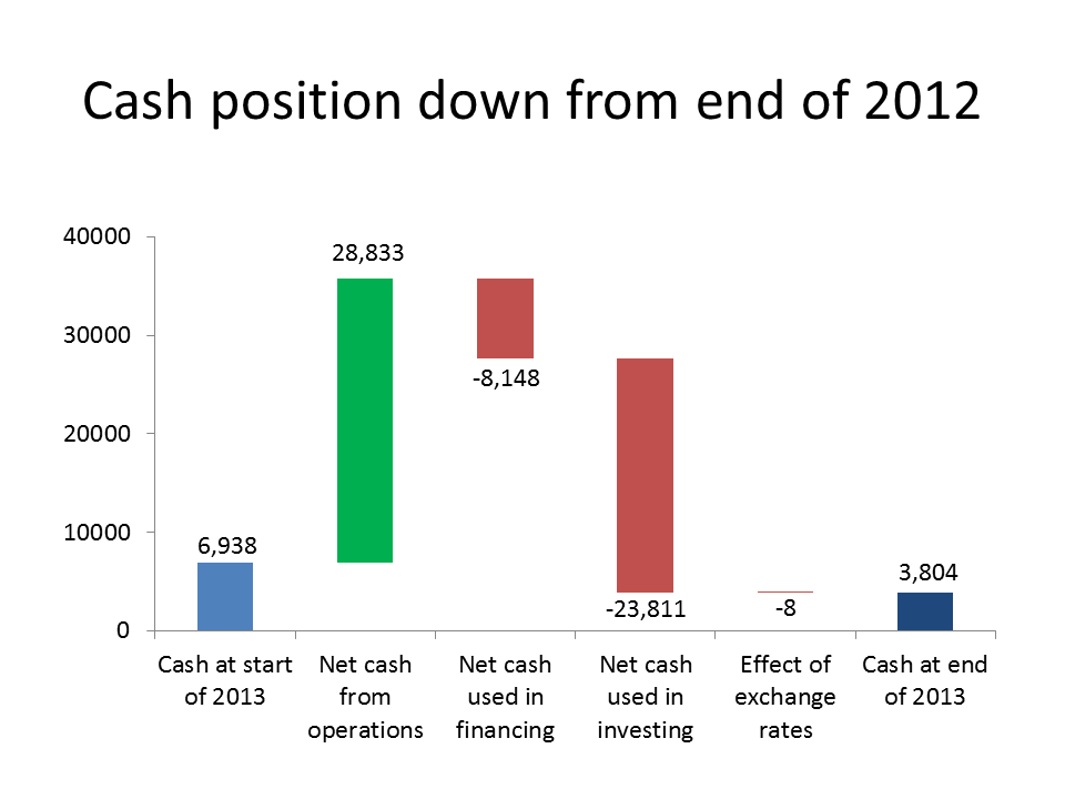
A waterfall graph is a good way to show the components of the difference between a starting value and an ending value. It is commonly used in finance and accounting presentation to visually show the components that contributed to the change in a measured value between two points in time. Here is an example:
While it looks like a complicated graph to create, it is actually quite easy in PowerPoint. The trick is that this is a stacked column chart with one segment set to No Fill and No Line, so it isn’t seen. That hidden segment is what “supports” the segments that seem to float above the horizontal axis.
The challenge has always been doing the calculations of each of the segments. This gets especially tricky if the graph ends up crossing the horizontal axis into negative territory. I have created a calculator that does the calculations for you. It is part of my Calculators For Visuals Excel file that you can download.
Right-click on this link and select to Save the file to your computer. Then open the file you have downloaded in Excel.
If you want to read a tutorial for more complex waterfall graphs, go to: http://peltiertech.com/WordPress/excel-waterfall-charts-bridge-charts/
Thanks to Echo Swinford for the inspiration for creating this calculator.

